Erdmann Housing Tracker 2024 in Review (July to December)
These are generally the most widely read free posts. I tend to make policy-related posts free and save actionable investment and market related posts for subscribers. I think the subscriber stuff is the good stuff, in terms of understanding the housing market for your own sake, so these posts are sort of the starting line-up of the B-team.
The last half of the year was tough to choose from. A lot of posts had similar reading engagement. Even so, I have mostly just chosen the posts with the most clicks.
July
The Cheat Code for Understanding Housing
The cheat code is this: The main source of rising price/rent ratios is rising rents. Structures depreciate. Land does not. When rents are inflated by supply obstruction rather than because homes are better and nicer, it is basically land rent. The land is basically a permission slip to own an artificially constrained asset. So inflated rents fetch a higher price than rents on structures. Land rents don’t require maintenance and upkeep.
Price/rent ratios have been rising for the past several decades because land rents are an increasingly large part of home values.
Economists seem to universally treat high price/rent ratios, a priori, as a cyclical disequilibrium. Usually they assume it is caused by mortgage access or federal subsidies. I can understand why they make that mistake. But it is a mistake. And the mistake is one of many paper thin cornerstones holding up 20 years of academic literature on high housing costs.
Valuations, Density, Rents, and Incomes
This was a follow-up to the cheat code post. In the course of looking at rent and price data, I realized that there is a confounding variable in post-Covid data. Covid led to migration flows out of the dense urban cores of the few American cities that have amenities associated with urban density.
Urban amenities are similar to supply-related land rents. They fetch a higher price/rent ratio because they are attached to location rather than depreciating structures. Rents have been declining in the most dense urban ZIP codes since Covid arrived, and prices in those ZIP codes have been declining even more. That has been from a loss of amenity value in our urban cores.
But, in non-dense ZIP codes, rents have continued to rise, and prices have risen even more, because high costs are due to constrained supply. One bright spot is that this has levelled off since 2022. If housing construction stays strong, maybe we will finally have a reprieve from rising rents and prices across the board.
August
Rents shouldn’t influence monetary policy
This wasn’t quite among the most read posts, but it should have been. Rent inflation should be completely excluded from inflation indexes when tracking monetary policy. Internationally, I think it is common to exclude the estimated rental value of owner-occupied homes, because the rental value of owned homes has little to do with short-term cyclical fluctuations in the demand for money.
Here, I also argue that even cash rents should be excluded, because in our current context, rent inflation is largely inflation of land rents. Land has nothing to do with production - the “P” in GDP - so rents on land have nothing to do with the price level in GDP. There are contexts in which rents on structures would be a meaningful part of a basket of price indexes. We do not live in that context.
We should not be calibrating monetary policy to keep land rent inflation at 2%. We should target all other prices at 2%.
Patterns in housing: Big = Simple
This was another post that wasn’t necessarily the most read, but it makes a handy reference. It is common for people to have the intuition that the bigger a problem is, the more complicated the cause and the solution must be.
But, that is actually wrong. Bigger problems are simpler problems.
I use Hurricane Katrina as an example. Nobody has to debate what caused population to drop, home prices to rise, or employment to drop in New Orleans in the summer of 2005. It was a big problem, so the diagnosis was simple. Housing is the same. The diagnosis is simple. And the worse the housing crisis becomes, the more obvious the diagnosis is.
Residential investment used to be highly variable and highly cyclical. Multi-family construction dropped permanently to a very low level in the 1980s. Single-family dropped permanently to a very low level in the 2000s.
A common claim from the “complicators” is that we need a large public presence in homebuilding to counteract cyclical private markets. Private housing markets haven’t had a cycle since the 1970s because public policy prevents private building from expanding above a cyclically neutral pace. That claim is the triumph of uninformed intuition over observation. Of course, part of their confusion comes from presuming that the collapse in construction is a choice of private firms.
It’s a popular point of view. Maybe even held by the majority. Those who hold that view strongly are probably incapable of engaging in objective discourse. Our only hope is with those who hold it weakly.
What Kalamazoo Reveals About the Dangers of Incomplete Observation
This was my reaction to a New York Times piece by Conor Dougherty.
Salim Furth kindly cited my post, but I have seen no indication that Dougherty has read it. The main thrust of the NYT piece is that rents aren’t high enough in Kalamazoo, so the state should subsidize the rents of upper income families.
That may sound crazy. Read the piece and tell me I’m misconstruing it. I don’t think I am.
As long as the brightest minds on the topic don’t notice the most important policy choice of a generation - the sudden reversal in 2008 of 20th century progress on mortgage access - how can anything coherent come of it?
It doesn’t appear to occur to Dougherty at any point on his visit to Kalamazoo to wonder why families with more than $100,000 annual incomes are renting rather than buying, or why new homes are being built to rent rather than to sell.
More Notes on Kalamazoo
The more I have thought about the article, the more the anecdotes just don’t make any sense to me.
September
In September, I had an op-ed in the Washington Post. It was a plea for the presidential candidates to loosen lending standards at Fannie and Freddie. That would do more for housing affordability and housing supply than all their other ideas, combined.
There were two responses to that op-ed which I replied to.
Responses to My Plea for Looser Lending: Dean Baker
I had mentioned in the op-ed that Atlanta didn’t really have a housing bubble, but it had a deep and highly regressive housing bust. That is because the crisis was caused by the mortgage crackdown.
Baker’s response was, frankly, pretty sloppy. He didn’t actually carefully cite Atlanta housing data. He just basically took the popular position that once the idea of a “bubble” became the public obsession, then it didn’t matter if home prices declined by 5%, 10%, 50%, or 70%, he has decided that the crisis had been pre-specified to be as deep as it was because of things that happened before 2008.
Unfortunately, many more readers will see his posts than will see mine.
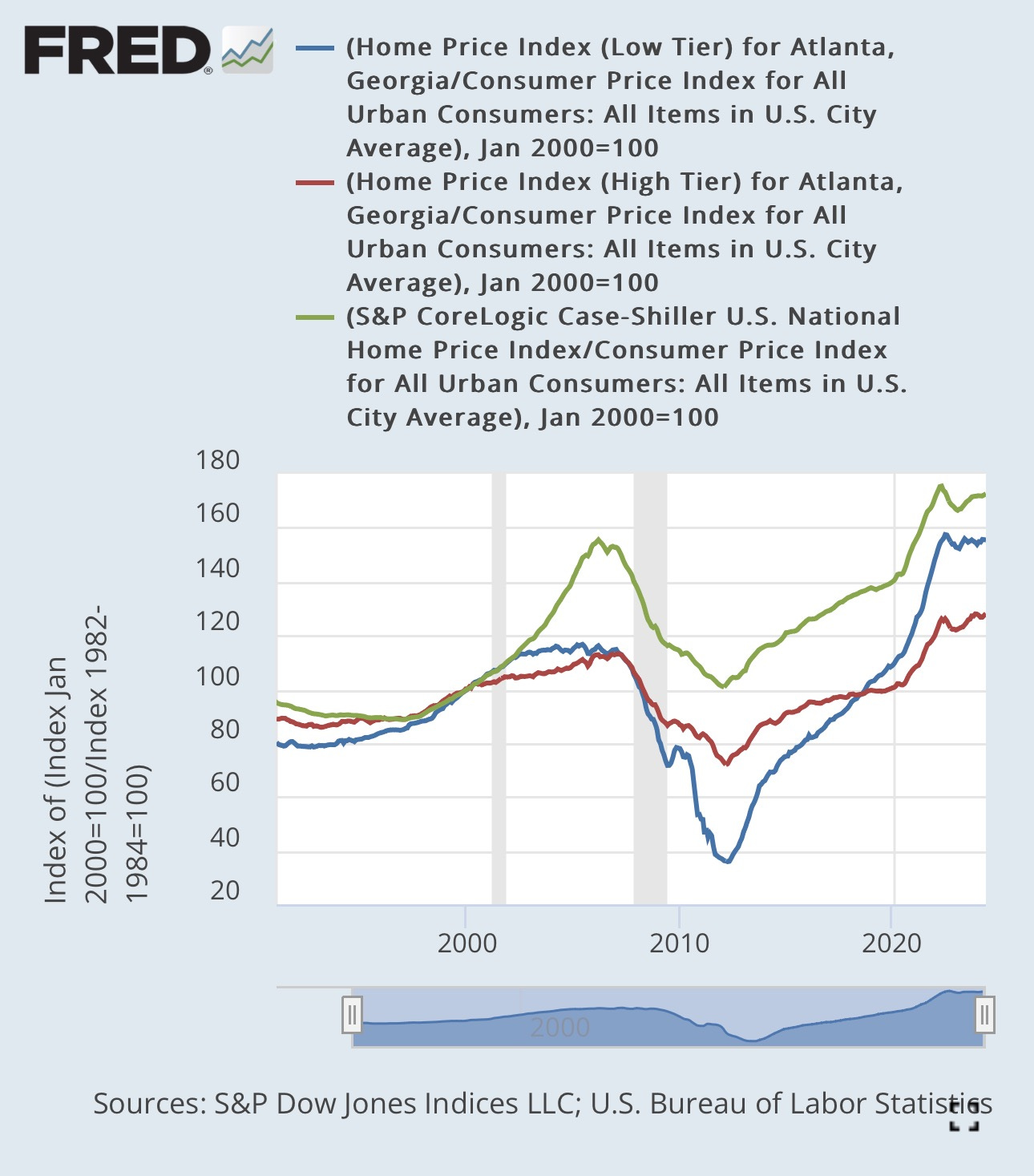
Here’s a chart of US home prices (green), high tier Atlanta home prices (red) and low tier Atlanta home prices (blue). Baker wrote, “This was still a bubble, given the trend in rents, but considerably smaller (KE: in higher tier Atlanta) than the one in the lower tier in Atlanta. For that reason it is not surprising that there would have been a sharper fall in house prices in the bottom tier.”
I wrote:
What would be surprising? After 2007, we could have used a few surprise-able economists. This was the root cause of the financial crisis. Any scale of catastrophe was presumptively attributed to some vague idea of a bubble, even if one needed to reach back to before 2002 and even into the 1990s to find the unusual price appreciation, as Baker did for low tier Atlanta.
Real prices that drop to half of the bottom of the previous cycle? “Not surprising.” Nothing to see here. Nothing to address macro-economically. Just nature running its course.
Would a decline in the index to 20 have surprised Baker? 10? Surely there is some point where the answer would be “yes”. And once you come to terms with that, it’s pretty clear that the number that should trigger surprise is well above 40.
Responses to My Plea for Looser Lending: Salim Furth
Furth’s response was more thoughtful than Baker’s. In my reply to Furth, I attempted to compare the estimated number of potential homebuyers who were locked out of mortgage markets in Kalamazoo with the decline in housing construction after 2008.
In broad numbers, the scale of missing buyers accounts for most of the drop in construction.
RealPage, Collusion, and Rents
I added two more posts on the topic of RealPage and landlord collusion.
Part 2:
The explicit claim is that the software results in higher vacancies. So, the landlords are still producing the product. They just aren’t selling it.
It would be like if OPEC limited selling volumes, but still drilled for all the oil and just burned off the extra. Or if monopolists reduced production to create elevated prices, but still hired a full staff and just had the unused staff sit around doing nothing.
Part 3:
A visual representation of the population of San Francisco and Phoenix, over time, and an estimate of the change in available units the RealPage “cartel” might be able to create in Phoenix in a steelman version of the claims against them.
Is San Francisco expensive because of San Francisco planning departments, or because of rental software? And is Phoenix now expensive because of rental software, or because in 2008 it suddenly took on San Francisco’s growth rate? (In Phoenix’s case the low growth rate is due to federal mortgage regulation, but to the same effect.)
We need empty houses
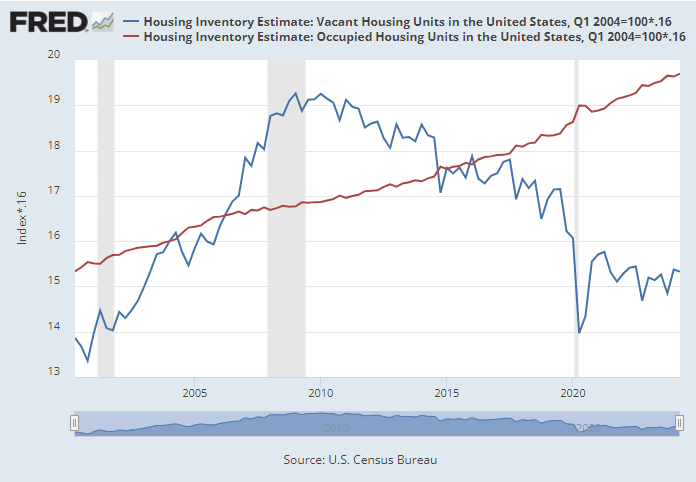
This is a simple visual. The blue line is millions of vacant units. The red line is the number of occupied housing units. I have set them up so that when the blue line is below the red line, rent inflation has been elevated, and when it has been above the red line, rent inflation has generally been moderate. We need more than 4 million vacant units to get the blue line back up to the red line.
October
The Moral Panic, Its Perpetrators, and Its Victims
Part 1, 2, 3, 4, and 5
In these posts, I chart home prices in a high tier Atlanta ZIP code and a low tier Atlanta ZIP code. Here is one chart, using price/income. Basically, the Atlanta market was very stable until the bottom dropped out of the low tier market. Low tier homes in Atlanta became very cheap once it was illegal for their tenants to buy them.
But, the collapse in construction that ensued meant that Atlanta now has a shortage of homes. Housing shortages always cause low tier rents and prices to rise higher than high tier rents and prices, so now, low tier homes in Atlanta are more expensive than they ever were before 2008.
In the series, I show that, according to Fannie Mae SEC filings, over the course of 2008, when home prices collapsed in low-tier Atlanta, Fannie Mae basically mostly stopped lending to that tier while it continued to lend into the high tier.
Before 2008, the average Fannie Mae mortgage was associated with a home worth just a bit more than the Atlanta average. By 2009, the average Fannie Mae mortgage was associated with a home worth more than the average home in ZIP code 30022.
The mortgage crackdown wasn’t some necessary medicine we had to take to avoid future crises. The crisis was caused by the mortgage crackdown. The collapse in ZIP code 30344 was well downstream of the Fannie Mae tightening. The subprime boom and bust had begun and ended from 2003 to 2007. You can be forgiven if you don’t see any unusual price patterns during that time.
If you want to have a reputation in economics, you have to take the Dean Baker line that the price trend in ZIP code 30344 from 2008 to 2012 was a necessary corrective from the price trend of 2002 to 2007. The academy is so confident in this that you can assert it without looking closely at the data. It’s just a thing that economists know.
November
National Housing Crisis Task Force
I was very happy to see the National Housing Crisis Task Force list mortgage access as an important element in addressing the housing crisis.
Rent inflation since Covid
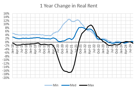
Tentative evidence that the trends in rent inflation caused by inadequate housing supply have receded. When housing is in short supply, low tier rent inflation is high (listed as “Min” in the chart). Since 2023, not only has rent inflation moderated, but it has also stopped being regressive. All tiers of rents have moderated.
We have hit that new equilibrium. Build-to-rent is about to take off. It will rid us of the regressive rent inflation. Maybe it can reverse it a bit. It would reverse a lot faster if we let those former mortgaged families back in the market.
In any case, even if the best that policymakers can do is keep their hands off the housing market, we might already have taken baby-steps into a new trend where tensions will not be as enflamed. Both the Harris campaign and the Trump campaign have been supportive of bills and rhetoric against landlord buyers. Any legislation that stops that market from developing will make things worse again.
Case-Shiller and Filtering
Comparing the difference between the Case-Shiller index (which tracks the value of existing homes) and the price per square foot of new homes can tell us a lot about filtering.
Over the 20th century, population and the stock of homes quadrupled. Real per capita income septupled.
Think of the proverbial Case-Shiller benchmark house in 1900. If it was maintained to remain basically the same for a century, at the end of that century, it was a much different reference item. If it had truly remained unchanged, and, say a family with a $30,000 (2024 $) income lived in it in 1900 and a family with $30,000 income still lives in it in 2024, those are very different families.
Over the long term, the Case-Shiller index can tell us a lot about filtering.
Instead of deflating the Case-Shiller index with inflation, what if we compare the nominal Case-Shiller index with incomes?
Basically, in the 19th century, or so, Case-Shiller and new homes tracked more or less together. Case-Shiller was flat relative to inflation, but declined relative to incomes. As incomes increased, houses whose prices tracked with inflation filtered down to families with relatively lower incomes.
This century, homes filter up, so the existing homes tracked by Case-Shiller have gotten more expensive relative to new homes. (Some follow-up details in a post for subscribers.)
The Housing Shortage by Metro Area
Here, I attempted to estimate the number of homes each metro area would need to build in order to get rents and prices back to historical norms.
In Part 4, I made the case for why there is a shortage of homes, in the pedantic economic sense. The way I put it is that, where there is a shortage, the higher valuation is attached to the land, not the structures. Buying a house in a supply constrained market is “bribing the land to buy the house”. The price of the land is the permission slip for buying an arbitrarily obstructed asset. A shortage in the most pedantic sense.
Here is my estimate of the shortage in the 30 largest metropolitan areas, stated as a percentage of the current stock of homes. This is the quantity of new supply that would be associated with a reversal of the regressive price inflation that is estimated by the Erdmann Housing Tracker.
December
Mortgages Outstanding by Credit Score
I consider this to be one of the more important posts I have written. I mapped Fannie Mae’s data on mortgages outstanding onto broader national estimates.
By these estimates, borrowers with credit scores below 740 held mortgages worth about 20%-25% of total owner occupied real estate from 1965 to 2007. Now it’s less than 10%.
Borrowers with scores above 740 held mortgages worth 10%-15% of total owner occupied real estate from 1965 to 2007. Then, it shot up because real estate values collapsed. Now that real estate values have recovered, these borrowers hold mortgages worth just under 20% of total owner occupied real estate.
Mortgage leverage is about the same as in 1980, but much more of it is to borrowers with high scores.
As a portion of GDP, mortgages held by borrowers with scores under 740 are about the same as in the 1970s. Mortgages held by borrowers with scores over 740 are triple what they were in the 1970s.
The reason mortgages are so much larger relative to GDP is because we have a shortage of housing, so real estate values are inflated.
I think what some of the mortgage bears are seeing is that the small portion of Americans who do qualify for mortgages have to stretch to make the payments work because home values are inflated. The millions of Americans who no longer are allowed to have mortgages are off their radar. And, it only seems prudent to them that if qualified borrowers are so stretched, it would be madness to approve less qualified borrowers. Since they will never accept that the mortgage crackdown itself is the cause of inflated real estate values, there is no path for them to understand the problem.
Fortunately, the coming boom in single-family build-to-rent homes will start to fill the gap on the housing shortage, and moderate costs in spite of the mortgage crackdown. Until we ban it.
But, that is not an ideal solution. All the sub-740 score tenants who are renters now instead of owners must pay a steep price because of their exclusion. Rents will remain somewhat elevated if they must consume housing only as tenants.
When we lost our minds
This was a 5 part series. It didn’t get an unusual number of clicks, but I think part 3 especially contains novel new empirical evidence, so I’m including it here.
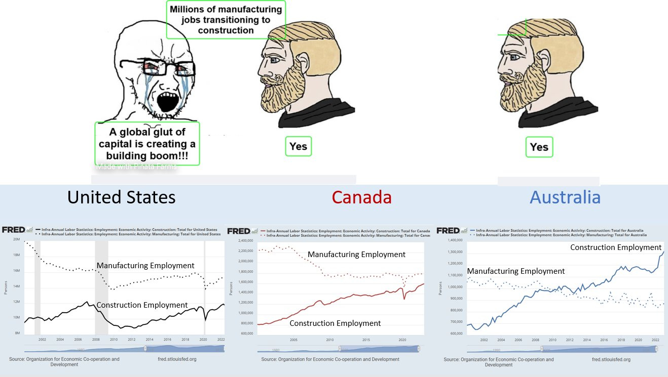
Here, I reviewed the claims from the movie “The Big Short” and the debate about the “Global Glut of Capital” before the Great Recession.
My basic point is that the critics of the “Global Glut of Capital” have all accepted a false premise. The debate is even worse than it seems. It was based on the notion that we had more houses and more construction employees than we could productively use.
In hindsight, that is nonsense. The US trend in construction employment, shown in the left panel here, was a disaster. It wasn’t anything like an inevitability or a necessity. We needed homes.
Bernanke here is basically saying, “Look, low interest rates are creating more homes and more construction jobs, but it’s not my fault.” When the crisis hit, a popular retort to this was, “See, it was Bernanke’s fault. He created those jobs!” Everything about this debate is nonsense.
Jobs are good! Houses are good! Capital is good! Honest!
Here I walk through the difference between cities that have a temporary demand spike and cities with perpetual supply shortages. Temporary demand spikes push prices up throughout a city (Phoenix 2005, Austin 2022). Perpetual supply shortages push prices up regressively (LA, New York, every major city since 2015).
Using the intuition from part 2, this figure gives the basic picture for Phoenix. From 2004 to 2008, all homes, cheap or expensive, retirement or non-retirement, rose and fell together.
Then from 2008 to 2012, just the cheap non-retirement neighborhoods collapsed. Both the cheap and expensive retirement communities look like the expensive non-retirement neighborhood.
Retirement communities don’t need mortgage access. They generally pay cash. It’s like a control group. Phoenix had a demand boom and reversal followed by a completely unrelated mortgage crackdown.
Someday, I’d like to expand this analysis to other metro areas. I’m sure the results will be similar. Retirement communities can be a control variable for estimating the effects of mortgage access.
Here I review Ed Leamer’s frustrating fatalism when he presented his iconic housing paper to the Federal Reserve in 2007.
Here I review Ed Leamer’s frustrating inability, in a 2015 retrospective article, to understand the mistakes he made in 2007. His basic framework is useful and important. Housing should be important to the business cycle because of changing construction activity, not volatile home prices. But just to put a cherry on top of the confusion his framework is mired in, he continues in that article to use Los Angeles as an example of a city with “a volume cycle, not a price cycle.” This was a free choice. He could have chosen any city to be his example. And he chose Los Angeles, and then doubled down on it. A housing volume cycle is about as relevant to the LA economy as altitude is to a chicken’s flight patterns. Utterly amazing.
Expensive Cities Aren't Attractive Cities
This was a 4 part rant. In those 4 parts, I walk through the evidence regarding the high costs of what I call the “Closed Access” cities and what others refer to as the “Superstar” cities - New York City, Los Angeles, San Francisco/San Jose, Boston, and San Diego. There is more demand to live in some of them than in others. As a group, though, there is no reason to think that the demand for living there is higher than normal. They are just normal cities who chose to obstruct new housing more than any other cities did. It’s all supply. They are expensive because they oppose housing. And, local incomes are higher, in part, because the housing shortage forces poor residents to move away.
It is common to treat them like they are especially desirable places because they are expensive and have high average incomes. It’s a mistake. As a group, they are average, except that they have failed millions of their most economically vulnerable former residents.
See you all next year. Thanks for coming on this journey of discovery with me.


Thanks for the good year of content. I was glad to be reminded of the value of "Empty Houses" in a healthy market. It reminded me of some of your commentary on fallacies of agglomeration theory applied to housing prices. I've been struggling to understand the settlement patterns of the U.S. for the past 50 years and how that pertains to the future--in a nutshell: rural areas lose population and urban areas gain it, and as a consequence, rural areas will have more empty and low value dwellings. For a while I've regarded this as the natural order of things, but your research into mortgage access suppression makes me wonder if this imbalance isn't a true market phenomenon.
Yes, the city or the immediate suburbs of a city offer more opportunity and consequently cost more, but why should exurbs be subject to a big gut punch in terms of value? What network of policy choices have made this happen? From a political standpoint of MAGA it boils down to "Goldurned China and illegal immigrants" but what comes from that aside from a broad based recession driven by a nutty tariff regime?