When we lost our minds: Pt. 3 The Dog that Didn’t Bark - Retirement Homes
One way that I highlight the importance of the mortgage crackdown in American housing markets is by highlighting price trends in cities that weren’t the center of attention in 2008.
Atlanta is probably the best example. There was nothing unusual happening in Atlanta housing markets before 2006 in terms of production and before 2008 in terms of prices. First production collapsed. Then prices collapsed - but the price collapse was very regressive. The top of the market was unaffected and the bottom of the market was devastated. And, right then, when that happened, roughly 1/3 of the traditional mortgage market had been cut off. Not subprime. Subprime had boomed and busted from 2003 to 2007 when nothing of note was happening in Atlanta. This was an entirely different thing.
And, amazingly, everything about this thing - the loss of access to mortgage markets, the decimation of neighborhoods where nothing of note had happened before - all of it went unnoticed because it got wrapped up and comingled with a completely separate story of a housing boom and bust in places like Phoenix.
This was probably the most important economic event of a century and most people - even most economists and policymakers - react with some aggravation to the suggestion that it happened at all.
Well, the boom and bust in places like Phoenix normally makes this assertion more complicated. It is easy to see in Atlanta that one single thing happened, and it started at the beginning of 2008, after the subprime lending boom and bust had played out. But, Phoenix has all those complications. It really did have a housing bubble before 2008, and so there are all sorts of outcomes that have to be explained.
One of the fundamental intuitions that I apply to housing markets is that local supply constraints cause prices to rise the most in low tier housing that families with lower incomes live in. But, loose lending conditions can also cause prices on those homes to rise more. I can use other clues like rent trends, construction activity, and migration patterns to discern which is which. But, that’s a complicated story.
Zillow publishes price data at the neighborhood level. A while back I found a handful of neighborhoods in Phoenix that are age restricted retirement communities. Retirement homes are not generally credit constrained like other markets. Usually, elderly home buyers in those markets sold homes they owned free and clear, and they are buying homes with cash. They don’t need a credit market.
But, there are still gradations within that market. There are cheaper neighborhoods and more expensive neighborhoods. Poor, middle class, and rich. So, retirement neighborhoods should reflect the other factors at work in the marketplace that affect other neighborhoods, except credit conditions. It’s like having a control group.
If thousands of families move in to Phoenix because of LA’s housing shortage, prices in all neighborhoods will rise. And when the migration stops, all prices will decline.
If, year after year, Phoenix doesn’t build enough homes, that inflates land values across the metropolitan area in a regressive way. That doesn’t depend on marginal mortgage access. In Figure 2, the difference between Atlanta and Los Angeles in 2021 wasn’t credit access. It is overwhelmingly a lack of housing in Los Angeles, which causes rents and home prices to rise in a systematic way that pushes hardest on families with the least resources.
In LA, low tier homes are more expensive. Retirement homes aren’t immune to that. A lack of adequate housing supply will make low tier homes more expensive - both retirement and non-retirement.
And, finally, mortgage access should only affect low tier homes in non-retirement neighborhoods. Mortgage access is especially important for working age families with lower incomes living in lower-priced homes.
Table 1 outlines what we might discern from analyzing these neighborhoods.
Phoenix Price Trends
I picked the 2 retirement neighborhoods in Phoenix with the lowest and highest home prices in January 2000, and I matched them with non-retirement neighborhoods that had the most similar price trends from January 2000 to January 2002.
Figure 3 compares the price trajectories of those 4 neighborhoods from 2000 to 2024.
Shades of Atlanta, don’t you think? If we’re looking at the differences between these 4 neighborhoods, there’s basically one big thing that happened. And it only happened to the low tier, non-retirement neighborhood from 2008 to 2011, then reversed.
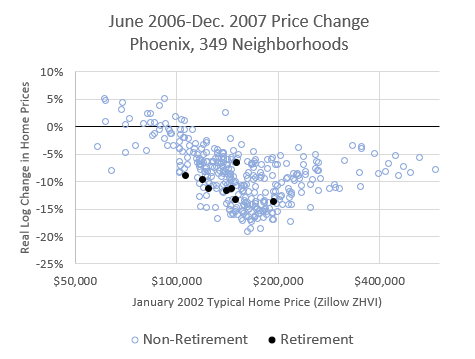
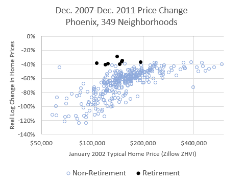
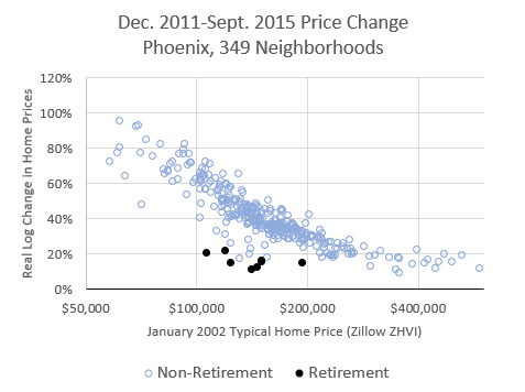
Let’s look at the entire Phoenix market. At different periods of time, there are different trends that tell clear and striking stories. In all the following charts, neighborhoods in Phoenix are arranged by the starting home price in January 2002. The y-axis is an estimate of the real change in home prices over each period of time (Zillow’s ZHVI, adjusted for the change in the average Phoenix income over that time.) The black dots are retirement neighborhoods. The blue dots are other neighborhoods.
January 2002 - June 2006: Phoenix Building Boom
From 2002 to 2006, home prices across Phoenix increased by around 50%. It didn’t matter if the neighborhood was rich or poor, retirement or not. That was due to a temporary positive shock in demand. There is no indication here that credit-dependent neighborhoods had any additional demand.
June 2006 - December 2007: Phoenix Building Bust
As I mentioned in the previous post, the period covered by “The Big Short” was complicated. There was a combination of a declining housing market, the collapse of the migration surge from California into Phoenix, a late cycle last gasp of lending (which is what “The Big Short” was focused on), and rising costs in low tier neighborhoods because new home construction had declined, and rents were rising.
Prices in the retirement neighborhoods declined during this period like prices in high tier neighborhoods did. Low tier prices didn’t decline or declined by less. That suggests that loose lending affected low tier prices during this period. But, there is some indication of prices in the cheaper retirement neighborhoods dropping more slowly than the more expensive retirement neighborhoods. That suggests that lagging supply from the collapse in new home construction was also a factor.
This chart supports the point of view in “The Big Short” that lending during that time had an inflationary effect on home prices, with a couple of important caveats.
As I mentioned in the previous post, if the lending boom was responsible for pushing up home prices, it was only keeping them steady when they otherwise would have fallen. In the preceding boom period, low tier homes didn’t rise any more in Phoenix than high tier homes. So, when lending conditions appear to have had an effect on home prices, they were stabilizing prices, not pushing them higher. And, they certainly weren’t triggering more construction.
If the broad conventional story of a credit bubble that caused housing to rise and fall is true, isn’t it really weird that prices collapsed first in the richest neighborhoods and in retirement neighborhoods that aren’t sensitive to credit conditions? When the $100,000 neighborhoods were still doing ok, were prices in the $400,000 neighborhoods in freefall because those were the neighborhoods full of foreclosed houses for sale? The end of the credit bubble hit retirement neighborhoods first? No. That causal story of the crisis is simply inaccurate. It never matched the facts.
In “Shut Out” I also point out that the decline in homeownership among families in the highest income quintiles started before the crisis and the decline in homeownership among families in the median and lower income quintiles was mostly after the crisis.
December 2007 - December 2011: Mortgage Crackdown
The broader Phoenix bust was still happening in 2008, so the baseline during this period is another 40% drop in the richest neighborhoods and the retirement neighborhoods. (This is on a log scale, which is how the numbers can be lower than -100%. Think of it as the number of times prices would need to rise 1% to get back to where prices started. Low end prices would need to rise by 1%, serially, more than 100 times after December 2011 to get back to where they had been in December 2007.)
During this period, every city looks basically the same, with a different baseline. In Atlanta, for instance, high end neighborhoods were basically flat or down slightly, while the cheapest neighborhoods declined by more than 50% (on a log scale). The shape of the cloud of dots is basically the same everywhere.
And, since the collapse of low-end housing during this period was due to the mortgage crackdown, the retirement neighborhoods look just like the richest neighborhoods. Compared to other neighborhoods at similar price levels, every single retirement neighborhood is an outlier - outside the range of the other neighborhoods.
December 2011 - September 2015: The Correction
I suppose I’m not doing a strict reading of Table 2 here, which would say that Figure 7 is a sign of loosening mortgage access. Obviously, there hasn’t been. I’m going to claim researcher’s prerogative here. By 2011, the low tier market was just far from any reasonable equilibrium.
Prices in December 2011 were a fire sale, having little to do with any fundamental. Homes in the poorest parts of Phoenix were actually selling at a lower price/income ratio than homes in the richest parts of Phoenix. Of course, that mattered little to residents who had been legally banned from buying them. Without a correction back to earlier mortgage lending norms, other buyers came into the market - more mom & pop landlords, corporate buyers, private equity, etc.
Prices in the retirement communities hadn’t been artificially lowered, so there was no correction needed, and corporate buyers weren’t interested in homes that weren’t on discount. This period wasn’t associated with the excessive and regressive rent inflation that is associated with perpetual supply shortages. So, I think it is safe to call this period a return to some equilibrium price in a functioning market. If a regulation hadn’t been passed to prevent you from borrowing money, you could buy homes in Phoenix on a “50% off” sale.
So, from 2011 to 2015, retirement neighborhoods continued to behave like high tier neighborhoods rather than like other neighborhoods with similar starting home prices. But, this appears to mostly be a mechanical reversal of an overshoot after 2008 when markets simply lacked buyers to find the equilibrium price.
September 2015 - February 2020: Supply Crisis
The initial correction didn’t fully heal the market. Local land use rules block multi-family construction and new mortgage standards prevent hundreds of thousands of Phoenix households from buying homes. These conditions have continued to prevent new construction from returning to sustainable levels. So, from this point forward, Phoenix and the rest of the country now joined New York, LA, San Francisco, Boston, and San Diego and became Closed Access cities. Housing is perpetually undersupplied, and this creates regressive rent inflation as families are faced with the grinding set of compromises required in the housing musical chairs game.
Since this period is characterized by lack of adequate new home construction and inflation of urban land value, it affects retirement neighborhoods the same as other neighborhoods. For the first time, in Phoenix, retirement neighborhoods experienced price appreciation that was negatively correlated with home values in the same way as non-retirement neighborhoods.
I hope to eventually revisit this data more thoroughly. For instance, one thing I would expect to see is that we would find this pattern that developed in Phoenix after 2015 already in Los Angeles before 2005.
Taking the entire period from 2011 to 2020 into account, one could see how enticing it would be to believe that private equity came swooping in bought up homes from real families and then jacked the rents up. Those things did happen in that order. But, the private equity purchasers were a result of the mortgage crackdown, not really a cause of anything. They helped the market find a bottom so that prices would stop collapsing after the traditional buyers had been banned by federal regulators.
When I was writing my Mercatus brief in defense of corporate home buyers, I found that the renter share of detached single family homes actually peaked in 2014.
That fits well with the trend shifts I am highlighting here. Large scale institutions could only justify owning single-family rentals at those fire sale prices. Once the market had returned to some semblance of a supply and demand equilibrium, the net demand was from homeowners. Rents were still too low to get home prices high enough to build new rentals. So, from 2015 to 2020, demand from families that could qualify for mortgages induced some new building at the high end of the market and some sales within the existing stock of homes, putting pressure on supply and raising rents.
The new single-family rental market has started to boom in the last couple of years, and I think that is because rents finally rose enough that even corporate landlords can justify paying the cost of a new home.
February 2020 - July 2022: Covid Boom
Over time, construction has slowly recovered in Phoenix. It’s hard to know, yet, whether the current rate of construction is high enough to end the regressive cost patterns that have developed since 2015.
When Covid hit in 2020, the overwhelming factor again shaping Phoenix housing was a new boom in local housing demand. This caused prices across the metropolitan area to rise. This was like a smaller version of the 2002-2006 period.
July 2022 - October 2024: Covid Correction
The Covid housing spike in Phoenix then reversed. And, again, there was little difference between rich and poor, retirement or non-retirement.
Now the question to ask of Phoenix housing data in the near future will be: has construction recovered enough to stop the regressive increase in housing costs that characterized the 2015 to 2020 period from returning? Whatever happens, I predict that retirement neighborhoods and non-retirement neighborhoods will continue to move in parallel. The answer I don’t know yet is if rich and poor neighborhoods will move in parallel. Since mortgage access is still severely limited, the answer likely depends on the growth of the new large scale single-family build-to-rent market.
Finally, Figure 12 compares the systematic price trends of 5 different hypothetical neighborhoods. I used the starting values of $100,000 and $180,000 because that is the minimum and maximum value of the retirement neighborhoods.
But, as you can see in the charts above, there are many non-retirement neighborhoods with more expensive homes, and the systematic effects of both mortgage access and constrained supply reach up to neighborhoods with more expensive homes than that.
So, in Figure 12, in addition to the $100,000 and $180,000 hypothetical neighborhoods, I also included a non-retirement neighborhood with a starting home value of $280,000. That is the non-retirement neighborhood that appears to have negligible sensitivity to mortgage access and local supply conditions. So, its price behavior from 2002 to 2024 roughly mimics the price behavior of the retirement neighborhood with a starting home value of $180,000. (The $180,000 retirement neighborhood probably has slightly more sensitivity to supply conditions and slightly less sensitivity to lending conditions than the $280,000 non-retirement community.)
Isn’t Figure 12 ironic? If you asked laymen or even economists to draw that chart, I’d guess many would draw 2006 to look like 2022 and vice versa.
When We Lost Our Minds:
Part 2: Respecting the Timeline
Part 3: The Dog that Didn’t Bark - Retirement Homes


