This series started with yesterday’s overview. This post and the next will offer some market data for consideration. Part 4 will review Ed Leamer’s address to the Federal Reserve in August 2007. Part 5 will review Ed Leamer’s 2015 review of the crisis and his presentation, using parts 1-4 as my frame of reference.
This post will be review for some readers. Part 3 contains legit new information, I think. But, before I get to that, it’s probably best to walk through the basics.
Here I will discuss 4 “Contagion” cities - Phoenix, Las Vegas, Tampa, and Miami. These are the cities most associated with the 2008 collapse.
The following presumptions will guide my analysis. These are the basic ideas behind the tracker. The tracker uses income as the independent variable, but home prices are highly correlated with incomes, so it is possible to do this sort of analysis with only home prices.
When low tier and high tier prices move together, that is a signal of shifting local demand. During a boom, a lot of new residents tend to bid the prices of all local housing higher.
When low tier prices rise higher than high tier prices that is either a signal of loosening credit conditions or persistently tight local supply conditions.
In cities where local supply obstructions are the main factor driving up prices, prices tend to rise more at the low end, as, year after year, families with higher incomes have to poach homes from the existing stock. They do that by being willing to pay higher rents than the existing residents can pay, and it leads slowly to regressive rent inflation throughout the metropolitan area as poor families are forced to choose between unaffordable rent, worse neighborhoods, regional displacement, or homelessness.
Things like lending activity, rent trends, and construction activity can help to differentiate whether loose lending conditions or local supply constraints are causing low tier housing costs to rise.
Normally, I use IRS income data and Zillow data at the Zip code level, which I analyze through my simple model. Here, I will use Case-Shiller “high tier” and “low tier” price indexes (adjusted for inflation) for these cities. Both data sources point to similar patterns.
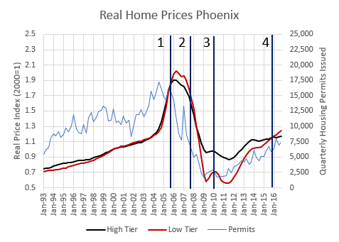
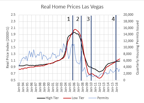
Each chart has 4 points in time marked.
The period up to the 4th quarter of 2005 was a period of expansion - more homes, generally rising homeownership rates, more mortgages, more migration out of the “Closed Access” cities and into the “Contagion” cities.1
The period from the 4th quarter of 2005 to the 4th quarter of 2007 was the period covered by “The Big Short”. This is when the CDO market boomed and ended. Migration out of the “Closed Access” cities dried up during this period. Ed Leamer presented “Housing IS the Business Cycle” to the Federal Reserve near the end of this period in the 3rd quarter of 2007.
The 4th quarter of 2007 through the 1st quarter of 2010 was when prime mortgage lending through the federal agencies was throttled. Roughly 1/3 of the existing market was no longer served. The 1st quarter of 2010 was when Michael Lewis’ book, “The Big Short” was published. There was a temporary first-time homebuyer tax credit in 2009 and early 2010. Then the comprehensive Dodd-Frank financial regulation bill was passed later in 2010. Both of those likely had some effect on home price trends.
The 4th quarter of 2015 was when “The Big Short” was released in theaters. Ed Leamer’s paper “Housing Really Is the Business Cycle”, looking back at his 2007 presentation, was published earlier in 2015.
Phoenix
Figure 1 shows data for Phoenix. In the growth period, construction was active and both high tier and low tier home prices increased at the same rate. The city was growing.
In the 2nd period, high tier prices declined. This is the period when low tier prices rose more than high tier prices. But they didn’t diverge by much. At the same time, new construction was declining sharply.
In the 3rd period, construction continued to collapse. The price tiers flip-flopped. By 2010, the low tier index in Phoenix was nearly 30% lower than the high tier index.
By the end of the 4th period, low tier prices had caught back up to high tier prices. Construction had stopped collapsing but was still low.
Las Vegas
In Las Vegas, the price boom happened about a year earlier than in Phoenix. But all the important inflection points I described above also happened in Las Vegas. All homes increased in value during the boom. Then, during the first phase of the downturn when the CDO boom happened, it was more a matter of high tier trends turning down faster than low tier trends. Then, low tier housing dropped much more in 2008 and 2009. Then, by 2015, low and high tier had reconverged.
What can we infer from these trends?
There is no evidence in the price indexes of a credit bubble before 2006. (And, actually, as I pointed out in “Building from the Ground Up”, debt was a lagging measure in the Contagion markets according to the New York Fed’s Household Debt and Credit report. Most of the unusual debt in Nevada and Arizona accumulated after 2005.
These cities had a population boom, much like Austin’s recent boom. And prices reacted much like they reacted recently in Austin - prices across the entire metro area spiked (in phase 1) and then corrected (in phases 2 and 3).The second phase, which is the “The Big Short” phase is complicated. The market, as reflected by high tier prices, was already contracting. This is reflected everywhere in many data measures - lower homeownership, less transaction activity, fewer housing starts, etc. It is plausible - even likely - that part of what was going on was a sort of last gasp credit bubble, which included some predatory and desperate borrowing and lending activity. And that activity may have been keeping low tier prices from dropping.
The broader market was flat or declining, even with a late cycle lending boom, and every 1% boost you think reckless lending was adding to the market means that the market would have dropped 1% more during this period without it.
For instance, in “The Big Short” Steve Carrell’s character calls back to the office and says, “It’s a bubble.” after he has talked to an exotic dancer who owns 6 investment properties. But, at the time, sales were down. For every exotic dancer that owned 6 properties, there had to be at least 6 other homeowners or investors who had exited the market. There has never been a book, a movie, a documentary, a Congressional hearing, etc. about those 6 missing buyers.
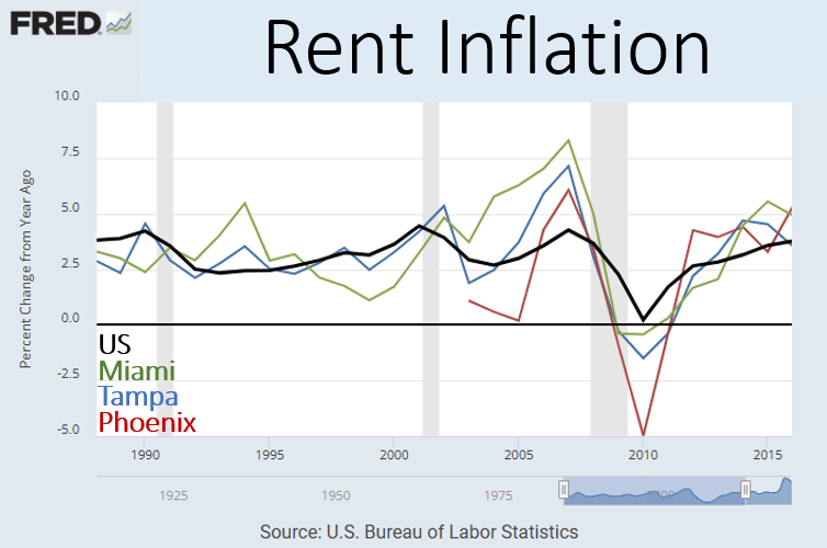
Also, in phase 2, housing production was declining sharply. And, as Figure 3 shows, rents started to rise nationwide, and especially were rising in the “Contagion” cities. Rents had been moderating during the building boom.
There was a complicated mixture of boom and bust during phase 2.In phase 3, the extreme tightening of prime mortgage lending caused low tier prices to decline much more sharply than high tier prices. Obviously, prices weren’t declining because of building boom was pushing down rents. Construction was very low.
In phase 4, low tier prices reconverged with high tier prices. Ironically, when the book version of “The Big Short” came out, it appeared that a lending induced price bubble had permanently retracted. But by the time the movie came out, it was clear that it hadn’t been permanent at all. Both high and low tier home prices in all these markets were back together at a level that was similar to 1990s levels.
These cities did experience a boom and bust, but it was a boom and bust in population - demand for shelter.
So there was a reversal in these cities. And that reversal was probably inevitable. But the mortgage crackdown in phase 3 was entirely unrelated. So, as I have highlighted in other posts, cities like Atlanta and Kalamazoo mostly have 2 flat lines, except that the low tier line drops down after 2007.
I’m limiting myself to the Contagion cities here because in the next post, the extra price volatility provides information about the market.
Tampa
The Florida cities are interesting. They hit the 4 tipping points about the same as the other cities. But, (1) there is more of a low tier price separation before 2006. And, (2) there is more of a continuation of low tier price appreciation after 2005 in phase 2.
As you can see in Figure 3, rent inflation was higher in Florida than in the US or in Phoenix, and it rose more in 2006 and 2007 when housing construction collapsed.
I think the most plausible conclusion is that Florida had more of everything. More loose lending. Tighter supply conditions. And more population-driven demand. The New York Fed Household Debt and Credit report also shows debt levels rising earlier in Florida than they did in Nevada and Arizona. So, Florida might have been seeing some credit-fueled appreciation before 2006.
All in all, my estimate is, generally, that the order of importance of factors moving home prices in these cities is:
A boom and bust from 2002 to 2008 that was very large, associated with the rise and collapse of housing-triggered migration out of the Closed Access cities, amounting to a rise and fall of well over 50% in all these cities.
A prime mortgage crackdown in 2008 that crashed the average home price by more than 20%. The highest tier homes were unaffected and the lowest tier homes lost half their value in many places, averaging to about 20% losses for average homes.
A credit boom and bust from 2002 to 2006 amounting to about 8% on the average home, which reversed after 2006.
A fourth factor is the relentless rise of low tier rents and prices from the perennial supply shortage. That has been growing in all cities since the 2010s. Before 2008, it was limited generally to the Closed Access cities. Miami is marginally Closed Access, so there was a small permanent premium on low tier housing in Miami already in phase 1 and 2 that was not related to lending activity.
Miami
Miami, like Tampa, has some separation in prices before 2006. But, compared to Tampa, the drop in low tier prices isn’t as severe. At the deepest lows, the low tier price index in Miami was only about 10-15% lower than the high tier index.
That is because Miami is a borderline Closed Access city. Of the cities in Figure 3, Miami’s peak rent inflation is noticeably highest. Also, Figure 6 compares per capita home construction between these cities. Miami isn’t as bad as the Closed Access cities, but it rarely builds at a faster pace than the national average. It builds at a much slower pace than the other Contagion cities.
So, its price trends are more like a Closed Access city. The Closed Access cities have had divergence between high and low tier home prices in the years leading up to 2006 because they don’t build enough and poorer residents are forced into tough compromises on their housing budgets. That creates permanent elevated housing costs in Miami that are the result of regressive rent inflation due to a long-standing housing shortage.
The perennial shortage raised both prices and rents. The mortgage crackdown lowered prices but raised rents.
Los Angeles and Atlanta
Finally, Figure 7 shows high and low tier trends in Atlanta and Los Angeles, to provide a sense a scale. Most cities look most similar to Atlanta.
The Closed Access cities, like Los Angeles, look very different than other cities. The scale of high costs in low tier housing in Closed Access cities is larger than any of the factors affecting home prices in the other cities during these years, but before 2008 that issue was strictly limited to the Closed Access cities.
When all of the data gets put in a stats blender, the low tier prices in Los Angeles before 2006 produced a lot of statistically significant output for any variable that is correlated with incomes. Those neighborhoods were doing a lot of the work in the models where supply was ignored and the model was designed to look for other factors like lending and Fed policy. But, to a first approximation, the inflated low tier index in Los Angeles before 2006 is entirely a supply issue.
Of course, it became a demand issue for the Contagion cities when millions of households were moving away to other cities in search of affordable housing.
So, the long and short of it is there was a small lending boom before 2007 and a big lending bust after 2007.
But, the important reason for going through this timeline again is in the next post. I was able to identify a handful of neighborhoods in Phoenix that are age-restricted retirement communities. Comparing those neighborhoods to the rest of Phoenix is enlightening. Stay tuned.
When We Lost Our Minds:
Part 2: Respecting the Timeline
Part 3: The Dog that Didn’t Bark - Retirement Homes
Part 5: The Lessons Leamer Learned
The Closed Access cities are New York, Los Angeles, San Francisco, Boston, and San Diego, which are perennially short on housing. Because of this, they bleed out domestic migration of their poorest residents most years, which causes the average incomes of families that don’t move away to increase, and tricks economists into calling them “Superstars”. They now regularly experience declining population during periods of economic growth.


While this is all eminently convincing and make sense, I think I've finally figured out what still rubs me wrong about your overall project:
You hold supply to be one of, if not THE core factor of why the mortgage crackdown was so bad... BUT the mortgage crackdown only makes sense as the latest episode of yet another policy misstep exacerbating the saga of a generations-long supply crunch.
What I mean by this is, let's consider the contrast: What does a NIMBY/supply-denialist version of your narrative look like? "We cracked down on mortgage lending because we were overproducing housing for so many decades -- it was the final lever the evil developers had been using to gentrify people out of their homes and keep building sprawl. We would've been fine if [X]... !".
The thing is, that last sentence is where it all breaks down:
1. "... if we hadn't cracked down, so the sprawl could've continued unabated" => This is contradictory to the NIMBY position that sprawl is bad.
2. "... if we hadn't cracked down, the evil developers could've gentrified the cities" => This is contradictory to the NIMBY position that developers and gentrification are evil, and cities are hellish places to live.
The NIMBY-induced supply crunch is basically the only background trend that's compatible with your narrative of the last 2-3 decades. And as true as your narrative might be, the cumulative amount of housing that would've been built without supply restrictions vastly outstrips the cumulative amount of housing that would've been built without mortgage/credit restrictions.
Just to reiterate... I really appreciate this project, though. Not trying to be your Most Annoying Commenter or anything, just offering opinions and constructive criticism (housing pun intended). It's been very illuminating and helped me update my model of the housing crisis to incorporate the mortgage crackdown that you so vividly describe. Cheers!
OT, but in the same ballpark or maybe the parking lot
https://www.bls.gov/news.release/pdf/prod2.pdf
Unit labor costs are up 0.8% in Q3 on year.
The Fed is fighting inflation? Or just wants to beat the snot out of people who work for a living?
This is a labor shortage?