There have been a couple of responses to my Washington Post op-ed. One of them is from Dean Baker. I appreciate Dean’s comments. These replies give me a chance to clarify and add some nuance.
In the op-ed, I argued that overly tight lending since 2008 has caused rents to rise significantly and is the main cause of post-2008 housing affordability struggles. I used Atlanta as an example of a city that didn’t really have a building boom or a price bubble during the subprime lending boom from 2003-2007. Yet, tightened lending caused prices and construction to collapse in Atlanta, to an extreme, especially in working class neighborhoods that especially depended on reasonably generous lending.
Baker’s post is titled “There Was a Housing Bubble in Atlanta Prior to the Crash”.
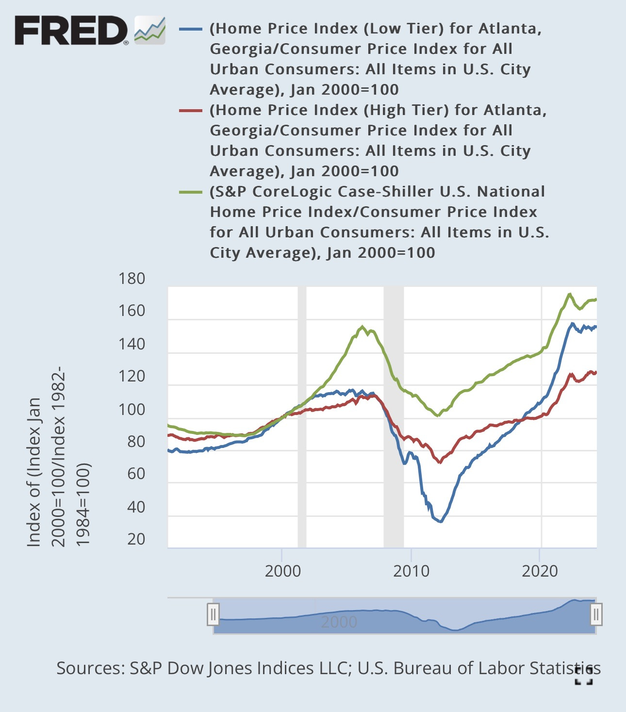
He shared a chart of low-tier home prices in Atlanta, andjusted for inflation, and wrote, ”As can be seen, there is a sharp rise in the index from 1996 to the middle of 2005.” And he noted that low tier home prices increased more than high tier prices from the bottom in the mid-1990s to the top in the mid-2000s. Also, rent inflation in Atlanta was moderate during that time. Rising rents weren’t the direct cause of rising prices.
He wrote, “This was still a bubble, given the trend in rents, but considerably smaller than the one in the lower tier in Atlanta. For that reason it is not surprising that there would have been a sharper fall in house prices in the bottom tier.”
The blue line in Figure 1 is low tier Atlanta. The red line is high tier prices. The green line is the U.S. average home price index, adjusted for inflation. All are set to 100 in January 2000.
There are several problems with Baker’s comments.
Before I get into the specifics, I think it is visually easy to see the problem with Baker’s comments in Figure 1. It’s a shame that he looked at low tier Atlanta in isolation. I assume that all readers looking at Figure 1 can readily accept that the blue line is level when home prices elsewhere were spiking and then declined much more sharply in the subsequent bust, in spite of that.
There was a significant nadir to peak cycle in low tier Atlanta. It rose more than the other indexes from 1990 to 1998, then rose in line with the national index from 1998 to 2002. Then flattened out. Baker is technically correct that low tier Atlanta peaked in 2005, but clearly it flattened out in 2002.
The private securitization boom happened very distinctly from late 2003 to early 2007. That coincided with a sharp rise in home prices in some cities. But most cities were like Atlanta.
Baker narratively conflates those trends. But that spike in the green line after 2002 is what conventional wisdom considers a bubble. And during those important boom years, low tier Atlanta was flat. And high tier Atlanta outpaced low tier Atlanta.
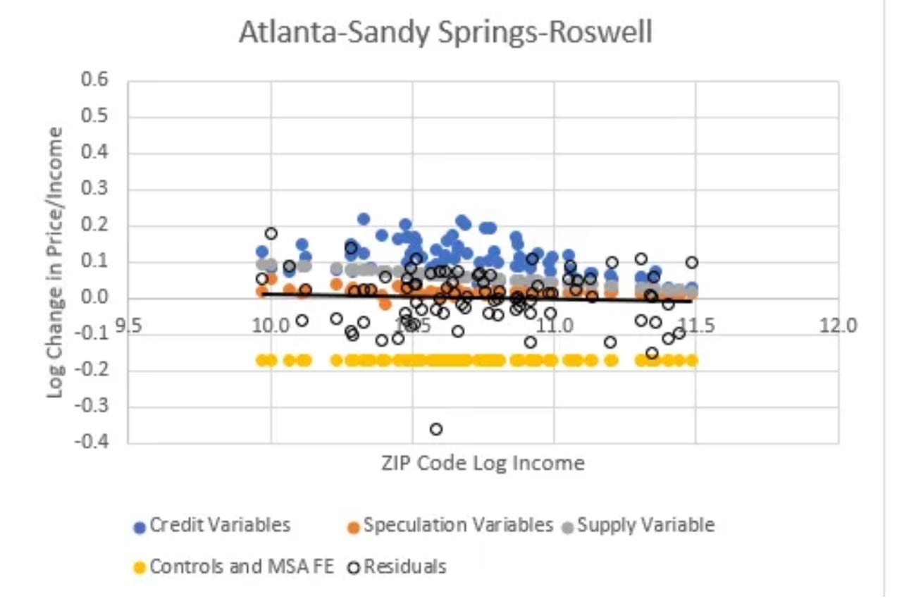
Figure 2 is from a paper where I decomposed the factors driving home prices from 2002 to 2006, relative to incomes. In that paper I found that credit access did seem to be associated with rising home prices in credit-dependent ZIP codes.
On average, I found that credit access was associated with an average of about 8% appreciation. That meant that credit access in low tier Atlanta was associated with 10%-20% price appreciation in low tier Atlanta.
But at the same time, there was nearly a -20% decline across Atlanta from local economic effects shared across Atlanta and unique to Atlanta. Atlanta was not experiencing a housing bubble from 2002 to 2006.
This graph for Phoenix looks very similar except Phoenix fixed effects were +20%. That nearly 40% difference is why Phoenix was a bubble city and Atlanta was not.
But, it is true that looser lending markets appear to have been associated with a rise of something close to 15% in low tier Atlanta.
And, if that change in credit access had reversed, a 15% reversal would have brought the Atlanta low tier price index in Figure 1 back down to about 100.
In fact, by the end of 2007, after the private subprime market had completely collapsed, low tier Atlanta had declined to about 100.
Then, in 2008, the GSEs poured salt in the wound and greatly tightened lending compared to their long-term norms, and after that, low tier Atlanta dropped to 40.
Baker calls that “not surprising”. What would be surprising? After 2007, we could have used a few surprise-able economists. This was the root cause of the financial crisis. Any scale of catastrophe was presumptively attributed to some vague idea of a bubble, even if one needed to reach back to before 2002 and even into the 1990s to find the unusual price appreciation, as Baker did for low tier Atlanta.
Real prices that drop to half of the bottom of the previous cycle? “Not surprising.” Nothing to see here. Nothing to address macro-economically. Just nature running its course.
Would a decline in the index to 20 have surprised Baker? 10? Surely there is some point where the answer would be “yes”. And once you come to terms with that, it’s pretty clear that the number that should trigger surprise is well above 40.
New Homes vs Existing Homes
Baker mentions that, as you can see in Figure 1, low tier Atlanta has again outpaced high tier Atlanta. And all the indexes are above the 2005 highs. He writes: “This suggests that builders have serious incentive to be building lots of housing in Atlanta and elsewhere, but for some reason they are not. The tightening of credit standards by Fannie and Freddie cannot explain this failure to build more housing, since that should be reflected in house prices, which it clearly is not.”
This is a little bit tricky, and it is an example of how the patterns I have highlighted are important for understanding housing markets. In analysis like Figure 1, there is a subtle observer’s bias. I set the indexes to be equal in 2000. But American housing markets aren’t in some naturally symmetrical balance. American housing markets are covered in asymmetries. Low tier homes aren’t now selling for more than high tier homes. They are just not as much cheaper as they were in 2000.
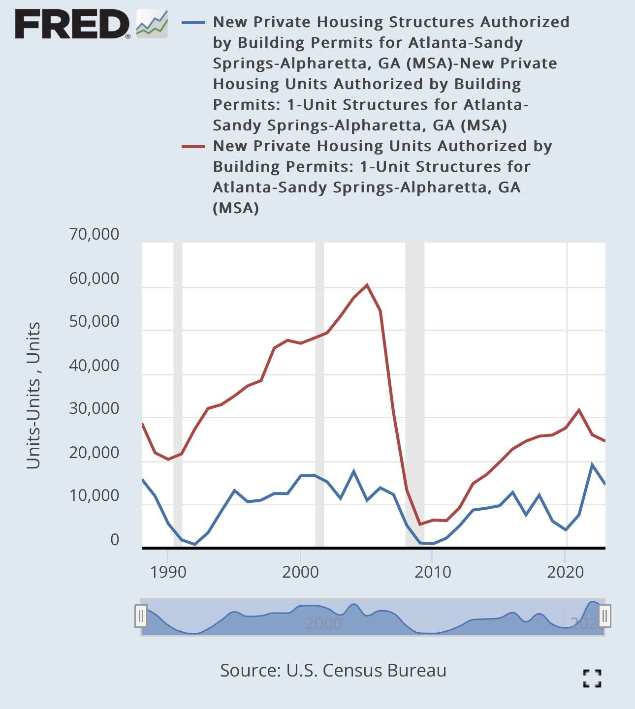
In the 2000s, new building was moderately active in Atlanta and was keeping rents low. New homes, which tend to be more high-tier, were lowering rents in old homes, which tend to be low tier.
Construction has been very low in Atlanta for 16 years, so now, the lack of new homes is causing rents on older homes to rise sharply.
In the 20th century, generous lending was keeping rents on old, depreciated homes low. They were on discount for renters who never received a mortgage. Now that we have reversed that, the discount is declining. If depreciated 80 year old homes are selling for more than they did 20 years ago, that doesn’t necessarily make new homes profitable.
Multi-unit building recovered after a few years and is as active today as it was before 2008. Single family building is still half the pre-2008 norm. I don’t think Atlanta suddenly adopted zoning codes that were anti-single family housing in 2006. Mortgage constraints are a clear culprit here.
As I have frequently written about recently, I do think entry-level new single family homes have become economical again. But overly tight mortgage markets mean that they can’t be sold to their tenants. This is starting to fuel an unprecedented spike in a build-to-rent market where large institutional investors buy whole neighborhoods from homebuilders.
I ask that readers consider that a big, unprecedented build-to-rent new home market will be a confirmation of my claims here.
Credit Scores
Baker also writes: “The average credit score has risen substantially over the last two decades. This means that using a fixed credit score as a cutoff would imply a smaller share of potential borrowers are being excluded. It also would have been helpful if Erdmann had included data on mortgage issuance in the 1990s before credit standards had been relaxed and the bubble had begun to build.”
This post is already long enough, so I won’t address every detail here, but the shift to much higher credit scores on new mortgages happened very suddenly in 2008 and 2009. The average score was especially low then because of the financial crisis. Scores have risen moderately since then for a number of reasons, but not nearly enough to bridge the 40+ point shift that happened in 2008-2009.
In the Washington Post piece, the Fannie Mae data reaches back to the 1990s, and one can infer from the similarities between their new mortgages and their existing mortgages that standards in the late 1990s had not significantly changed from previous trends. That’s the best I can do with the data I have accessed in the Fannie Mae 10-Ks.


I've admired Dean Baker for a long time, particularly because I recall that he was critical of the Fed's tight money policy during and following the Great Recession. However, he continues to feed the fallacy of the housing bubble theory on the basis of the Case-Shiller Index. Supply and lending constraints have emerged as the Uber-issue in housing availability, but I can't say how mainstream that thinking is---your op-ed helps.
As a general rule, I think that efforts to reduce rental costs for low to moderate income people through increased multifamily production is the critical component in Closed Access cities. The Boston metro region will not start producing starter homes for this segment---we've created geographical and political constraints that are nearly insurmountable. Large scale rental projects that gradually densify city cores and close suburbs are more efficient.