You can benefit from a fresh approach to housing because the housing market is different than it used to be in important ways that are recent enough to be underappreciated. You might be familiar with the “wtf happened in 1971” meme. A big part of the story is that housing access changed in the 1970s.
Here’s a chart from “Shut Out” of regional income disparities since 1929.
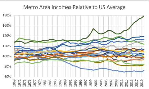
Here is a chart of income disparities for the 20 largest metro areas. The same chart, but reversed!
We can’t stop capital from flowing north to south or east to west. We can’t really stop people from moving between regions (or at least we haven’t figured out how to yet). But, we can effectively stop new people from moving to specific cities by blocking new housing at the municipal level.
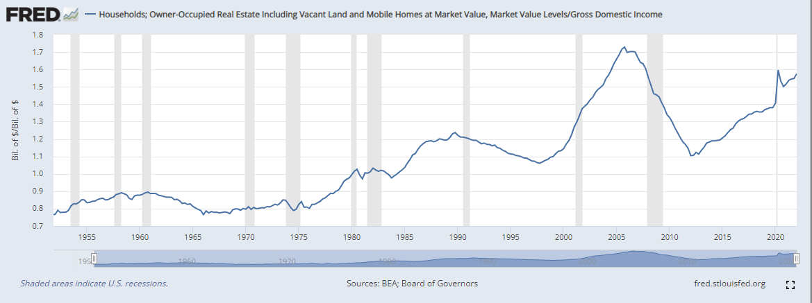
It is no coincidence that when the regional convergence ended and was replaced by local divergence, real estate values started eating the American economy.
Those 3 charts tell you a lot of what you need to know about American incomes and American housing trends. I have a series of 4 papers coming out at Mercatus over the next several weeks that highlight this problem, and the scars it leaves on the American housing market, which is the foundation I use for this model of home values. I will have a lot more to say about this as those papers are released, but today I will just introduce the basic idea for you.
The lack of appreciation for the supply issue has led to a backlash against mortgage lenders, the Federal Reserve, etc. And a backlash is understandable. American residential real estate is basically worth double what it should be - something like $20 trillion in excess value. Whatever the cause of that, we should be really worked up about it.
But, a really funny thing about that excess value is that real estate in the land of McMansions: where the value comes from the actual cost and value of lumber, gypsum, and concrete - places like Texas or Tennessee - it has remained pretty level. All that excess comes from places where there aren’t enough homes. Excess value could come from too much demand or not enough supply. The long term trend is clearly from inadequate supply, and once you start going down that rabbit hole, you realize that it is implausible for “excess demand”, whatever form that might take, to lead to a doubling in home values over the course of decades.
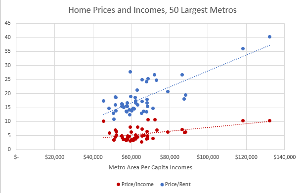
This is a really strange picture. Richer cities are spending more of their incomes on rent, and where they spend more on rent, home prices fetch a higher multiple on that rent. People don’t increase the portion of their incomes that they spend on housing as they get richer unless things are really weird. And, the kicker here is that, you could say, they aren’t richer, after housing costs. This strange picture is a side effect of the tell-tale scars of housing deprivation.
Housing valuations and local incomes are stable where homes can be adequately built and families of all types can move to a city. They are high where there aren’t enough houses and families can’t easily move there. So, you could say that the American housing market and economy is being driven to a large extent by housing affordability that is sort of cantilevered in that chart at the low end. And, where incomes rise, so do housing costs. And, thus, the total US residential values from the previous chart are hiding the true nature of the problem. The normal cities are normal and the cities that look rich are unaffordable and burdened by inflated residential real estate values.
But, even this level of disaggregation is only half the story!
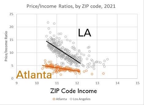
Here are price/income ratios for Atlanta and Los Angeles, down to the ZIP code level. Again, we have 2 charts that are the same chart, but reversed!
The excess value in real estate comes from cities that are artificially increasing the incomes of the typical families that live there by pushing poorer families out. It is the obstruction of housing that pushes poorer families out, by systematically making housing more expensive for poor families! It isn’t that housing for the rich has become excessively valued. It’s that housing has become excessively valued where there isn’t enough of it, and the amount of excess value is the amount of excess required to get poor families to move away from the housing deprived cities.
There is no amount of demand stimulus that could make Atlanta look like LA in this regard. This is purely a supply problem. The increase in American real estate valuations is entirely from this supply issue (with cyclical variations that fluctuate up and down around the long term uptrend, and which create an overconfidence in the “demand stimulus” critics every time there is an up-cycle).
I will go into a lot more detail on this as the papers are released, but I hope this gives you some insight into where the “supply” factor comes into the model that I introduced yesterday. You can quite easily see the difference between LA and Atlanta in that chart, and it is a difference that can be quite easily measured. Atlanta will never look like LA, no matter how much demand stimulus we give it. And LA will never look like Atlanta, no matter how much stimulus we take away.
This is new - and weird. And that’s why you can profit from understanding it. Because the mistaken status quo about how to think about housing naturally receives the benefit of the doubt. And every cyclical move around this long term problem serves to deceptively support the status quo. Everyone else simply has to remain unmoved from their priors - which is the easiest thing to do. And, in the meantime, by understanding this properly and releasing yourself from your priors, to understand what is new about American housing markets and cyclical activity, you can profit by trading against them.


I haven't seen an analysis that breaks down our housing dysfunction so concisely and convincingly. The different slopes between Atlanta and LA sadly says it all! Awesome post.