"Reassessing the role of supply and demand on housing bubble prices" (Part 3)
As I discussed in Parts 1 and 2, much of the existing literature on home price fluctuations from 2002 to 2010 has focused on a small part of the puzzle - ignoring the difference between Dallas and Los Angeles and focusing on the differences of home price behavior within each city. They did this because of a presumption that the housing boom and bust was due to some temporary form of demand boost that was unsustainable, and the debate was over the fundamental source of unsustainable demand. Did credit fuel speculation or did speculation use credit? The different effect those factors had on prices from city to city was determined by a fixed difference in supply constraints from city to city, and so supply was treated as a difference in the background to control for rather than fundamental factor in changing prices to analyze and compare to other factors.
In my previous paper, I developed a variable that can convey supply constraints and track their changes over time in a way that allows it to be analyzed alongside other factors like credit access and speculative activity. In this paper I am using that variable to re-assess the importance of lending standards and speculation in changing home prices, alongside the importance of supply constraints and other factors that affect prices uniformly within each metro area.
As I mentioned in Part 2, the effects of constrained supply systematically raise the costs of housing on poorer families the most. And, during the 2002 to 2006 boom, home prices didn’t universally rise more in poorer neighborhoods in all cities. They systematically rose more in poor neighborhoods in cities where poor neighborhoods were already expensive. And they generally rose in proportion to how high they had been before. You can see this in Figure 1. LA was bad in 2002 and much worse in 2006. In Phoenix, the relationship is relatively flat in both 2002 and 2006.
First, let’s look at the correlations of several factors with changing price/income ratios from 2002 to 2006 without using my supply variable. Table 1 is from the paper. The far right column shows the correlation between these various variables and changes in price/income ratios. You can see that there is a significant negative correlation between incomes and home prices. Where incomes were lower, home prices increased more, according to the regression.
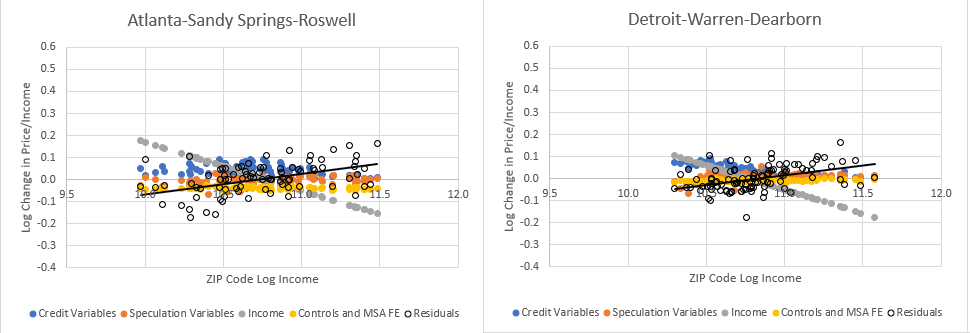
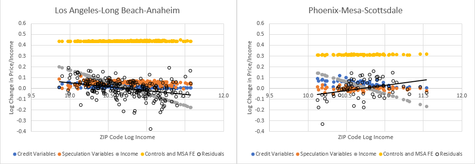
Figure 2 and Figure 3 show the estimates from this regression in graphical form for Atlanta, Detroit, Los Angeles, and Phoenix. Each dot is a ZIP code. The blue dots are for the changes associated with FHA market share in 2002 and denial rates on new mortgages in 2002 (measures associated with credit access). The orange dots are for the changes associated with non owner-occupier mortgage market share in 2002 and the price trend in the year before 2002 (measures potentially associated with speculation). The gray dots are for changes correlated with income. The yellow dots are for changes that are uniform across the metro area (fixed effects). The hollow black dots are for changes that are unexplained by these variables.
You can see that the credit variables are associated with some relatively sizable shifts in home prices. Nearly 10% in many ZIP codes in Atlanta, Detroit, and Phoenix. As far as I can tell, this is a similar effect size to the findings in the Griffin, Kruger, and Maturana paper I reference in my paper. As I mentioned in Parts 1 and 2, while statistically significant, this is a relatively small effect compared to the total changes in home prices at the time. Most of the changes are swallowed up by fixed effects - differences between cities. And, as you can see here, much of the change in home prices was simply a result of being located in Phoenix or Los Angles.
But, there is another point that I think jumps out here. That is the residuals - the changes that aren’t explained by these variables and the income variable. As you can see, across all cities, according to this regression, there was a sharply negative correlation between income and price changes. The poorest ZIP codes in each city increased by 30% or 40% compared to the richest ZIP codes.
But, notice a funny thing with the residuals. They are also correlated with incomes. Now, if you do a regression of the residuals from the entire data set with income, there is no relationship. It’s just a big blob of dots with no trend, so it looks like the output of the regression is unbiased with regard to income. But, notice here, within Phoenix, Detroit, and Atlanta, the residuals are correlated with incomes at a scale that is basically the mirror opposite of the changes attributed to the income variable. Residuals in LA, on the other hand, are negatively correlated with income even after accounting for the effects of the income variable.
In other words, while this regression appears to provide unbiased estimates across the whole data set of all cities, it has a real problem with an income bias within every city. That is because of the patterns I found in my previous paper. Home prices in every city are correlated with incomes, and that correlation is different in every city depending on local supply constraints.
So, adding my supply variable solves at least 3 problems. (1) It can provide estimates that are unbiased with respect to income within each metro area. (2) It provides an estimate of the effect of supply constraints on changing prices which are independent of the credit and speculation variables. And (3) by accounting for the effect of supply constraints on changing prices, it produces metro area fixed effects that may have more meaningful information about price changes that affect the entire metro area which are not associated with supply constraints.
As Mian and Sufi pointed out, home prices at the low end increased in spite of tepid income growth. Since I use price/income ratios, my dependent variable automatically picks up changes in prices that are not proportionate to changing incomes.
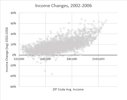
And, in fact, during this period, incomes were quite top-loaded, rising in general more where they were already high. Figures 4 shows changing incomes from 2002 to 2006 and Figure 5, shows the change in price/income ratios.
Remember back to Figure 6 from Part 2, just looking at changing prices, home price appreciation in the Closed Access cities (cities like LA whose high prices are largely due to supply constraints) were much higher in neighborhoods with low incomes while other cities - including “bubble” cities like Phoenix - had relatively similar price appreciation across the metro area. But, here, in Figure 5, you can see that since incomes were rising more slowly at the low end, price/income ratios did rise more where incomes were low in most cities, and I think it is likely that this does reflect a lending boom that happened at the time.
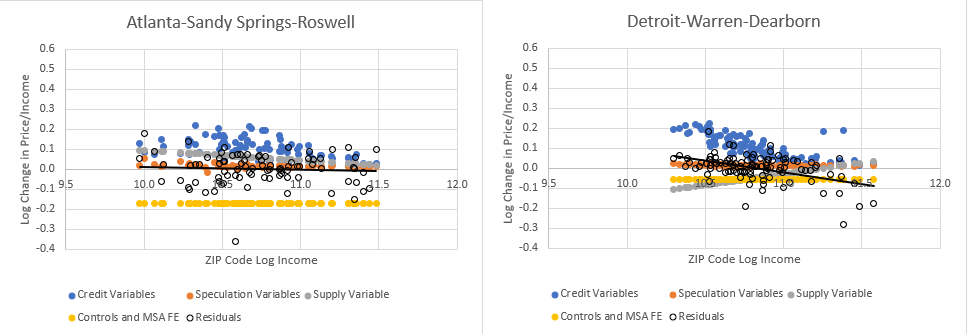
Note, though, that by analyzing it this way - by measuring the exponential increase - you could say that Figure 5 understates the difference between high cost cities like Los Angeles and the other cities. Looking back to Figure 1, price/income ratios at the low end of Phoenix went from around 4 to 6 while in Los Angeles they went from 8 to 15. A proportional increase in Los Angeles equates to a much more extreme change than it does in Phoenix. In any case, this is the measure that I use in my analysis. And Figures 6 & 7 show the estimates of the effect of each factor on price/income changes in each ZIP code.
Here, instead of an “income” control variable, there is a “Supply” variable that reflects the patterns that I attribute to supply constraints in my previous paper. And, this isn’t just curve-fitting. This isn’t a fixed effects variable. Just like the credit variables and speculation variables reflect pre-existing conditions in each ZIP code as of 2002, this variable also reflects the pre-existing supply conditions in each ZIP code as of 2002. The slope of the price/income line in each metro area in 2002 reflected pre-existing supply conditions, and so the estimates shown in Figure 7 of the effects of supply conditions on price/income changes from 2002 to 2006 are not just a measure of how prices changed in LA. They are a measure of how price/income ratios changed, in every metropolitan area, in proportion to the pre-existing 2002 condition in every metropolitan area.
There are many scenarios where this variable simply wouldn’t explain much. It specifically reflects the effects of a broad-based increase in housing demand as that demand is manifest in contexts of different supply elasticities.
You could argue that the supply variable is evidence in favor of the “passive credit” school that argues speculation drove prices and credit usage higher. I think various aspects of the evidence here (some of which I will discuss in future posts) argue for a third point of view - that supply constraints themselves were the primary motivator, so that moderate increases in housing demand drove prices, credit usage, and speculative activity.
I have described the price/income slope as the result of price pressures that come from outside a neighborhood as inadequate housing supply induces intra-metro area consumption compromises and cross-neighborhood migration. So, you could think of it that way. The credit variables estimate the idiosyncratic effects of credit access on the demand within a ZIP code. The supply variable estimates the systematic demand from an entire metropolitan area acting upon each ZIP code. Inside demand (possibly driven by credit access) vs. outside demand (which is triggered by a lack of adequate supply in other ZIP codes).
Also, as you can see, the residuals aren’t biased in Figures 6 & 7 with respect to incomes. There is a bit of a trend in Detroit, which goes away if I add a control for the effect of property tax rates on the price/income slope, which I have not discussed here for the sake of simplicity. (Controlling for property taxes mostly has modest effects on the output, but Detroit is one city where there is a noticeable difference. With the control, both the residuals and the supply variable in Detroit become more flat.)
And, finally, you might have noticed that adding my supply variable appears to have increased the ability to isolate the effects of credit access on home prices. Price/income ratios in parts of Detroit, Phoenix, and Atlanta where FHA market share was high and denial rates on mortgage applications in 2002 were high, saw price/income inflation of as much as 20% associated with those variables. I have posted the regression output below. The estimates in Figures 6 & 7 are from the far right column. The interactions shown in the table are included in the “Credit” and “Speculation” variables in Figures 6 & 7. There is more to say about that, which I will leave for the next post.
In summary, I have found apparently important effects on home price appreciation from 2002 to 2006 from credit access. However, in order of importance, prices were correlated with (1) metro area differences, (2) supply constraints, (3) factors outside the model, (4) credit access, and (5) speculation and trend continuation. And each of those factors affected distinctly different parts of the market in interesting and perplexing ways, which I will discuss soon.


Thanks Kevin. I wanted to bring up some recent news from Boston that has correlation to your research with respect to inclusionary zoning. Mayor Michelle We has announced plans to compel developers of multi-family projects to increase the percentage of income restricted units from 13% to 20%. I doubt this will have any meaningful impact on housing affordability, particularly since I wasn't able to find any mention of significant upzoning proposed in the plan. So it goes.