
Mortgages Outstanding by Credit Score

I’m going to play with numbers a bit here. I think all my proxies are reasonable enough.
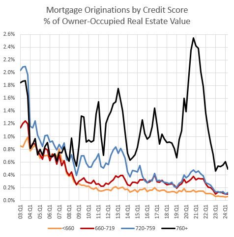
The New York Fed publishes data on mortgage originations by credit score. But, a lot of homeowners were grandfathered into ownership in 2008. They owned homes based on previous standards, and as long as they don’t sell or default, they can keep being owners. So, the quantity of mortgages being originated to borrowers with lower credit scores serves as a an asymptote that the quantity of mortgages outstanding moves toward, but doesn’t move to immediately.
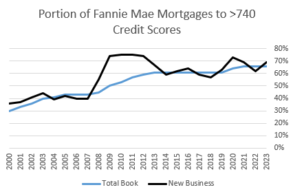
At Fannie Mae, before 2008, roughly 2/3 of mortgage lending went to sub-740 credit scores. Then, it suddenly switched, and since 2008, roughly 1/3 of mortgage lending went to sub-740 credit scores. The proportion of lending going to lower credit scores had been pretty stable as far back as I can track the data. The sub-prime/Alt-A lending boom wasn’t associated with a significant change in lending by credit score.
You can see that in Figure 1, from the New York Fed’s Household Debt and Credit report. There was a refi boom in 2003, which tends to increase mortgage activity among the highest credit scores. Then, from 2004 to 2007, during the subprime/Alt A boom, proportions returned back to the long-term norm. The New York Fed tracks 5 bins of credit scores. I have combined the bottom 2. Total activity before 2008 tended to be roughly the same in the 4 bins, and other data finds those proportions at least into the 1990s. Compare that to today, where all mortgage originations to scores under 740 don’t even add up to the quantity of originations to scores over 760.
Fannie Mae tracks mortgages outstanding by credit score. Figure 2 shows that credit scores on new originations changed quickly in 2008, and the book of existing mortgages changed slowly. Now, they are both tracking at a level where >740 scores are settling in at about 2/3 of mortgages originated and mortgages outstanding.
Fannie Mae credit trends roughly match the national trends published by the New York Fed.1 So, in the charts below, I have applied the proportions of mortgages outstanding in Fannie Mae’s book of business to the total estimate of mortgages outstanding tracked by the Federal Reserve to estimate how many mortgages are still being held by borrowers with various credit scores.
Figure 3 shows mortgages outstanding as a percentage of GDP (M/GDP) and as a percentage of real estate value (M/RE). And it shows real estate value as a percentage of GDP (RE/GDP).
A lot of the problem that has led the academy astray is that many economists got into the habit of vastly overestimating the effect of credit conditions from things like mortgage rates on home prices. So, when RE/GDP shot up after the turn of the century, and mortgages outstanding scaled with it, it seemed plausible that a lending boom was responsible for it. Of course, it is just as plausible that rising real estate values would cause mortgages to rise proportionately.
Until 2006, when the market started to cool, mortgages were just rising in proportion to real estate value (M/RE was stable). The rise in M/RE after 2005 was due to collapsing home values. You can see in Figure 3 that when M/RE starts to rise, M/GDP was actually flattening out.
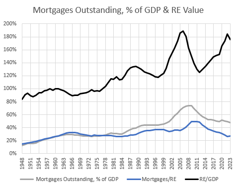
Actually, this is a bit tricky. Under normal circumstances, when supply conditions haven’t doubled real estate values, marginal changes in credit conditions might be an important factor in the relatively small variations of real estate values that used to be considered highly cyclical. Many of the little squiggles in the 20th century on the black line in Figure 3 might be related to credit conditions. But, we don’t live in the age of squiggles any more. And that’s because supply constraints and hard-line mortgage suppression became more important at a much larger scale than the small shifts related to things like changing mortgage rates.
This is similar to the problem with claims about urban value (agglomeration). There used to be small differences in home prices and incomes because of the special value of certain cities, and then when the supply crisis caused differences in home prices and incomes to shoot up, it seemed like agglomeration value must have exploded. Similarly, when the supply crisis caused differences in home prices to shoot up, it seemed like the effect of marginal credit access must have suddenly exploded.
In both cases, those issues had actually become less important. Or, I should say, they were just as important as they always had been, but supply had now overshadowed them. It is key to resist inflating those factors. (Actually, ironically, the sharp removal of credit access has become very important in housing costs, but those who overestimate the effect of credit access to the upside end up completely missing the far more important changes to the downside because they assume that credit conditions are still loose as long as real estate values remain elevated.)
There are several broad clues that the causality goes from real estate values to mortgage levels more than the other way.
First, from World War II to the mid-1960s, New Deal mortgage programs pushed homeownership rates up 20 percentage points. You can see that mortgages outstanding increased significantly during that time. Yet, home prices were low. Keep in mind that the RE/GDP measure is an estimate of the total value of owned homes compared to GDP. The portion of homes owned went from near 40% to near 60%. That was associated with a building boom which moderated rents, so the total value of those homes, even with the huge increase in the quantity of homes counted in the measure, didn’t increase relative to GDP.
That will happen again if we loosen urban land use rules and make mortgages accessible again. A lot more homes will be associated with total value of real estate that is lower than it is now.
Also, mortgages outstanding was forced lower after 2008, and after a temporary price shock, prices moved up higher than ever. Choosing the wrong policy response created the natural experiment that proves the premises of that policy response wrong. That isn’t widely appreciated. It’s really counterintuitive to blame the lack of mortgage access for higher home prices. There was a temporary decline in prices from the mortgage crackdown, and then an even more ferocious return to higher housing costs. It’s all just mortgage suppression. A reversal of the 1940s to 1960s funding and building boom. Now fewer homes mean higher rents and prices.
Prices moved up the most in neighborhoods where mortgage access is most binding.
Among metropolitan areas, the most expensive cities tend to have the lowest leverage.
These are among the patterns that suggest a small role for mortgage access in driving real estate values, or even suggest a role where mortgage access has the opposite effect as the usual claims.
In Figure 4, using Fannie Mae data, I estimate total mortgages outstanding as a percentage of GDP, by credit score. (Figure 4 and Figure 5 show the two measures independently in the left panel and stacked in the right panel.) Here, I have assumed that the proportions were stable from 1965 to 2000, after which I can reference Fannie Mae data. By 1965 homeownership had reached near its peak level, and on an age adjusted basis, homeownership was relatively stable between 1965 and 2007, so I think this is a reasonable assumption.
Also, the characteristics reported by Fannie Mae of its new mortgages in 2000 are similar to the characteristics it reported of its existing book of business. So the proportions of loans going to high and low scores was similar in 2000 to what it had been for some time.
But, keep in mind, in these charts, the proportions of these measures are fixed, by construction, from 1965 to 1999. I included all of those years to be able to compare current levels to estimated levels from those previous decades.
Borrowing from both cohorts increased along with rising real estate values in the 2000s. As I have reported in all of my work, going back to my earliest findings, if anything, the rise in borrowing before 2008 was weighted more to high credit scores, high incomes, professional careers, borrowers with college degrees, etc.
Then, in Figure 4, you can see clearly where the mortgage crackdown occurred. Mortgages outstanding went from 3/4 of GDP to half of GDP, and it was systematically imposed according to borrower quality. Scores below 740 went from 41% to 16% of GDP! From 1992 to 1998, it had been about 28%. In the 1990s, mortgages held by borrowers with credit scores above 740 had been about 16% of GDP. Today it’s 32%!

You can see that the mortgages outstanding held by low credit score borrowers started to decline earlier than high credit score holders. You might infer that the decline was from defaults and foreclosures.
I can take a decent stab at that question. If we compare mortgage originations to mortgages outstanding, we can also determine how much attrition there was from defaults, sales, paydowns, and refinancing. I can’t tell which of those were the reason for the attrition, but we can at least see how important attrition was.
In Figure 5, the dotted lines are new originated mortgages. The solid lines are attrition - the decline in existing mortgages outstanding from paydowns, refinancing, foreclosures, etc.
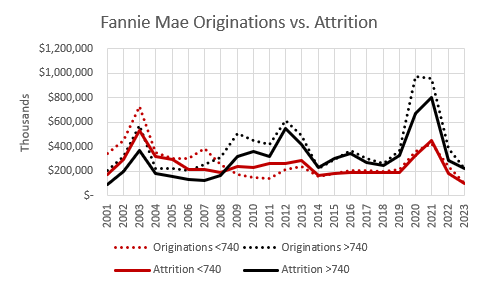
From 2007 to 2013, attrition is pretty stable for credit scores below 740. It actually rises a bit for scores above 740.
Now, there is a lot going on here. I think much of the rise for >740 is from more refinancing after interest rates declined. For <740 borrowers, we know there was an increase in defaults and foreclosures - more so than among >740 scores. But, there was also a decline in sales and refinancing. Some homeowners were trying to hold on to what they had while others lost theirs involuntarily.
But, the broader point remains. The initial decline in mortgages outstanding to borrowers with credit scores below 740 at Fannie Mae was not due to more attrition. It was due to the decline in originations of mortgages to low credit scores.
I hadn’t appreciated the earliness of these changes, even as late as when my 2 books on the subject were published. More recently, I have moved toward putting more weight on tight lending as a cause of the Great Recession and of the housing bust.
The liquidity effect of removing billions of dollars of credit and potential credit predated the loss of housing wealth. It caused the loss of real estate wealth, a decline in spending and production, and the recession. Defaults didn’t cause a recession. Potential borrowers at the banks getting declined caused the recession and most of the rise in defaults.
As I have pointed out in many posts, high tier homes generally didn’t lose value. And, as Figures 4 & 5 show, lending and mortgages held by borrowers with high scores continued relatively unabated. Their troubles were caused by the recession, which had been caused by the troubles that we collectively laid on low score borrowers.
In short, in these charts, the declining red lines caused the recession and the recession caused the declining black lines.
In 1999, mortgages held by owners with credit scores below 740 amounted to 23% of the total value of owned homes. Today it’s 9% - well below the post-WW II norm.

For owners with scores above 740, since 1999, mortgages outstanding have increased, from 14% to 18% of owner-occupied real estate value.
Figure 6 compares borrowing outstanding as a percentage of total real estate value by credit score. The rise in leverage in both cohorts was mostly associated with declining real estate values from 2006 to 2009. But, by 2008, lending to low scores had been shut down so sharply, by 2009 their total outstanding mortgages were declining even faster than prices were. Then, leverage of both cohorts declined as real estate values recovered.
In 1999, mortgages held by owners with credit scores below 740 amounted to 23% of the total value of owned homes. Today it’s 9%.
We have completely erased the progress of post-New Deal mortgage programs. By this estimate, from 1965 to 2000, borrowers with credit scores below 740 never held mortgages worth less than 16% of total owner-occupied real estate value before 2014.
For owners with scores above 740, mortgages outstanding have increased, from 14% to 18% of owner-occupied real estate value.
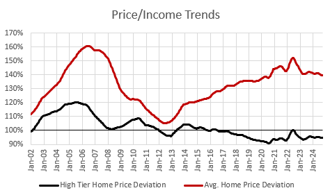
Actually, I think this has a bias. Remember, the prices of low-tier homes have been much more volatile than high tier homes, because of the mortgage crackdown. Figure 7, using Erdmann Housing Tracker data, compares the relative price trends of the average metropolitan home since 2002 and the relative price trends of the average high-tier home in a ZIP code with no credit constraints.
This divergence in price trends is new. It’s related to the shortage of housing. In the 20th century home prices were universally moderate. Price trends didn’t vary much, cross-sectionally, like this.
I don’t have a good way to estimate the effects of this quantitatively. But, I think we can safely assume that the true leverage of low-score borrowers is lower and of the high-score borrowers is higher, than Figure 6 would suggest, because the prices have appreciated much more on homes that are more likely to be owned by low-tier borrowers, even as their mortgage liabilities decline.
Since 2008, we’ve had a haves and have-nots market. A third of borrowers are locked out of the market. And borrowers who can still get mortgages had a buyer’s market with, until recently, both moderate prices and low interest rates. It was, by far, the best time in recent history to be a mortgaged buyer, for those who were allowed to be.
The have-nots who lost their homes or are unable to buy homes have gotten the worst of the crackdown, because their rents have generally increased massively. The have-nots who were grandfathered in and managed to hold on to their homes ended up with a bit of a windfall because their homes, especially, have elevated prices because of the effect the mortgage crackdown has had on rents.
This also should play into your reading of homeownership rates. I have shown how homeownership rates are actually much lower than the published rates because housing supply has become so constrained that it is affecting household formation.
Above, I noted that when lending standards were tightened, it created an immediate shift in the trends of originations. But, it took a while for the change to show up fully in mortgages outstanding.
That is even more true for homeownership. Tight lending standards are lowering homeownership, but many grandfathered homeowners now own homes with some small fraction of their mortgages remaining. Or they now own them outright. Many of them might be able to use their home equity to buy new homes with cash.
Homeowners per capita peaked at 38% in 2004 (if 2024 age demographics had applied then). That has settled around 34% in recent years. That is probably still a bit above the sustainable run rate (before accounting for demographic trends) because there are certainly many homeowners who remain owners even though they would not qualify for mortgages if they were to relive their lives under current regulatory conditions.
One final thought: You may have noticed a strange disconnect between different sources of data. National data shows homeowner leverage at the lowest level in decades. Yet, mortgage hawks will point out that new mortgages have tended to have high debt-to-income ratios. How could both of those trends be happening at the same time?
One reason is that in the national data of existing homeowners, there are many grandfathered in homeowners who have no choice but to keep paying down their existing mortgages on schedule, and they have steadily decreasing mortgage principal outstanding on homes whose market values keep rising at an excessive pace. They can’t easily do cash-out refinancing. They can’t sell and buy into a new home, unless they can do it with cash.
Meanwhile, some high credit-score buyers are purchasing homes with high leverage and high DTI’s.
So, new homes report some use of high leverage, or at least high payments relative to incomes, but existing homes across the entire market have low average leverage. High DTI’s are more a product of expensive housing than they are of loose lending conditions. I am quite certain that if lending standards were loosened up, average DTI’s would fall because a lot of lightly leveraged existing homeowners would purchase new homes and a lot of entry-level buyers in affordable markets would trade in the rent payment that is taking 40% of their income for a mortgage payment that only takes 30%. And DTIs would decline over time as mortgage access helps improve supply conditions.
Other factors are blocking families from mortgage access. So we should expect high DTIs after a decades long construction depression has pushed up rent/income levels significantly. The way to lower DTIs is to lower rents, and the way to lower rents is to make mortgages more accessible on all the other margins.
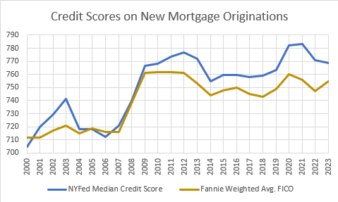
One way to compare mortgages between Fannie Mae and the broader market is to compare Fannie Mae’s weighted average FICO score on new business with the New York Fed’s median credit score on originated mortgages. These are slightly different measures, but for my purposes here, it shows enough similarity. If anything, it suggests that the shift to tighter lending standards at Fannie Mae has been somewhat less than the broader market. But I suspect most of the recent difference comes from the fact that the average score on new mortgages is near to the maximum score. This might create a negative skew in the distribution that mechanically pulls the median higher than the average.
There are 2 bins of credit scores that are reported with the same range by the New York Fed and Fannie Mae. Scores under 620 and scores between 620 and 660. Here is the proportion of all mortgages originated to each group, as reported by both.
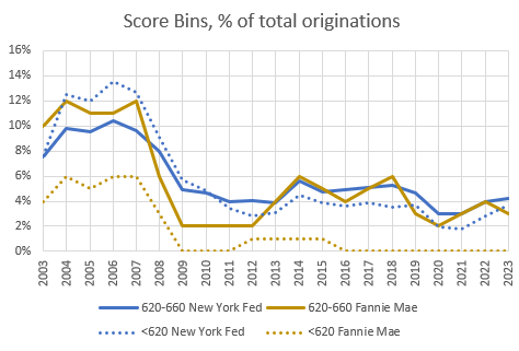
Fannie Mae doesn’t tend to serve as much of the very low end of the market, so they have always originated fewer of the <620 mortgages than the broader market, but even there, the scale of the decline is similar.
Using various ways to estimate the portion of lending going to the bins of scores reported by each, the trends are surprisingly parallel. Fannie Mae’s market position relative to the broader market over time has been surprisingly stable given the various changes that have happened in the lending marketplace over this time. Using Fannie Mae mortgages as a sample reflective of the broader market seems reliable.
It's a shame your system isn't geared towards LTIs like here in the UK. This far simpler metric makes discussions of the topic far more accessible to the general public, and thus more prone to being covered by the legacy media.
The problem here is more regulatory in nature, especially when it comes to nature. Planning reports for medium to large scale projects can run to 12,000 pages, with 400 pages devoted to bat populations alone.
I asked Grok to estimate the impact on supply using your work. As expected, our archaic and unfit for purpose planning system is the main culprit, but stricter LTI restrictions since 2008 have constrained the supply side. Grok estimated that lending restrictions accounted for 10-20% of the problem, equating to 120,000 to 360,000 homes never built.
I asked Grok to look at the Europeans. Both Germany and Ireland maintained elastic supply despite tightening of lending criteria, but both appear costly at face value.
It feels kind of like counter to Kling's Dictum (Governments "solve" problems by restricting supply and subsidizing demand), this is a rare instance where we have restricted <i>both</i> supply <i>and</i> demand.