
Another cool paper and more notes on a bad paper on housing supply

Evan Soltas and Jonathan Gruber have published a paper titled, “How Costly Is Permitting in Housing Development?”. They noticed that in Los Angeles, they could estimate the cost of municipal permitting hassles by comparing the value of properties and land that had been guided through the permitting process and then put up for sale to properties that sold while still requiring municipal permitting.
The abstract:
Permitting costs are widely cited, but little analyzed, as a key burden on housing development in leading U.S. cities. We measure them using an implicit market for “ready-to-issue” permits in Los Angeles, where landowners can prepay permitting costs and sell preapproved land to developers at a premium. Using a repeat-listing difference-in-differences estimator, we find developers pay 50 percent more ($48 per square foot) for preapproved land. Comparing similar proposed developments, preapproval raises the probability of completing construction within four years of site acquisition by 10 percentage points (30 percent). Permitting can explain one third of the gap in Los Angeles between home prices and construction costs.
This is an interesting way to look at it because causation goes both ways on costs vs. other local obstructions to new housing. One way to think about it is that if there are complex mechanisms in place to limit local building, it may be hard to quantify them from the bottom up. In a market like the Los Angeles area, clearly those mechanisms interact to put an annual cap on new construction of about 30,000 units. Some of those mechanisms operate through the price of raw land, fees, and other higher costs. Where fees and costs don’t bridge the distance between the de facto production cap and market values, developers will start to queue up. Queuing up so that it takes, say 10 years to fully permit and complete a project that should take 3 years, is costly. Developers see it as a cost. But, really, it’s a side effect of some web of capacity constraints in the local municipal approval process.
If I’m reading Table A10 from the paper correctly, they estimate the value added to the median property of completing the permitting process before selling the property to a builder to be $347,000 by one estimate and $480,000 by another estimate. I assume the median property is a single-family project. In my reduced form estimate of metro area scarcity premiums, in my Metro Area Analysis packages, the Los Angeles premium is something like $330,000.
Their estimate of the mean average value of permitting is $700,000-$900,000. I would expect that it is substantially higher than the median because some of the pre-sale permitting involves upzoning. My scarcity premium says that for each unit you can get upzoned to in Los Angeles, your property will be worth an extra $330,000.
But, they note:
Preapproval can essentially commit the municipality to allow a property to have a more-valuable, more-intensive land use than is typical. Consistent with this hypothesis, we find that on average, preapproved properties submit permits with greater floor space, unit count, construction cost, and building height than similarly-sized properties without preapproval in the same neighborhood and year. Might these differences drive the approval premium? We address this concern by augmenting the repeat-listing specification with permit controls—floorspace, unit count, valuation, building height—imputing each when it is not observed. Our estimates suggest the approval premium is not readily explained by more-intensive use.”
That seems surprising.
I’m trying to wrap my head around the math and the implications. I’m not sure how their findings relate to my approach, where scarcity appears to create a uniform valuation premium across a market.
They find that the permitting premium is higher in high-tier neighborhoods. That makes sense, and comports with other work like the recent paper from Vincent Rollet at MIT. Infill development can add the most value in neighborhoods that are currently at low density and high value. But, their note that adding unit count doesn’t seem to affect the premium would seem to be counter to Rollet’s findings. And, the trends that I track in urban housing markets have much more to do with how new construction affects the prices of homes across the rest of the market than they have to do with the cost and location of the specific new projects.
I’m still trying to wrap my head around how all these pieces fit together. There is a lot to consider here. Unfortunately, many economics papers are written in a way that is incomprehensible to a colloquial English speaker. I have a hard time understanding precisely what they are claiming in many parts of the paper. One could argue that that is excusable (or that it is my problem, not the authors’). Brain surgeons and rocket scientists shouldn’t worry about writing in a way that I can understand. But, the problem with economics is that our knowledge is still hit and miss and there are many issues where all the econo-speakers have faulty assumptions or empirical blind-spots that foreign speakers can’t account for. When it is at its worst, it leads to discourse on Swiftian floating islands.
All that said, this paper appears to be a useful empirical addition to the study of the ways in which cities block city building.
While I’m on this topic, I thought I’d address another econo-speak paper that I have written about a few times. This is the “Supply Constraints do not Explain House Price and Quantity Growth Across U.S. Cities” paper out of the San Francisco Fed. In my previous post on the paper, I noted that the authors had responded to some of the criticisms of the paper.
I think it might be worthwhile to review some of their responses, not to further criticize the piece, but to note how the blind-spots among econo-speak handicap the ability of academic economists to address the paper’s problems.
Also, by the way, one of the authors, John Mondragon, mentioned that Bryan Caplan had written a critique of the paper, but he didn’t link to it, and nobody has offered a link to it when I asked. If anyone has seen it and knows where to find it, please let me know in the comments.
Maybe I don’t write well in colloquial English, because Mondragon also mentioned my critique (and also didn’t provide a link) and said that he hadn’t “seen anything that merits a response.” Then, in reply to comments from Matthew Yglesias, laid out, in very concise language, exactly the framework that my posts were criticizing. So, maybe I’ll give it one more shot. His comments are indented below. I will rudely interrupt his comments with my reflections:
Let’s be clear about the model in mind (which is just Rosen-Roback, of course).
This is a common comment I get from educated economists on this topic, including the “of course”. Don’t you know your Rosen-Roback? As with any model, the Rosen-Roback model makes some assumptions. Probably the key assumptions that makes Rosen-Roback a poor tool for understanding American housing today are,
Homogeneous Labor: Workers are identical, meaning they have the same preferences and skills.
Perfect Mobility/No Moving Costs: Workers can immediately and costlessly relocate to any city.”
This pushes the train right off the rails. I have come around to thinking that the entire “affordability” problem is the result of ridiculously poor housing supply. Not just supply so poor that homes aren’t getting larger or better in line with real incomes or that families aren’t moving to expensive cities. Supply conditions so poor that a significant portion of families systematically will become poorer as a result of trying to remain in their homes and home cities. Rent inflation outpacing nominal income growth. And, families really hate displacement. Some of them will pay ransom rents or accept homelessness to avoid it.
The families moving in to Los Angeles or New York City are trading off space and commuting time in order to lower their housing demand for moving in. The families moving out of Los Angeles or New York City finally have hit some tipping point where the next step up in housing expenses will make life unbearable.
These families clearly do not have the same preferences and skills. They aren’t remotely trading the same markets. Living near grandma and in the area where you have 20 years of personal and professional contacts is not a tradeable service.
This isn’t a matter of nitpicking some reasonable assumptions that are good enough to give us a map of the world. In cities where some homes trade at price/income ratios of 15x, this is the overwhelming issue. A systematic failure of those assumptions is the reason home values can get that high.
Here’s the thing. I am confident in that assessment. In a number of ways, I think we can infer that this is an important issue, and probably the primary cause of the housing cost crisis. Maybe I am convinced, but others are not. Maybe I am over-stating the case. But, it is the case. Litigating the importance of those differences in household behavior, and the asymmetrical demand patterns that come from aspirational moves versus displacement, is a key question that needs to be tackled to know how to analyze American housing markets.
“We haven’t seen anything that merits a response… The model…is just Rosen-Roback, of course.” reflects a inability to engage with the criticism. They don’t know what they don’t know.
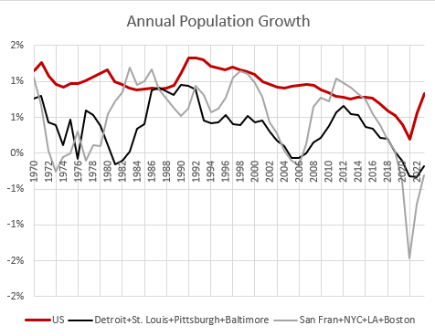
In every case, from Detroit to Los Angeles, when new home construction has declined, rents in the poorest neighborhoods with the fewest amenities have inflated. Before 2008, one could pretend that Los Angeles really did suddenly become more popular and productive, and just coincidentally stopped growing at the same time. We ran a national experiment and caused the same effect in every market in the country.
Any research that doesn’t engage with this is floating islands stuff. But, I don’t think they can understand it. And, since they can’t understand it, even the facts in question are seen through fun house mirrors:
Something happens to increase demand for living in a metro: productivity drives up wages, amenities improve, tastes change, whatever. As people start to move to a supply constrained metro, prices will rise faster compared to a less constrained metro exposed to the same increase in demand. The rapid price growth reduces real incomes, so fewer people will want to move there. On net, you will have higher price growth and less growth in population and housing in the constrained metro relative to the unconstrained metro.
This framework makes sense. And we do see places where prices have grown a lot but population growth has been low and vice versa. We can all agree on these things.
Economists with Rosen-Roback-colored glasses on can agree on those things, and that’s why the academy will have a hard time understanding what is wrong with this. The Closed Access cities (New York, Los Angeles, San Francisco, Boston, and San Diego) that have become peculiarly expensive are shrinking. They do not have unusually high in-migration. They have net domestic outmigration. If not a single person moves into those cities this year, hundreds of thousands will still need to move away. Because people have babies and babies grow up. And some grown ups really don’t like to be displaced from their homes. Increased demand from newcomers is not necessary for these cities to have a housing crisis.
Since they have Rosen-Roback-colored glasses on, they don’t think this is a problem. There is a migration variable in their equations. When 100,000 former babies decide to form new households in the Closed Access cities, the migration variable says that the cost of amenities in those cities will rise enough that 100,000 residents choose to increase their utility by moving to cities with different costs and amenities.
Each year that hundreds of thousands of families are faced with that dilemma, the families that remain are self-selected as families who considered displacement to be too personally expensive. No newcomer is paying $3,000 rents in Los Angeles to live near the next displaced family’s grandma. But the families left who are much poorer for it, are paying for grandma access. The Manhattan project test explosion is happening on the north end of the Los Alamos compound and the Rosen-Roback window economists want to view it through is on the south side of the building, and they conclude that the nuclear test was a failure.
Their paragraph above describes a reasonable, plausible world that isn’t relevant to the question they are asking. It is a piece of the puzzle, but it isn’t driving the narrative. The expensive cities with rising incomes are shrinking or growing very slowly and countercyclically. Their growth rate is much nearer to cities where demand growth has been lower than they are to the national average.
I described this issue in my Mercatus paper “Home Price Trends Point to a Worsening Lack of Supply”. Each dot in Figure 4 is a metro area. Housing permits move it to the right and population growth moves it up. The Rosen-Roback model says that productive, successful cities move up that regression line. People want to move there, and the city grows. But, if local supply conditions make building new housing difficult, prices rise as it rises up that trendline, and that changes the margins on which families choose to move into or out of the city. But, the most expensive cities are anchored at the bottom of that trendline - low or negative growth.
There is also another margin on which housing demand turns, and that is just our general, national level of income and productivity. As we get richer, we all want better homes. We want better homes in Omaha and Cleveland just as much as in New York and Los Angeles.
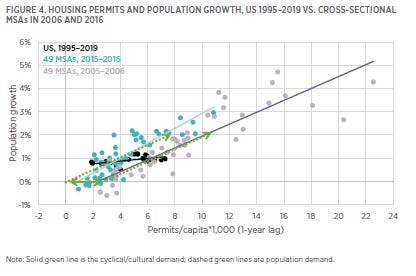
So, in Figure 4, more successful cities move up the trendline relative to other cities and also, over the course of a business cycle, the entire trendline moves horizontally, right and left. In 2016, a city with no population growth didn’t need any new homes. In 2006, a city with no population growth needed about 2 new homes per 1,000 residents. A city with 2% population growth needed about 8 or 10 new homes in each of those years. In other words, every year, the 2% growth city needs 8 more homes per 1,000 residents than the no-growth city does. But, between the bottom of the business cycle and the top, every city sees similar growth in demand of about 2 new homes per 1,000 residents.
The reason population growth in the expensive cities with high out-migration and rising incomes is countercyclical is because they don’t permit enough homes for even minimal growth. They are countercyclical because there is nothing special about them. Those cities become expensive and shrink when demand for housing per capita increased by 2 homes per 1,000 residents in every city across the country, simultaneously.
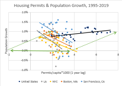
The black dots in Figure 4 and the black trendline show US permits and population growth over time. Those dots and that trendline are also in Figure 5. Nationally, population growth tends to be stable over time, so practically all the changes in housing production are cyclical, so the trendline is flat. The plots over time for the Closed Access cities are shown in Figure 5. The more homes they build, the faster they shrink.
Their population growth after 2008 was above the US average because when the average American was getting poorer and demanding less housing, those cities could just barely get up to average population growth. They grew because they were getting poorer, along with the rest of the country.
But, generally, when the rest of the country is getting richer, and cyclically demanding more homes per resident, Closed Access city growth goes to zero.
They didn’t get more expensive because they were especially successful. They got more expensive because the whole country was getting a bit richer. It wasn’t getting unusually richer. The country was getting richer at a moderate pace in line with historical norms. And, that was more than the Closed Access cities could handle. So, housing costs in the neighborhoods in the poorest neighborhoods with the least valuable amenities inflate until enough families move away to bring the total real economic growth of those cities down to the Malthusian limit they have created for themselves.
When the rest of the country is doing well, the most vulnerable residents of these cities have to get poor enough to move away. It’s how our economy currently equilibrates.
Rosen-Roback is a true and useful model, but not applicable.
Mondragon continues:
But these don't answer the relevant question! The relevant question is this: are differences in price and quantity growth explained by our best measures of which metros are more or less constrained. When we scientifically relate measures of supply constraints to the data, do we see the standard supply story?
Fortunately, it’s easy to answer this question and check if this story explains the data. And it does not. Not even a little bit. If any of the measures we looked at had shown the slightest shadow of an ability to explain the data our paper would never have existed. (And we looked at more than what we included in the paper!)
In fact, measured supply constraints are utterly –glaringly– uncorrelated with population and housing growth.
Our best measures of housing supply constraints across metro areas can’t show the “slightest shadow of an ability” to explain housing trends after 2008. I completely agree!
What the authors have discovered, but don’t understand is that our best measures of housing supply constraints across metro areas are true and useful models that aren’t applicable to the post-2008 American housing market.
They aren’t applicable because almost every city obstructs multi-family housing similarly, and metro area differences in the ability to build single-family suburbs into the greenfield were the reason cities had different supply conditions before 2008. The 2008 mortgage crackdown collapsed the single-family housing market, and so since 2008 the pre-existing estimates of their supply conditions don’t apply.
Since they don’t account for the effect of the mortgage crackdown and they apply inapplicable models to the causes of housing inflation, they discover true patterns and they don’t know what they mean. Here, I’ll highlight some of their responses to questions about their paper that were issued in an addendum.
1. Are you saying that housing supply does not matter? A: No...What our results suggest is that empirical measures of variation in housing supply across MSAs do not matter. Equivalently, housing supply functions across MSAs look pretty similar.
It would be easy to think that a paper titled “Supply Constraints do not Explain House Price and Quantity Growth Across U.S. Cities” was asserting that supply doesn’t matter. Here, they clarify, that isn’t what they find. They just find that certain data sets that were empirically estimated when the American housing market was characterized by entirely different constraints don’t apply anymore.
That’s right! They don’t apply. But the authors are also trying to figure out why they don’t apply by using other models which also don’t apply, which just leads to confusion.
5. How can this be consistent with evidence that there is a large housing shortage? A: The evidence on the housing shortage is not without controversy. For example, McClure and Schwartz (2025) find no evidence of a housing shortage in aggregate and only limited evidence in a few localities and even those are not the usual suspects. In our own data, we also find that the growth of housing units outpaced population growth from 2000 to 2020, consistent with their conclusion.
I have discussed elsewhere that new homes per capita is a bit misleading since 2008. The economic collapse after 2008 was associated with a sharp drop in fertility. But, population growth had been stable for decades before that.
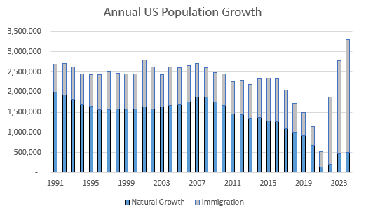
So, population growth declined after 2008, but the neutral rate of new household formation that would result from that is just now arriving. Young adults were still reaching normal ages of household formation at normal rates after 2008. So, residents per home was stable after 2008, but household formation has been well behind neutral. Adults per household has been rising. There are millions fewer homes per adult than there were in 2008.
McClure and Schwartz appear to be even more off the scent. I didn’t find an ungated copy of the paper, but the abstract says:
This article examines the extent to which the US as a whole and its metropolitan areas face a housing shortage by comparing change in total housing units and total households from 2000 to 2020. Although various studies indicate that the nation has a shortage of anywhere from 2 million to 4 million units, Census data show little evidence of a shortage. Household formation did exceed the growth of households from 2010 to 2020, but that does not take into account the large surplus of housing produced during the previous decade. From 2000 to 2020, housing production exceeded the growth of households by 3.3 million units. Of the nation’s 381 metropolitan areas, only four experienced a housing shortage during this time, as did only 19 of the nation’s 526 micropolitan areas. Even though the stock of housing is adequate in most markets, the mismatch between the distribution of incomes and the distribution of housing prices results in housing affordability problems, especially for extremely low-income renters.
They did the thing. The definition of a household:“the people of a house collectively.” If there was a shortage of homes, I wonder how McClure and Schwartz would find out.
I found an article about their paper. It confirmed that this was their way of thinking, and it also went into vacancies. From the article:
National total vacancy rates were 9% in 2000 and 11.4% by 2010, which marked the end of the housing bubble and the Great Recession. By the end of 2020, the rate was 9.7%, with nearly 14 million vacant units….Metropolitan areas saw a nationwide surplus of 2.7 million more units than households in the 20-year study period, while micropolitan areas had a more modest surplus of about 300,000 units.
So, the 3 million unit surplus is basically the number of new homes minus the number of new households. So, their definition of a shortage not only requires that households somehow form without houses, but also that the number of vacant homes remains at a fixed quantity and doesn’t scale with the size of the country.
The comments on vacancy rates are a bit more subtle. They blame the 11.4% vacancy rate in 2010 on the 2000s building boom. This is common. Ben Bernanke used similar thinking to excuse lethargic economic growth after 2008. As I wrote in “Build More Houses”, “The years 2009 and 2010 saw fewer new houses as a percentage of the existing stock of housing than any other 2-year period since at least 1965. In fact, the same can be said for the 3 years leading up to 2010, the 4 years leading up to 2010, and so on. For every period of any length of time since 1965, the period ending in 2010 is the period with the lowest number of permits and shipments as a percentage of the existing stock of homes.”
Associating the high vacancy rate in 2010 with a building boom, literally, could not be more wrong. But these authors would hardly be alone on that.
Figure 7 compares new home construction and the vacancy rate since 2000. Before 2006, new home construction was running at about 1.4-1.6% of the housing stock, annually. That was pretty moderate, historically. Vacancies, of all types, were running between 12% and 13% of the housing stock. That is a bit higher than it was in previous decades, but I think it’s not a stable measure. For instance, mobile homes are counted as vacant units. The methodology for counting them changed in the 1980s and there are more of them today. I don’t think the millions of mobile homes in Texas, Florida, and Arizona that are seasonally vacant so that middle class retirees from the Midwest and Canada live there in the winter mitigate against the notion of a housing shortage. In fact, it would be illegal for families to live in most of them.
As I noted in “Build More Houses”, vacancy rates were never associated with building booms. When construction was high in 2004 and 2005, vacancy rates were low in the Closed Access cities that families were being displaced from and the Contagion cities where they were moving to. To the extent that vacancies in 2005 were moderately high, it was in some parts of the rest of the country where neither construction nor home prices were particularly high. (By the way, isn’t it silly that to have this conversation, we have to stipulate that the little bump there in 2004-2005 was some sort of generation defining building boom?)
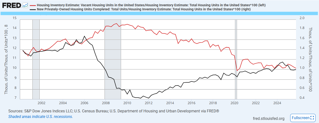
The rise of the total vacancy rate from the mid-12s to the mid-14s was entirely related to a building crash, and when vacancy rates were at their peak in 2010, they were still low in the Closed Access cities. They were about the same in the rest of the country as they had been in 2005. And they were extraordinarily high in the Contagion cities in Florida, Arizona, and Nevada, where, again, construction had been collapsing for 4 years so that cumulative housing production was well below decades’ long trends.
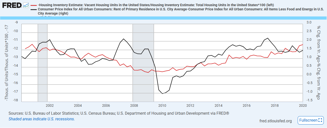
Of course, vacancy rates (shown inverted in Figure 8) are well documented to be correlated with rent inflation. Over the past 30 years or so, rent inflation has always been elevated when total vacancy rates have been below about 13%. And, cross-sectionally, vacancy rates are correlated with rent inflation and with rates of new construction across metropolitan areas. Maybe the authors would lean back on their language that supply matters, but that supply isn’t correlated with our standard measures of metro area supply conditions.
It has been nearly 40 years since the entire Northeast region allowed more than 3.3 new homes to be completed per 1,000 residents. One wonders what methods McClure and Schwartz are using to conclude that local supply conditions are unrelated to vacancy rates that never rise above 8% or to perpetually elevated costs in the Northeast, and to write, “This condition suggests that we cannot build our way to housing affordability. We need to address price levels and income levels to help low-income households afford the housing that already exists, rather than increasing the supply in the hope that prices will subside.”
I think we can assume the methods are shoddy. Please correct me if I’m wrong, and I will apologize. It seems like low quality work for Mondragon, et. al. to be citing.
Later in the reply appendix, the language seems to get stronger.
12. Are you saying that regulations are completely irrelevant? A: No. What seems clear from our paper is that regulatory differences across metro areas do not seem to matter for differences in house price or quantity growth….13. You look only at house prices, but don’t rents matter more for affordability? A: In our updated version of the paper we include a measure of rents and find the same results…But our results suggest there is no difference across these markets: housing supply constraints do not seem to matter for growth in rents or prices
Note that the language has changed from carefully suggesting that our measures of supply conditions don’t correlate well with housing costs to suggesting that supply conditions don’t correlate with housing costs.
Technically this is true. There weren’t large differences in supply conditions across metro areas after 2008. The mortgage crackdown created a vertical supply curve for entry-level single-family homes in every city that didn’t already have a vertical supply curve. Their mistake is generalizing that finding rather than attributing it to the rather enormous demand and supply shock that created the divot in construction shown in Figure 7.
Unfortunately, we still live in a time where you can write a dozen papers about the generation defining rise in construction shown in Figure 7 in 2004 and 2005 while not noticing either the cause or the effect of the change in production from 2006 to 2010, or, attributing the 2006-2010 divot to the 2004-2005 increase. It’s really funny to look at Figure 7 and realize that is the conventional approach, still today in 2026.
In question 14 of their reply appendix, I think this is basically the problem (emphasis mine).
14. There is a gap in house price growth between more- and less-constrained house prices and the constraint measures are correlated with differential house price growth, isn’t this evidence that you are wrong and housing supply constraints do explain housing market dynamics? A: No. In the paper we show that this correlation is generally quite small, but even setting this aside it is not evidence for the standard view. In an appendix of Louie et al. (2025a), we show that for the supply-centric view this correlation actually points to implausibly large, ad hoc shifts in housing supply functions. Intuitively, this is because the constraints are not correlated with differences in housing quantity growth while the supply-centric view requires any difference in prices to translate into differences in quantities proportional to the supply elasticity. Instead we think this correlation is easily explained by differences in demand for housing quality (including amenities like location) relative to demand for quantity.
I must confess, I can’t quite parse my way through all the statistics they are running in the appendices. So, I think we have a language barrier. I can’t read some of the statistical jargon that economists use, and economists can’t read Figure 7.
They consider the uniform changes in housing supply conditions that actually occurred in 2008 to be implausibly large, so they didn’t happen, and they can’t explain subsequent trends in home supply and prices. This is the state of the debate among credentialed economists.
>> Instead we think this correlation is easily explained by differences in demand for housing quality (including amenities like location) relative to demand for quantity.
It’s funny, this is basically the NIMBY view in a nutshell, just dressed up in academic jargon.
According to them, the REAL problem is that a bunch of people want to live in places they can’t afford. Nevermind anyone’s particular reason for wanting — or NEEDING — to live somewhere; if they can’t afford it, they don’t deserve it, period.
They very clearly do the household/population thing which is laughable and sad.
Is their paper even able to capture that supply constraints ban smaller homes and smaller homes are cheaper?