

I previously wrote in general about the recently posted NBER working paper titled, “Supply Constraints do not Explain House Price and Quantity Growth Across U.S. Cities”. I have poked around and looked at it a bit, and in the process, happened across a couple other papers, which I wrote about in the previous post.
In this post, I will address some of the specifics in this paper. Here’s the abstract:
The standard view of housing markets holds that the flexibility of local housing supply–shaped by factors like geography and regulation–strongly affects the response of house prices, house quantities and population to rising housing demand. However, from 2000 to 2020, we find that higher income growth predicts the same growth in house prices, housing quantity, and population regardless of a city's estimated housing supply elasticity. We find the same pattern when we expand the sample to 1980 to 2020, use different elasticity measures, and when we instrument for local housing demand. Using a general demand-and-supply framework, we show that our findings imply that constrained housing supply is relatively unimportant in explaining differences in rising house prices among U.S. cities. These results challenge the prevailing view of local housing and labor markets and suggest that easing housing supply constraints may not yield the anticipated improvements in housing affordability.
Off the bat, we can see that it has some of the same problems I discussed in the previous post. Supply elasticity after 2008 was largely driven by the mortgage crackdown, which pushed home prices below replacement value and destroyed the entry level new single-family home market across the country. So every city had similarly inelastic supply conditions, regardless of what their local supply constraints were. Elasticities estimated from earlier periods will not be helpful.
Economists still seem to approach the urban housing issue with the idea that cities draw people aspirationally. They seem to think that supply elasticity is driven by high demand. As more newcomers want to arrive, the cost of construction rises, supply becomes more inelastic, and prices increase. That’s a good general model of how cities grow. It’s just not a good model of America’s current condition. We made cities illegal. The expensive cities are the slowest growing cities. And, it isn’t just that prices have to rise further to accommodate extra growth. It isn’t even that prices rise enough that growth into those cities is slowed. It’s so bad that when generalized demand for housing across cities increases, so that demand for housing in the expensive cities is increasing for reasons that aren’t related to local attractiveness at all, their supply response is so pitiful that their carrying capacity shrinks as a result of the generalized increase in demand.
In terms of carrying capacity, you could say they have a bizarre downward sloping supply curve. As demand for housing increases, their populations decline. And they decline by displacing the poorest residents that can’t afford the rising prices. So, their average incomes increase.
This paper sort of avoids that problem, but it creates a new problem. As BenW pointed out in the comments on my earlier post, they use total income for their income variable, not per capita income.
I think this sort of relates to my point above. Attractive cities with high demand should have rising incomes and rising population. Back when Detroit was the belle of the ball, incomes in Detroit were a little higher than other cities, but it also attracted more people. For every engineer, there were waitresses and janitors and nurses and doctors. Economic ascendence led to broader growth more than to a siloed exclusionary gated city. So, this would make some sense as the income variable if we still lived in that world.
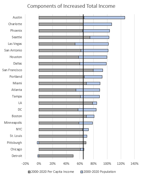
Today, population growth is negatively correlated with per capita income growth. This creates some odd outcomes. Figure 1 shows income growth from 2000 to 2020 for selected major metro areas according to this measure.
The gray bars are per capita income growth. In the US, the average growth was about 65%. Among the largest cities, the standard deviation around that was about 7%. The blue bars are population growth. The standard deviation of population growth was 16%.
So, their income variable, which is supposed to be a proxy for demand, is mostly a product of how many houses were permitted.
I’d guess that when they write about cities with high demand vs. low demand in a paper about cities with expensive housing, most readers would be surprised that New York, Boston, LA, and Washington, DC have below average demand among the major metropolitan areas. (At least by my estimate using BEA population and income numbers.)
The authors show that both income growth and inelastic supply conditions are correlated with rising prices, but that the correlation with income is stronger. They conclude that home prices rise because of rising incomes more than because of supply constraints.
Even ignoring the issues with the demand variable, this is plausible for this time period. Since cities had uniformly inelastic supply conditions for entry-level single-family homes, due to the mortgage crackdown, cities under more growth pressure (higher total income from higher population growth) from 2000 to 2020 tended to experience more rent inflation and rising prices.
Regarding quantities, of course, in their regressions, the quantity of homes is dominated by the income variable, because the income variable is mostly driven by how many homes were permitted.
They recognize that, so they have an interacted variable of supply elasticity and income. If supply constraints are important, we should expect home prices to rise more where both supply conditions are tight and income growth is strong. That variable generally shows no correlation in the 2000-2020 period. In the 1980-2000 period, it shows a positive sign - prices went up more where income growth was strong and supply conditions were loose. That’s the opposite of what you would expect if looser supply conditions led to more building which kept prices low. I suspect some of these variable identification issues are creating problems, but it’s an interesting way to look at it, if you have good proxies for supply and demand.
They do a robustness test using 1980-2000 data. During that period, before the mortgage crackdown, their estimates of supply elasticity might be relatively accurate. During that period (Table IX, panel B, in the paper), the results tend to reflect supply side expectations. Home prices were weakly correlated with income growth and more strongly correlated with supply elasticity.
They conclude: “Through the lens of a standard demand-and-supply equilibrium housing model, in which we allow for arbitrary correlations of income growth with other housing demand or supply shocks, our estimates imply that differences in housing supply elasticities across U.S. cities are small and quantitatively not important for explaining differences in house price and quantity growth.”
I would agree with that conclusion for the 2000-2020 period. But, that is because the mortgage crackdown killed entry-level construction in every city by pushing the prices of existing homes below the cost of building new homes. And, there is little variation between cities in supply elasticity of apartments.
I don’t agree with the sentence that follows - “Our findings challenge the consensus that relaxing regulatory constraints would substantially lower housing prices and meaningfully expand housing quantities.” The peculiar condition of the entry-level single family home market since the Great Recession is not a condition to generalize from. And, how would we know that relaxing supply conditions won’t work if “differences in housing supply elasticities across U.S. cities are small”?
They write, “We do not find any evidence that supply constraints are economically or statistically significant determinants of variation in the growth of house prices relative to house quantities.” That’s quite a bold statement to make. I think they are resting on the migration assumptions from the paper I discussed in the previous post. They write, “But this result could be consistent with the important class of local labor market models where migration across cities is driven by the cost of housing relative to income. At the extreme case, it may be the case that migration causes price-to-income ratios to be equalized so that local housing supply elasticities will have zero effect on prices but large effects on migration and the quantity of housing.”
Migration across cities is definitely the equilibrating force here. As in the paper I discussed in the previous post, they appear to be assuming that demand of displaced families is highly elastic - picking up and moving at the slightest rise in housing costs. As I wrote there, that is definitely not the case. Families are migrating away from supply-deprived cities in the order at which they are sensitive to high costs, and in the worst cities, the only families left are those that are insulated from high costs or are willing to pay extremely high housing costs which reflects very inelastic demand (a willingness to pay high costs).
But, again as I wrote in the previous post, that is visible in the asymmetries that exist within metro areas. It’s going to be hard to spot with metro area averages.
I’ll throw one last point out there.
Figure 2 compares population growth in Atlanta and New York City.

Figure 3 compares annual changes in real home prices.
In both cases, over time, during this period, prices increased the most when population growth was lowest. In New York, prices declined in 2008-2012 when population growth was more than 0.5%. Prices have increased when population growth was lower or negative.

In Atlanta, prices have been rising more in the recent period when population growth is slower than they did before 2008 when population growth was higher. Looking at this through a time series lens, where was higher demand driving prices higher?
Yet, looking at the whole period, it’s hard to know what story these two cities would appear to tell. I think it’s going to be hard to come to confident conclusions about generalizable conditions in Atlanta and New York City by aggregating the changes through these volatile years.
Sorry, I may mostly be repeating myself from the previous post, but on all these papers, I think one of the common blind spots is the lack of appreciation of the supply shock related to the mortgage crackdown.
Every city experienced the same shock, and if it isn’t accounted for in a model, then it’s really going to muddy the waters. The construction of homes selling for less than about $250,000 cratered across the country after 2008. That was the majority of single-family construction!

This creates rhetorical difficulties. Research that considers supply and demand of shelter - rent - will clearly see this as a supply shock. Rents hadn’t significantly declined, and no amount of rent inflation in 2017 was going to trigger new construction of any significance anywhere.
Research that centers on home ownership and home prices will be confused, because it will measure the shock as a reduction of demand. But the return to some new equilibrium will look like inelastic supply, or like local supply conditions don’t matter. Analysis that includes both the shock and the return to some equilibrium is going to be really muddy.
Yes. Local supply conditions from 2000 to 2020 had little effect on home prices. No, that doesn’t mean that local supply conditions have little effect on home prices. No, we don’t need to wonder if supply and demand still works. And, no, we don’t need to wonder if regional displacement is very painful for families. It is.
If regional population flows are what makes your model work, you are describing a refugee crisis. Human beings tend to not love those. Replacing a supply response with a migration response does not call for a “reevaluation of our understanding of housing supply”. It calls for embracing it.
If you’re interested, here are a couple of posts where I discuss the complicated stew that is demand elasticity in cities that have dire housing shortages. (1, 2)
Oh, and as with the papers from the previous post, if any readers see any glaring errors that I am making in statistical inference, please comment.
I admire the patience and tenacity Kevin Erdmann has shown in trying to tell the tale of US housing markets.
I will go out on a limb, and say "Yes, supply matters." It is a new idea I have, called "supply and demand."
Solutions?
Perhaps the US government should offer "bribes" for un-zoning or radical up-zoning of property in densely populated neighborhoods. Decriminalizing housing construction is a good idea.
That is, a city would get a large grant for up-zoning property in dense ZIP codes.
Another tactic is to pay a city, say, $200,000 for every housing unit built, if in a crowded zip code. That would be $100 billion a year, for 500,000 "extra" units.
By way of comparison, just the interest on the national debt today is near $1 trillion a year.
Yes, for 10% of the cost of interest on the national debt we might be able to have another 500,000 units a year. Worth a try.
I challenge the macroeconomic community to come up with better ideas.
Figure 4 is really eye opening. It’s not showing a *shift* from affordable to higher-priced homes, it’s showing the complete evaporation of construction of homes affordable to first-time home buyers. Probably the most stark graphic representation that I’ve seen