As I mentioned in the previous post, my new paper makes three observations:
One pattern that is associated with greatly obstructed regional housing supply is a negative correlation between population growth and housing production. This peculiar pattern may provide another tool for identifying supply-deprived markets and quantifying the scale of the shortfall.
Price, rent, migration, and housing production trends after 2008 were much different than trends had been before 2008. This points to a universal shift to inelastic supply. Every city became more like LA.
The most likely culprit for this shift is overly regulated mortgage access, which has undercut supply the most where incomes are lower and new housing production is more sensitive to access to mortgage funding.
In this post I will describe the first observation.
First, let’s think about housing production as the combination of 2 components - (1) new homes to accommodate population growth and (2) new homes to accommodate changing norms about housing consumption (smaller households, second homes, demolished homes, etc.).
Population growth has declined since the Great Recession, but generally since World War II, it has run at around 1%, give or take a bit, with little variation. In spite of this, housing production is highly cyclical. So, in the short term, most changes in construction activity are for component #2. This is why analysists tend to treat housing as a highly cyclical sector.
Looking at Figure 3 from the paper, there is practically no correlation between housing construction and population growth. The annual cyclical component over the past 60 years has varied (the green line on the x-axis) from a retraction in demand of about 2 units per 1,000 residents to demand for about 6 units per 1,000 residents. At both extremes, about 4 units per 1,000 residents were required to accommodate population growth. (The dashed green lines represent the housing required for population growth during the weakest and strongest cyclical housing markets.)
If housing was largely constructed to meet population growth, the scatterplot would be an upward sloping line, like the dashed green lines, as a home would be built for roughly every two and a half new residents (4 homes per ten residents).
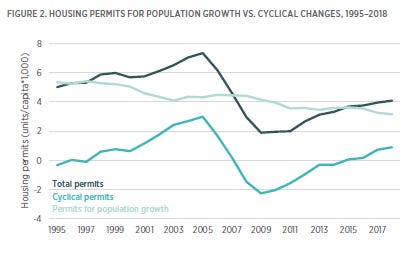
Figure 2 from the paper approximates the number of new homes required each year for population growth (the light blue line). The residual number of new homes constructed after accounting for those homes are the number of homes built for cyclical reasons (the medium blue line).
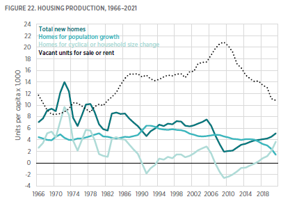
Figure 22 from the paper expands this to a longer time period and also includes a measure of vacant units to get a sense of scale regarding the annual cyclical production of homes.
I think there are a few interesting things to note here. First, you can see that housing construction has become much less cyclical than it used to be. Also, back when housing was highly cyclical, the cyclical increase in units had an insignificant effect on vacancies.
So, there was a small blip up in vacancies after 2002 during the “building boom” of the 2000s. There is no reason to attribute that rise in vacancies to national rates of cyclical building. First, because there is no historical reason to expect one. And, second, because the building cycle in the 2000s was moderate. (In fact, that’s part of our problem. We don’t have building cycles any more.) I have a Mercatus paper that goes into some of that.
This, of course, is one of my core messages. The canonical idea that the Great Recession happened because we had overbuilt housing is just utterly wrong, and its acceptance as canonized knowledge has been an albatross around the neck of working class America. Notice how most of the rise in vacancies came from 2006 to 2010 when housing production collapsed and the cyclical component actually went deeply negative. Those vacancies in 2010 are canonically attributed to the moderate building boom that ended in 2005.
(1) That is clearly ridiculous. There isn’t a 4-year lag in the connection between housing production and vacancies. (2) Dealing with that ridiculousness and finding the alternative explanation for those vacancies, the explanation that presents itself is that we opened up the heavens and released a financial shitstorm on ourselves after 2006 that created a negative demand shock so devastating that a fresh million homes in a country that was relatively desperate for them and that had largely stopped building them, sat empty because we had concocted so many frictions meant to keep families out of them.
But I digress.
A curious thing about housing construction and population growth is that, while there is no correlation between the two over time, there is a strong correlation between them cross-sectionally among metropolitan areas.
Figure 4 from the paper compares 49 metropolitan areas in 2006, when there was a lot of cyclical construction, and 2016, when there wasn’t much. In Figure 4 I have carried over the green indicator lines that I used in Figure 3. In 2016, the dashed green line extends from the origin because there wasn’t any cyclical construction. In 2006, the dashed green line extends from cyclical construction of about 2 units per 1,000 residents because there was a moderately positive amount of cyclical housing demand.
Notice, the regression lines for the cross-sectional relationships each year follow the dashed green lines. In other words, (1) in any given year, the number of homes built within each metropolitan area is highly correlated with population growth. And (2) changes in cyclical construction are generally universal. On average, every metropolitan area was cyclically building 2 more homes for cyclical demand in 2006 than they were in 2016. Cyclical changes in demand over time are mostly shared.
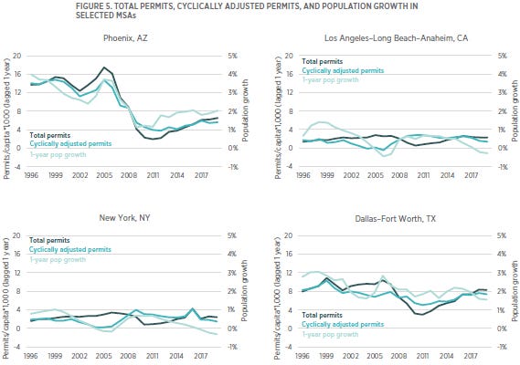
So, in Figure 5 from the paper, I started with the total number of housing permits issued in each metropolitan area (the dark blue lines), and I subtracted the estimate of cyclical housing demand that comes from Figure 2. That leaves the number of new homes available in each metropolitan area for population growth (the medium blue lines), after accounting for new homes built for the shared trend in cyclical demand.
When you do this, the cyclically adjusted number of permits (the medium blue lines) in each city matches more closely with population growth (the light blue lines) than total permits do. (see footnote) And, you can see that population growth even turned negative in New York and Los Angeles before the Great Recession. Their populations had to decline, because there had been a moderate increase in the national cyclical demand for housing, and housing production in those cities has become so pitiful that a moderate increase in demand used up all the political capacity they have for building.
Here, I should note, I use the term “cyclical” for the non-population portion of housing demand, but these changes don’t need to reverse. As is clear in Figure 22 above, there are changes in housing demand that are unrelated to population growth that can be permanent. The per capita demand for housing units before the 1990s increased substantially and will not reverse any time soon. There is such a propensity to treat housing demand before the Great Recession as excessive and unsustainable, I want to make clear that, in using the term “cyclical”, I in no way mean to infer that any of it was unsustainable or needed to reverse at all. (I have discussed how housing production gets reported in a way that overstates recent cyclical demand here.)
Now, let’s look at housing and population growth over time among the metropolitan areas. Basically Figure 3 but for cities. Since they tend to share cyclical demand trends, they tend to look like the national numbers. Over time, in most cities, there is little correlation between population growth and housing production.
In the top panel of Figure 6, I include the national scatterplot from Figure 3 (black), and also the scatterplot for Detroit (blue), Dallas (gray), and Atlanta (orange). In every case, the plots are relatively flat. Dallas and Atlanta have tended to grow by about 2% annually, and Detroit has tended to have relatively flat population growth. The vertical level of the scatterplot for each city is different, based on their population growth. When cyclical construction increases by 4 or 6 units per 1,000 residents, nationally, and the plots move to the right, housing construction in each city increases by about 4 or 6 units, and the plots for each city move to the right in relative unison. (Atlanta does reflect some pro-cyclical local growth.)
The bottom panel includes Seattle, which has a flat relationship at slightly higher population growth than the national average, Phoenix, which has a positive correlation (as did Atlanta in the top panel, to a lesser extent), and Los Angeles, which, befuddlingly, has a negative correlation between population growth and housing construction.
How can this be? This comes about because LA has a hard maximum on housing production at somewhere around 3 units per 1,000 residents.
Think about it this way. When cyclical housing demand was low, Los Angeles had population growth of about 1%, similar to the national average. When cyclical demand was at -2 units per 1,000 residents, LA was permitting about 1 unit per thousand residents, which meant that 3 units per thousand residents were available for population growth. At normal household sizes (roughly 2 1/2 residents per unit), that equates to a bit less than 1% population growth.
When there is cyclical demand for 4 units per 1,000, LA would need to permit 8 units to maintain 1% population growth. (4 units for population and 4 units for cyclical demand.) But, LA won’t permit more than three. So, when housing demand is high, prices in LA must rise until they are painful enough to displace a bit more than 1% of the local population. That’s the process I describe in paper #2. That’s how you get the negatively sloped price/income line in Los Angeles from the previous post and below in Figure A.
The increased price/income levels in poorer neighborhoods of housing deprived cities are not the result of speculation. They are the result of inertia. Families willing to pay more to avoid regional displacement.
From the paper:
Where there is a lack of adequate housing, moderate population growth leads to a process of “musical chairs” in which some families must be displaced from the area. That choice—whether to stay or leave—is moderated through the financial burden of increasing housing costs, which naturally falls more heavily on households with fewer financial resources. This leads to a self-selection of households out of the expensive metropolitan areas based on how much they are willing to choose excessive housing costs over displacement.
And that process gets kicked into high gear when cyclical housing demand is high. A steepening of the income sensitive price/income level is the process through which population growth is driven down to accommodate rising housing demand. The reason the price/income slope steepened in LA between 1996 and 2005 is because housing demand was above the LA metro area’s willingness to build, and so the high price/incomes were necessary in order to force voluntary regional displacement under duress.
The price/income line in LA in 2005 had to steepen to create the negative population pattern shown in Figure 6.
From the paper:
Therefore, when there is a general increase in demand for housing, prices in Los Angeles must rise until housing-motivated migration frees up existing units to accommodate the demand. Local population must decline until the number of units demanded is below the metropolitan area’s maximum willingness to permit new units (shown in red in figure 6). In other words, outmigration motivated by housing costs must march Los Angeles down the dotted green line to the point where the dotted green line hits 3 units per 1,000 residents. Cyclical demand for housing is what determines Los Angeles’s rate of population growth in any given year, because higher demand requires an equal and opposite reaction of outmigration. This leads to the odd result that Los Angeles’s population is negatively correlated with housing production. A metropolitan area with completely inelastic supply conditions, such that construction activity was completely insensitive to changing demand, would have a vertical pattern of plots in figure 6.
This pattern of outmigration from Los Angeles during housing booms causes the correlation in Phoenix to be positive, because when demand for housing increases, the outmigration from Los Angeles creates more population growth in Phoenix. So housing permits and population growth in Phoenix have an unusually positive correlation. In Phoenix, when per capita housing demand increases, it tends to be paired with an additional increase in population growth because of migration from Los Angeles.
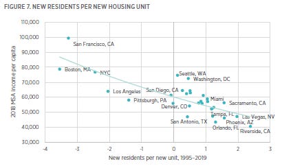
Figure 7 shows 2018 income per capita plotted against the correlation between population growth and new housing permits (the slope of the lines in figure 6) for 30 major metropolitan areas from 1995 to 2019. The most supply constrained MSAs—Boston, San Francisco, New York City, and Los Angeles—are to the left of the origin in figure 7, meaning that their rate of population growth was negatively correlated with the rate of housing starts between 1995 and 2019. When Americans demand more housing, those Closed Access cities build a little bit more, but not enough, so some of the new cyclical demand for housing must claim units from the existing stock of homes. Thus, ironically, rising construction, which is sensitive to changing demand for housing but not nearly sensitive enough in those MSAs, is associated with declining MSA population. Fast growing MSAs that have taken on housing-related migration from the Closed Access cities are to the right in figure 7.
One way to describe the distribution of MSAs in figure 7 is that the MSAs at the top left are MSAs where relatively fixed housing supply means that rising housing demand drives negative population growth, and the MSAs at the bottom right are MSAs where population growth drives housing supply. The outliers on both the left and the right of figure 7 are a result of the income-sensitive migration within and between MSAs, which is driven by the lack of adequate supply in the MSAs on the left. That migration makes both the sources and the destinations of those migrants outliers in average income (on the y-axis). If migration weren’t driven by housing constraints, it would be a historical peculiarity for population growth and housing construction to be negatively correlated with incomes.
In other words, the difference in incomes is the result of displacement. The Closed Access cities (to the upper left) have higher average incomes because of who didn’t leave, and the Contagion cities (to the lower right) have lower average incomes because of who did leave the Closed Access cities because of housing displacement
In this final chart, I have added New York City, Boston, and San Francisco to the scatterplot. These are the Closed Access cities. The negative correlation between local housing production and population is a sign of their housing problem.
Since these are commonly referred to as “superstar” cities, one fear of housing antagonists and skeptics is that if they built more housing, it would just attract more rich in-migrants. I think the case for that is generally weak. But, possibly, this provides a framework for estimating how much population potential these cities have.
I like to point out that there really isn’t any evidence that there is any more demand for living in Los Angeles than there is for living in Kansas City, and the only way to know would be for LA to actually permit as much housing as Kansas City does for a few years and see what happens.
In the scatterplot, you might notice that population growth in San Francisco tends to run high compared to housing permits. The blue San Francisco dots are higher up the y-axis than the LA, NYC, and Boston dots are. This is a sign of coping with undersupplied housing. The number of residents per unit is likely rising in San Francisco, as one way of dealing with the housing supply problem. So, to test for the natural rate of population growth in San Francisco, we would need to push cyclical housing demand extremely low - well into negative territory, until the demand for housing was so low that those coping mechanisms would cease and population could rise in San Francisco to the level it would naturally rise to without the housing constraint. It is plausible that for San Francisco, that is 2% or higher - something similar to Austin.
But, when cyclical demand for housing fell to -2 units per 1,000 residents, population growth in LA, New York, and Boston was not much different than the national population growth of about 1%. I think it is plausible that the unconstrained population growth rate of those cities isn’t much more than 1%, and that more housing construction would mostly lower prices rather than trigger more in-migration. It isn’t so much people wanting to move in that pushes prices so high, it is people not wanting to move out.
The housing costs bedeviling the “superstars” for the most part may really just be a really dumb supply constraint that they have imposed on themselves. I think it is plausible that they are just normal cities, that demand for living there may not even be as strong as it is for living in Atlanta or Dallas, and they’re just really bad at housing.
Figure 8 is the slope of the price/income lines of several metro areas (shown in Figure A for Atlanta and Los Angeles in 1996 and 2005). You can see that the slopes had to greatly steepen in the Closed Access cities before the Great Recession to induce regional displacement. The sunbelt cities had a much different experience. But, rising costs on the poorest residents of every city - the costs associated with inadequate housing and a resistance to displacement - have been more universal in recent years. The post-Great Recession experience will be the topic of my next post.
Footnote: A sidenote on Figure 5. One of the implausible pieces of conventional wisdom on the pre-GFC boom and bust is that, even if total housing production was pretty moderate by historical terms, we overbuilt in a few areas that had been taken over by speculative fervor. Phoenix is a favorite example.
I have written about this extensively, but Figure 5 provides a visual clue about how dumb it is that this is canonical. Notice how close permitting rates and population growth rates move together in Phoenix, even though there has been a lot of variation in both. Also, notice that the cyclical impulse is important in LA because the rate of construction is so low, but in Phoenix, where homes were being built to accommodate 3% population growth, an extra 2 or 3 units per 1,000 residents of cyclical demand just doesn’t amount to much compared to that. The cyclical building was, relatively, much lower in Phoenix than it was in slower-growing cities. And, even if Phoenix had accumulated some amount of excess supply, with 3% population growth, supply very quickly would get claimed. There are several layers of serial implausibility to the story that places like Phoenix had an especially difficult housing bust because before the GFC speculators were overbuilding homes where nobody wanted them.
What happened to Phoenix was that we implemented a demand shock so large that decades-long migration patterns suddenly whipsawed to nothing, and additionally thousands of Phoenix residents were booted from their homes during the ensuing foreclosure crisis.


Speaking of Phoenix, what the heck is going on there? Have you actually run out of water?