More color on the inevitable rent boom of the 2010s.
Here I want to build on the post about mortgage affordability vs. rent affordability, on the point that the clampdown on mortgage lending in 2008 necessarily led to unprecedented rent inflation.
Skeptics and opponents of federal mortgage agencies and the Fed attribute high home prices to low interest rates and mortgage access. I agree that a lower discount rate could raise the price/rent ratio, though I don’t think this is particularly important compared to other factors in housing economics. But, where the market is allowed to operate, the cost of new homes will be generally anchored to the cost of construction. If price is fixed by the cost of construction, and the price/rent ratio increases, then lower interest rates and more access to credit should lower rents.
The national natural experiment we started in 2008 has confirmed this. Cutting off mortgage access lowered price/rent ratios substantially. Construction collapsed, and rents increased just as substantially. They could do nothing else. Finally, today, rents may have risen high enough so that entry-level single-family homes will be constructed again in large numbers, and maybe rents will start to level out.
Of course, since their residents are blocked from mortgage funding, those homes will need to be bought by Wall Street firms in order to be constructed at any useful scale. Cue complaints about Wall Street taking over housing.
I described a model in the recent post where rent is composed of rent for structures and rent for land. Where housing is obstructed, rent for land rises. And, the multiple of land rents is higher than for structures, so the price of homes where supply is obstructed go up even more than rents.
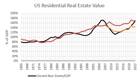
In an earlier post, I had estimated the value of US residential real estate based on fixed multiples for land and structures, plus the 2008 credit shock.
In Figure 1, I have added an additional measure that estimates the value of residential real estate in the absence of the credit shock. You can see that aggregate US residential real estate values followed my simple model, along the lower trajectory of the estimate that includes the credit shock, until recently, when residential values jumped back up to the modeled estimate of real estate value without a credit shock.
In the recent post, I asserted that the post-2008 period was characterized by undervalued real estate, because of the credit shock. Few new homes can be constructed when existing homes are cheaper than new homes. After 2008, rents had to rise enough to bring the price of existing homes back up to the price of new homes.
When the credit shock knocked down home prices in 2008, residential construction basically shut down. Figure 2, from the recent post, shows the average rental value of owned homes. It separates out the rent for the structure and the rent for excess land value. Rents (relative to incomes) have been flat since the mid-1990s. But, after 2008, with so little residential investment, the value of structures declined relative to the average income. Rents kept rising with incomes because of rent inflation, which is entirely rising land rent.
The red line in Figure 1 is the total real estate value modeled on these two aspects of rent.
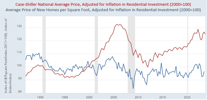
Here, I want to tie in another recent post, where I discussed the difference between new home prices and existing home prices. The key figure in that post is Figure 3.
Again, the key is that filtering is everything in housing. When there isn’t enough housing, it’s the old depreciated homes that get more expensive. New homes are built where new homes are legal. They are built where land is cheap, because homes can’t stay expensive where it is legal to build more.
So, essentially all of the excess appreciation of home prices when construction is too low is in existing homes, and specifically, the appreciation of the excess value of the land the homes sit on.
New homes, over time, just reflect the cost of construction. The blue line in Figure 3 is the price of new homes, adjusted for the price of construction inputs and new home size. It’s basically flat. The red line is the cost of the average existing US home.
When you don’t build enough new homes, land prices rise, and existing homes get expensive.
Putting It All Together
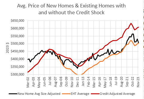
OK, now I’m going to reference my Erdmann Housing Tracker data, from the largest 30 metro areas. Figure 4 compares (orange) the average home value in those cities (from Zillow), (red) the EHT estimate of what the average home value would have been without the credit shock after 2007, and (black) the average price of new homes (on a per square foot basis, though this doesn’t make a huge difference).
The first thing I want you to notice is that the actual price of existing homes (the “EHT Average”) was pushed well below the price of new homes between 2007 and 2011. In the EHT, I estimate the drop in the value of existing homes that was associated with the collapse of demand from new buyers who could no longer access mortgage credit based on long-standing norms.
Keep in mind, the shift I measure in the EHT has nothing to do with the subprime boom. It measures the effect of the later shift in prime lending standards. If prime mortgage credit standards had remained the same, existing home prices would have tracked with new home prices. The scale of the credit shock is based on the decline in home values in ZIP codes with lower incomes that happened in every city across the country when mortgage access was tightened, regardless of the existing conditions of the housing market in each city.
There weren’t many new homes constructed in 2011, because, as I discussed above, the value of existing homes was so low that buyers opted for existing homes and builders could not profitably build many new homes. There is no bottom for existing home prices, because they are mostly sunk costs.
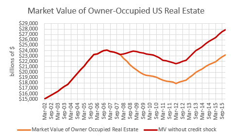
This brings me to a claim I make from time to time. The entire $5 trillion wealth shock that was associated with the Great Recession was related to the late tightening of prime mortgage borrowing. The crisis was a stupid policy choice. A policy choice that remains in place today.
Figure 5 shows the total market value of owner-occupied real estate and the estimated value of that real estate if prime lending standards had been held stable. Even the one trillion dollar loss in the red line is plausibly related to the credit bust.
Anyway, back to Figure 4, notice that new home prices track existing home prices (with the credit adjustment) until 2015. Then, from 2015 to 2020, new home prices remained relatively flat while existing home prices continued to rise. They bridged the gap.
Remember, my point here is that existing home prices were cut by about 20% on average by the credit shock, and so land rents had to push home prices back up by 20% to get land prices back up to zero on marginal lots, which could trigger more construction. Until then, new construction was limited to apartments and high-tier single family homes in neighborhoods where land still had positive value.
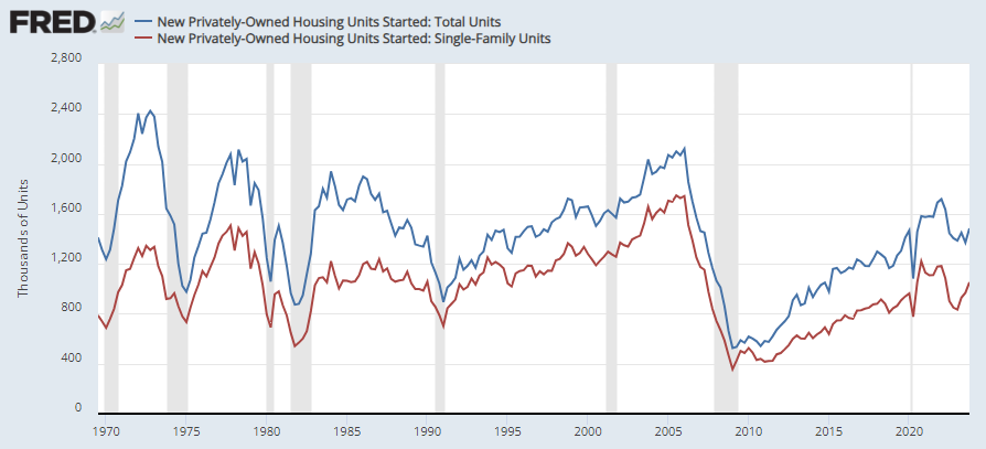
In Figure 6, you can see that after 2015, new housing starts sort of levelled off. (Of course, since the Fed mistakenly targets price inflation that includes rent inflation, they started to raise interest rates and slow the economy down to keep inflation down. That meant that other prices had to run below the 2% target, because rents were rising more than 2%.)
By 2020, the gap had been bridged. Then Covid happened and residential investment costs have been a bit volatile. But, through that, new home prices have continued to basically track actual existing home prices.
Now there is a burgeoning build-to-rent market that the homebuilders can build for. The tenants still are prevented from buying the homes so there has to be a landlord owner. This will be the main source of marginal new increases in construction until mortgage access is fixed or YIMBYs manage to get more infill development going. From this point on, marginal new demand for housing should lead to more new homes rather than higher prices of existing homes.
Finally, look back one more time to Figure 4. Again, think of the red line as the actual value of existing homes required to induce new construction in 2011. Since the market value of existing homes has been whacked with a 20% discount, the red line has to move 20% too high to get back to a market with ample construction.
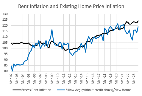
The The blue line in Figure 7 is the ratio of the average existing home price (without a credit shock) to the average new home price. The black line is the cumulative excess rent inflation since 2011. Rents (which are land rents) had to rise high enough to bridge the gap and make new homes worth building again. (1)
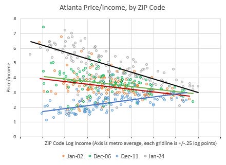
Finally, to look at it one last way, Figure 8 shows home price/income ratios in Atlanta in 2002, 2006, 2011, and 2024. The price levels in 2002 and 2006 were basically at the margin that induces new construction. The vertical axis represents the ZIP code with the average Atlanta income. Most new homes are built at that income level or higher.
Then, in 2008, the credit shock had a peculiar effect on American home prices. They went down the most where incomes were low and mortgage access was critical. By 2011, only the richest ZIP codes in Atlanta remained at a price level that could induce new building. Construction in Atlanta dropped by about 90%. Atlanta residents had to squeeze into the existing stock of homes for the next decade until rents could rise enough to make up the difference.
Where there is a shortage of housing, rents always rise the most in the poorest neighborhoods, and that causes prices to rise the most in the poorest neighborhoods. And, that’s just what happened in Atlanta. Very regressive rent inflation was required to get home prices back to the 2002-2006 norm.
But, notice, it didn’t stop there. And, I think that is because Atlanta has become more like LA and New York. Every city has become more like LA and New York. A decade of underbuilding has created excess land value in every metropolitan area. Remember Figure 2.
So, I think what we are seeing is that in order to induce new building, the price/income ratio at the average ZIP code had to rise to 5 instead of 3 or 4 because now all land around Atlanta has excess value.
Think of it in terms of a house and an unimproved empty lot next door. In 2006, the house sold for 3.5 times its residents’ income and the lot next door sold for some negligible amount. Then, in 2011, the house sold for 2.3 times its residents’ income, and the price of the lot was negative. The lot was simply not marketable.
Now, the lot has a value of 1.5 times the income of the home’s residents. The house has a value 5 times its residents’ income. A new house would cost 3.5 times their income, but now the lot has value because the entire city is in a state of deprivation, and when that happens, families bid up the rents of homes in an attempt to avoid displacement, as I have outlined before, and lots accrue excess value.
I’m not sure what happens from here. If home construction takes off, even under today’s conditions, where they will need to be sold to investors, will Atlanta price/income levels slowly revert back to the pre-2008 norm? Maybe. Or maybe, this is the new equilibrium based on different mortgage standards and lower homeownership rates than were common in the 20th century. It would definitely stop rising.
My guess is that in the long run, as we settle into a less equitable distribution of housing, families with lower incomes will use less housing rather than spend more, but that will be a long term process of setting new expectations and moving through this period where families are displaced because of the lack of supply.
But, as far as I can figure, this regressive rise in home prices had to happen once the mortgage moral panic was set in place in 2008.
(1) It is also interesting to compare the pre-2006 period to the post-2011 period in Figure 7. Before 2006, existing home prices were mainly rising in the Closed Access cities where they don’t allow many new homes. So, there was no connection between the trend in national rent inflation and the relative cost of new homes. Existing homes in LA were getting more expensive, and new homes were being built in Houston. The two had little to do with each other.
Then, after the credit shock, home prices and construction was affected in the entire country. There was no longer potential for regional arbitrage. Homes got more expensive everywhere. Rent inflation was elevated everywhere. New home construction was limited everywhere. So, the national rent numbers ran parallel to the existing/new price ratio after that.

