"Price is the Medium Through Which Housing Filters Up or Down": Part 4
Price/Income in poor neighborhoods really seems to convey useful information.
In Parts 1, 2, and 3, I highlighted results from my new paper at Mercatus. Metro areas with inadequate housing trigger a bidding war that forces families to either compromise into less desirable housing or move out of the metro area altogether. Those who compromise are, effectively, claiming housing that would normally be used by a family with lower income, in cities that allowed adequate housing construction. The lower the income in a neighborhood, the more the pressure from those down-market substitutions builds. The result is that housing costs are amplified in the poorest neighborhoods and the only residents who remain in the poor neighborhoods are those who are willing to take on an especially high cost of housing to avoid being displaced out of the metro area. All of these pressures create a reliably linear pattern in the price/income ratio across each metro area. Price/income ratios in the richest neighborhoods don’t differ that much, and don’t tend to change that much over the business cycle or over time, but price/income ratios in poor neighborhoods in the cities that block housing the most aggressively can rise to more than 10x.
Figure 1 compares Los Angeles and Atlanta in 2016. The slope of the line is a pretty good proxy for the adequacy of housing supply in a city. The median home price in a city is really mostly simply the midpoint of that line. And, since the process of forcing families out of a city because of inadequate housing plays out through this systematic bidding war and a self-selection of families across incomes to choose displacement over rising costs, the slope of the line is correlated with net domestic migration rates.
So, I think the measure of the slope of the price/income line for each metro area at any point in time is a pretty good indicator of supply constraints in each metro area. There are some measures that are commonly used, such as the Wharton Regulatory Land Use Index developed by Joseph Gyourko, Albert Saiz and Anita A. Summers, or the supply elasticity estimates from Albert Saiz at MIT. I think this might be a useful alternative to those estimates. And, the price/income slope can be estimated in real time from month to month or year to year, so it can be used more precisely and it can be used to identify trends in real time.
Another useful comparison is the filtering rate of housing. A recent paper by Liyi Liu, Douglas A. McManus, and Elias Yannopoulos, “Geographic and Temporal Variation in Housing Filtering Rates”, estimated the rate at which the incomes of the owners of existing homes change over time. In cities that permit enough housing, the existing homes tend to become more affordable as they age. But, in cities that don’t permit enough housing, existing homes tend to be claimed by owners with higher incomes over time. This process of filtering is manifest through price pressures, which my price/income slope is picking up.
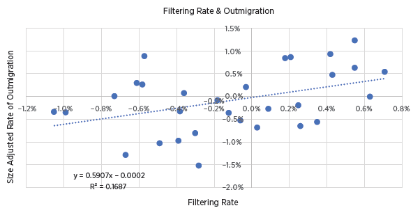
Figure 2 compares their filtering rate to my estimate of outmigration rates from 30 metro areas (relative to normal outmigration rates, so the average metro area is set to zero). There is a correlation. If the average home is traded up to new families at a rate of 1% higher income annually, that is associated with an unusual annual outmigration rate about 0.6% higher.
But, they find that much of the filtering is related to the relative increase in incomes in a given city. So, in Figures 3 and 4, using their data, I have separated out the filtering between filtering related to the change in a metro area’s average income, and the filtering of homes unrelated to that. In other words, in a city where the average home filtered up 0.3% annually, if the average income of the metro area had increased by 0.5% annually, then I attribute 0.5% of filtering to the metro’s changing average income and -0.2% of filtering to the existing stock filtering down relative to the rise in income.
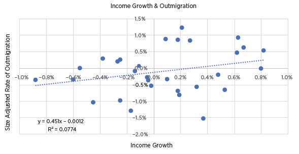
Figure 3 shows the correlation between income and outmigration. There is a weak correlation. In cities with rising incomes, more residents migrated away. It’s hard to nail down a causation here, but one explanation could be that some of the rising incomes are due to the compositional changes of poor residents moving away because of inadequate housing. That is in line with the growing number of studies that I highlighted in part 2.
Figure 4 shows the correlation between the remaining filtering and outmigration. Since much of the filtering is related to metro-area income trends, there is less variance between cities (which you can see in the narrower spread across the x-axis), but the relative effect is stronger. A higher positive rate of filtering of 1% annually is associated with a higher rate of outmigration of 1% annually.
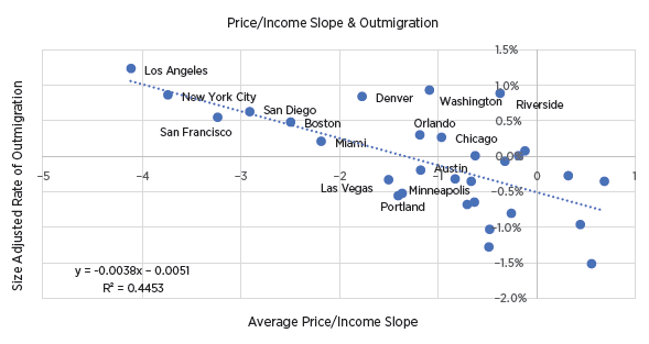
Figure 5 shows the correlation between the price/income slope and the rate of outmigration. The price/income slope has a much stronger correlation with outmigration than either the filtering rate, metro area income growth, or the filtering rate relative to income growth. A price/income slope tilted 1 point more negatively downward is associated with 0.38% higher annual outmigration.
(The price/income slope I use a based on incomes on a log scale. A doubling is equal to about 0.7 log points. So, a slope of -1 means that if homes in a ZIP code with $100,000 average incomes sell at 5x income, then homes in a ZIP code with $50,000 average incomes sell at 5.7x income. Looking back at Figure 1, to Atlanta and Los Angeles in 2016, Atlanta’s slope was 0.02 and Los Angeles’ was -4.31. So, we would expect Los Angeles to have outmigration 1.6% higher than Atlanta’s [4.33 x .38].)
These correlations are displayed in table form here. The coefficients of Figures 2, 3, and 5 are shown in the first 3 columns. The right panel shows correlations with in-migration. As you can see in the first 3 columns in the right panel, neither filtering rates, income growth, or the price/income slope have a statistically significant correlation with in-migration. (The p-value, in italics below the coefficients, denotes the probability that the correlation is spurious. For instance, for the filtering rate, there is a 2% probability that there really isn’t a positive correlation between filtering and out-migration and this coefficient is positive by random chance. There is a 54% probability that there isn’t a correlation between filtering and in-migration.)
In column 4, I have added a variable for the annual number of housing permits per capita over a decade. Here, let’s look at in-migration first. One extra permit over a decade is associated with 2.9 additional residents over that decade, (0.29 annual in-migration rate x 10), which is about what we should expect. Regardless of what is going on with the other variables, with prices, etc., the average household size is a bit more than 2 1/2 members, so in any reasonable model, that’s about how many new residents should be associated with a new house.
But, notice what that does for the price/income slope variable. Alone, the price/income slope variable is relatively weak, but it becomes statistically much stronger in the correlation with permits. Basically, I think you should think of the in-migration rate as the causal element here. If there are reasons for families to migrate to a city, that city can respond in one of two ways. It can either permit a home for them, or it can refuse to permit a home for them. So, either permits rise at a rate that accommodates the average household, or the price/income slope steepens. And, it appears, it must steepen by 0.25 points per 1% of in-migration to force the number of compromises that will make a home available.
One of those compromises is that another family moves away. And in column 4 of the regressions with outmigration, we can see that outmigration is highly correlated with the price/income slope and not correlated at all with permits.
That makes sense. If Atlanta is growing by 1.5% annually while Kansas City is growing by 0.5% annually, and they both simply permit new homes to accommodate those new families, then the rate of outmigration has nothing to do with the rate that homes were built.
But, as we saw in column 4 of the regression with in-migration, when cities don’t permit enough homes, it leads to a steepened price/income slope. So, the number of housing permits doesn’t tell you how many families will move away from a city, but the slope of the price/income line does, because the slope of the line is the result of inadequate building.
In short, in-migration must trigger either more homes or rising costs, and if it triggers rising costs, those costs induce outmigration.
One complaint NIMBYs have about new homes is that they will simply attract more newcomers to a city, and just make the displacement worse. These regressions provide at least a speculative result that suggests they are wrong. Mostly what new homes do is keep local costs down so that locals are not displaced. If a city permits an additional house, the city is likely to grow by about 2.9 residents, but those are likely existing residents that now won’t be displaced.
Conclusion
I think these findings are compelling, and I think the price/income slope for each metropolitan area can be productively used as a proxy for supply elasticity or supply constraints at the metropolitan area in statistical research. I have already done that in another paper that will be posted soon. In this paper, I have a table of the slopes for 30 metro areas from 2001 to 2019. Others should be able to reasonably easily construct their own estimates if they choose.
The price/income slope conveys important information about a city’s housing supply, and in turn, it can be used as a variable to more robustly test other influences on cities’ housing markets.


Aren't NIMBY's wrong because: supply = demand?
@sosmith23@gmail.com
!!
Thanks!
R,
-S. Smith
Endlessly entertaining to see how deep blue areas consistently punish their constituents.