
Notes on Erdmann Metro Area Housing Estimates: Part 2

I have added a link in the menu at the top of the newsletter for “Metro Area Analysis Packages”. They are currently available for $400 for a package for a single Census Metropolitan Statistical Area and $300 for additional packages.
The core analytical tool in the packages is my estimate of the scarcity premium within each market for a lot associated with a single home. A lack of housing has caused the land under homes in most markets to be inflated. In some markets (New York, Los Angeles, San Francisco, Boston), that premium existed before 2008 and was enforced by a blanket of municipal obstructions to new housing. In most markets, the premium has accumulated since 2008 because of unsustainably low new rates of construction that are the result of temporary conditions. In those markets, the scarcity premium will reverse, and this product is an estimate of how large the premium is in each market, how quickly it is rising or falling, and the general risk/reward of investing in that market, given this situation.
This data can also be useful for local policymakers as a way to guide and measure the effects of local policy choices.
Here are previous posts outlining some of the data in the packages:
Part 1, Part 2, Part 3, Part 4, Part 5, Part 6
Link with PDF of sample package
Notes on Metro Area Housing Estimates (Part 1)
Below, I will describe one additional part of the package that I didn’t cover in the previous parts: Real rent estimates.
Cyclical trends in home prices and rents tend to affect all homes in a market proportionately and perpetually unsustainable supply tends to create regressive rent and price inflation. Below is the comparison of the effect of this condition on rents in 4 different markets.
Keep in mind that lots were selling at a discount in almost all markets between 2008 and 2015 because of the mortgage crackdown. Construction of the types of homes that would have been purchased by families who were sensitive to mortgage access collapsed because of that.
In short, for the past 60 years or so, on the edge of most markets, there were homes that cost, say, $200,000 to build that sat on lots with marginal value. By 2012, those homes were selling for less than $150,000. Arithmetically, they were $200,000 homes on -$50,000 lots. Since nobody sells lots for less than $0 unless they are already bundled with homes, builders couldn’t compete. The “real rent land premium” in these charts is the rent associated with that marginal lot value. Before 2008, outside of the Closed Access cities, lot premiums were rare. This isn’t just a measure of relative value. This is a measure of the peculiar effect of scarcity, which causes valuation distortions that are uniform across a market, which my model estimates.
Figure 1 visualizes these changes.
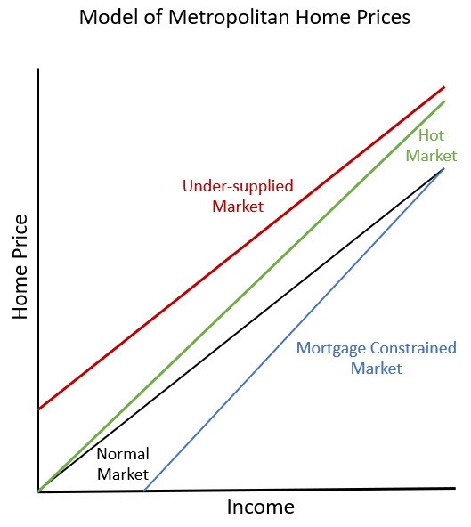
In brief, cyclical trends change price/income ratios proportionately (tilting the slope of the line representing prices across incomes higher or lower, from the origin). Mortgage access doesn’t change prices much at the top, but it raises and lowers relative prices in poorer neighborhoods. A lack of supply across a market raises prices uniformly across the market, raising the price/income line above the origin.
In all these markets, first a mortgage crackdown lowered this line to below the origin after 2008 (making existing low-tier homes too cheap for new homes to compete). Then, the resulting shortage pushed the entire line upward again until it was back at the origin. By the time that was happening anywhere, the cyclically neutral growth of housing demand was higher than the construction industry was capable of catching up with, so construction has been growing since 2015, but not fast enough to stop this line from rising in every market. So, by 2021, there was a premium just about everywhere (the line crossed the y-axis above the margin). Since 2021, however, measures of mortgage access suggest there has been additional credit tightening. This has increased the slope of this line in every market, lowering the point at which it crosses the y-axis and mechanically reducing the scarcity premium in every market.
That has happened even though current construction activity hasn’t been strong enough to lower the actual level of home prices and rents in most markets. So, I think the underlying scarcity trends are still headed higher, even though the stated scarcity premiums have been flattened over the past couple of years by the tighter lending conditions.
This, of course, is a matter of interpretation which each user of this data will need to consider on their own.
Figure 2 shows the typical US price/rent ratio, based on Zillow price and rent estimates. I have manually inserted a smoothed line here to show what the likely path of the price/rent ratio would be without some of the Covid-era price noise and the recent effects of more tightening in lending standards.

Rent inflation has flattened out in the last couple of years, which should be associated with a flattening out of the price/rent ratio. (The elevated price/rent ratio is largely due to rising rents.) The recent decline in prices and the recent decline in scarcity premiums measured by my model, is probably a temporary result of lending conditions. The lower level may be sticky, but the trend is likely not negative. The scarcity premium will continue to rise in many markets until new home completions grow.
Until the passage of time provides more clarity, I think looking at the trend over the entire period from January 2020 to today is likely a better indicator of the trend in the scarcity premium than the month to month changes have been over that time. I have added a linear indicator in each figure below to give an indication of the trend in each market.
Market 1 is a fast growing city. It had already turned from discount to premium by 2017. Now, there is a $400 rent premium attached to every home in this market. Also, rents popped up by about $150 in this market in 2021. That change is associated with cyclical demand, and will likely reverse.
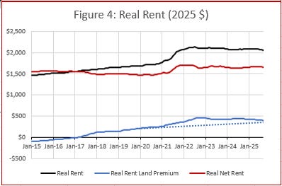
So, this market has a complicated set of forces. The 2021 boost was due to a rise in in-migration during Covid that is now reversing, making this market look a bit bearish. My model suggests that another $150 in rent deflation is likely to occur in the near term because of cyclical changes unrelated to the scarcity premium, though it has only slowly reversed slowly over the past 3 years. In addition to that, rents should correct by about $400/month over the long term, but that will require a years’ long - maybe decades’ long - building boom. I also suspect that the scarcity premium in this market will hit new highs before it permanently starts to correct back to $0. The scarcity rent premium has increased by $180 since January 2020, suggesting that the underlying slope is still positive.
In short, this is a complicated market with several forces pushing in different directions. There will be potential for profitable development here, but it will be useful to know what risks each project will be sensitive to.
For planners in this market, it will be important to look past the short-term bearishness to continue allowing for high growth, especially in amenity rich infill projects whose value isn’t as sensitive to the scarcity premium.
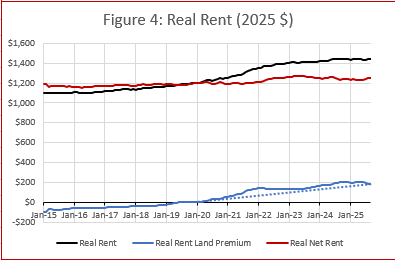
Market 2 is also fast growing. In fact, it already had a premium by 2015. There is more than a $500 scarcity premium, which is responsible for all the increase in rents since 2015.

Both of these markets are fast-growing. But growth has slowed in Market 2 in the last few years. The scarcity premium is large here, but that will be a slow-moving correction. In the meantime, construction has pulled back too much - probably enough to see a fresh rise in the scarcity premium. Apartments and infill development had risen here, but has pulled back a bit. More of that could be fruitful here, in spite of the long-term scarcity correction that will eventually play out, but that might depend on local political constraints.
The scarcity rent premium has added $193 since January 2020, suggesting a strong underlying trend that is likely to continue rising before it corrects.
Market 3 is more of a slow growing market. It didn’t cross from discount to premium until late 2018. The scarcity premium here is only $128. The local construction market is still well below its 2008 footprint, so the scarcity premium will likely remain elevated for some time before it begins to permanently correct. Current completions in this market are about 6,000 units annually, and I peg neutral construction at more than 11,000. So, there is a lot of room for growth in the local market, and probably quite a long runway until the small scarcity premium gets bid away, slowly.
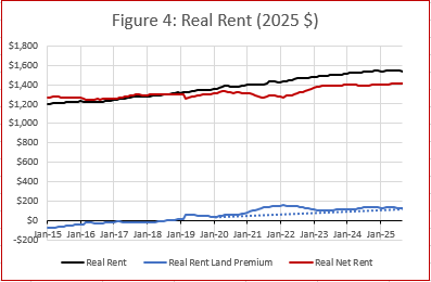
Also, there is a bit of a cyclical boost in this market now, though it is relatively small. Scarcity has added $86 to the rent premium here since January 2020. That is a slower trend than in the other sample markets shown here, but construction here is very low. The model estimates that it will take nearly a doubling of construction to permanently flatten the premium.
Finally, market 4 was very late in the transition from discount to premium. But, the premium has accumulated quickly. The scarcity premium is relatively low here, but is likely to rise significantly before it corrects. The risk/reward for building or buying rentals here seems especially good. The total premium is low, but the trend is sharply higher - $193 since January 2020.
This might be a market where some excess profit can be pocketed by developing rentals with a plan to sell them in a number of years when the scarcity premium starts to peak.
Planners, developers, and suppliers are using this model to supplement their in-house analysis. Contact me if you are interested in any packages.