
Notes on Erdmann Metro Area Housing Estimates

Friday, I posted a downloadable example of the metro area analysis that I am making available.
Today I want to continue reviewing why this data is important and useful.
Bottom-up underwriting will always be the primary tool for real estate capital allocation decisions. How much income will a project produce? How much will it cost to build or buy it? My data doesn’t replace bottom-up underwriting. It is naive about demand forecasts. But, in the coming years, it will be an important addendum to use to nudge bottom-up analysis.
Let’s say a builder has a 20% hurdle rate to proceed with new projects. Figure 1 represents the decision-making process. Let’s say 7 projects beat the hurdle. Over the course of those projects, uncertainties arise, and realized returns may differ. Here, 3 projects underperformed the hurdle rate, but on average, the target ROI was achieved.
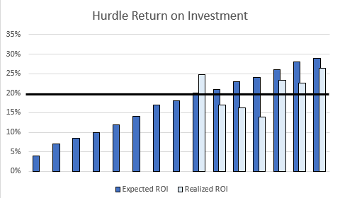
In addition to that idiosyncratic risk, there is also cyclical risk. There are times when realized returns in Figure 1 would all have been 10% higher and other times when they would all have been 10% lower. And, in those cases, all builders in the market would likely have experienced similar deviations. Because of that, and because builders are not in control of business cycles, builders reasonably focus on what they can control - good underwriting, good locations at good prices, well-designed product, and cost controls - basically finding expected ROI above the hurdle and then making sure it stays that way, all else equal.
Today, residential real estate markets are in a peculiar state. There will be predictable trends going forward, and I have figured out how to track them in a way that allows you to pinpoint where your risks are.
For the foreseeable future, there will be an increasing number of potential projects that present high expected ROI. But, realized ROI will come in predictably low. If you follow publicly traded homebuilders, you can already see symptoms of this. Some builders are abandoning lot options and selling out some existing communities at lower margins than they were fetching a year or two ago. But, generally margins remain healthy, and they are also reporting that they are still finding new opportunities that beat their ROI hurdles.
I suspect that this will continue to be a common theme. Builders will remain active. Profit margins will be reasonable, in general. But, land in some locations will lose value before or while communities are developed and sold, leading to abandonment losses or shrunken margins.
To understand what’s happening, let’s step back 25 years to see how we got here.
Figures 2 through 5 will highlight the path we have taken. They compare new home production per capita and the lot premium related to supply scarcity in each of the 30 largest metro areas since 2002. (Here, I’m using a lot premium/ avg. metro income ratio to produce comparable levels over 25 years.)
Figure 2 compares 2002 to 2005. In 2002, there weren’t large lot premiums yet. By 2005, there were 2 sources of lot premiums. Those 5 outlier dots at the top left are the infamous Closed Access cities - NYC, LA, San Francisco, Boston, and San Diego. They had a lot premium before 2008 because local land use regulations create persistent displacement of their existing residents.
And, cities in the rest of the country had developed marginal lot premiums by then because of the active market and the lending boom, but mainly because they were the destinations of all those families that were leaving the Closed Access cities.
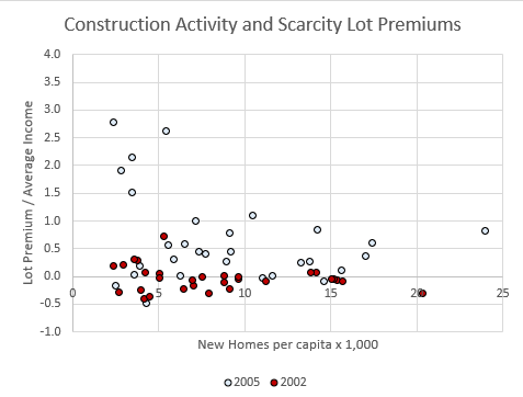
The Fed disastrously misread this situation and slowed down construction across the country. Home prices levelled off after 2005, but notice that the lot premium increased in many cities. With less construction, rents increased during that time, and the tell-tale sign of distressingly inadequate housing supply spread across the country.
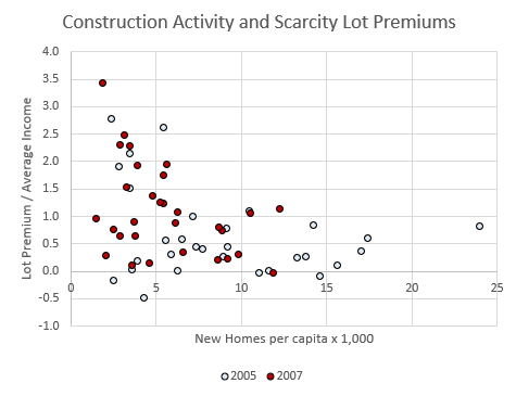
Then the mortgage crackdown created a housing crisis. By 2012, housing construction was negligible in every market, and lot premiums were driven into negative territory in most markets because existing home prices had been driven far below replacement cost where families were now blocked from mortgage access.
The rent inflation of 2006 and 2007 had paused as the crisis aftermath settled out. After 2012, rent inflation returned until lot premiums associated with new rent inflation countered the price shock created by the mortgage crackdown. The recovery in rents has outpaced the capacity of builders to meet demand, so lot premiums have risen well back above $0 in most cities.
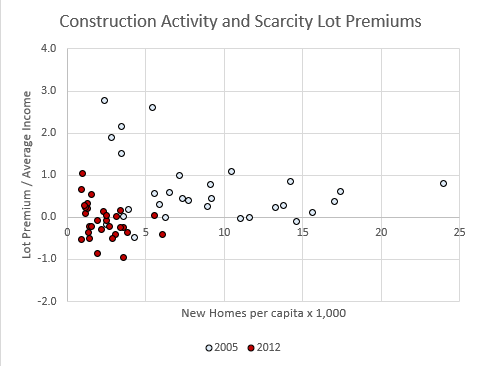
The Closed Access cities, having abysmally low capacity for new housing, have moved back up to their permanent spot at the top left of the chart. (California YIMBYs are working hard to fix that for the 3 coastal California markets. We’ll see how that plays out.) The rest of the country is slowly moving through the process of expanding capacity for construction again, and while they do, they each develop a lot premium that rises until construction returns to a level that can sustainably support normal household formation and population growth, then the lot premium slowly normalizes back to something close to zero, where it should be.
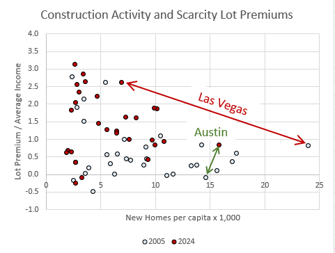
In Figure 5, the difference between Austin, who is fastest along that path, and Las Vegas, who is slowest, is stark. That is partly a product of Austin’s recent leadership in dense multi-family construction and it is partly because average incomes in Austin are high and so it wasn’t as deeply harmed by the mortgage crackdown.
Every city (except the Closed Access cities) will become Austin. They will each take a different path. The peak lot premiums will be different. The date of the peak will be different. And the rate of normalization will be different. But every city will follow a similarly shaped path.
Figure 6 is the average path of the 30 largest cities since 2002, and a projected path from today to 2034. Now these markets will march ahead along the path Austin has tread as capacity expands.
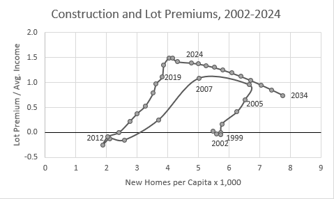
The average lot premium in the 30 largest metro areas is about $150,000. If that takes 15 years to normalize, that’s a $10,000/year average annual loss on land holdings. Thinking back to Figure 1, this model can add some information to expected ROI. Is the lot premium in this market still rising? Is it over the hump? Is the lot premium going to subtract $5,000, $10,000, or $20,000 from each unit’s value each year?
And, within that market, which projects are most exposed to the lot premium? Will some projects require more time to develop, and what will the lot premium do over that time?
Note in Figure 6, the only way that these lot premiums will normalize is through a building boom the likes we haven’t seen in decades.
There is work to be done. There are profits to be made. But those two developments won’t always come hand in hand. These will be strange times where sometimes, rising construction and sales activity will be associated with declining land values.
This is a simple model. And, for each market, short term cyclical fluctuations can sometimes require guesswork on the direction of the lot premium. But, it’s a way to take the blinders off while competitors are keeping them on. Unforecastable cyclical fluctuations might cause ROIs across the market to rise or fall by 10%. But, there are predictable trends that can allow you to make the dark blue bars in Figure 1 match more closely to the light blue bars. That will serve you well during those times when ROI’s are all underperforming by 10%, and it will point you to where cheap abandoned land positions should be opportunistically purchased from developers who didn’t plan for these trends.
That’s what my model can do. There are trends that individual markets are following. Others don’t exactly know how or why these trends are working. You can adjust for them across markets and you can select for exposure to them within markets.