
Conventional Wisdom about 2008 and the Midwest

I have recently realized that I could have strengthened the narrative of “Building from the Ground Up” by referencing the Midwest as a sort of control group during the 2008 crisis.
Figure 1 is the touchstone chart for this point. Housing starts in the Midwest. It’s similar to pictures that I show for various measures in various regions, such as low tier home prices in Atlanta. Conventional wisdom says there was a boom and bust. Most Americans saw nothing, normal, nothing, normal, crash.

The marks are:
Mark B: This was the Fed’s 2007 annual Jackson Hole meeting. That year housing was the focus. And the point of view expressed at that meeting, which the Fed board appears to have accepted to guide their subsequent policy choices was that during Period A in the chart, so many homes had been built that the downturn hadn’t begun to make up for it, and so there would be a housing contraction in 2008 and 2009, and there was little the Fed could or should do about it.
Then, separately, in Period C in the chart, the federal mortgage agencies greatly tightened lending standards, eliminating 1/3 to 1/2 of the traditional mortgage market, and kept it there. That combination of events - the Fed’s insistence on a contraction to very low housing starts, its resignation to keeping them low once they were there, and then the multi-sigma scale tightening of mortgage access - were more than enough, because of the scale of the impositions, to create the crisis that we created.
Nobody using Figure 1 as a guide to macroeconomic management would call any of those choices sane.
You might ask, what initially caused the housing market in the Midwest to go from nothing, normal, nothing, normal, to crash, then?
The Fed.
Here is Bernanke at the March 2006 FOMC rate setting meeting.
As I discussed, I see the economy as still being basically quite strong, and it needs to moderate to become consistent with its long-run potential. The vehicle by which that is going to happen is the slowing in the housing market. I think we ought to raise the rate today and not to signal an immediate end for several reasons. First, we could think of our policy in terms of the mortgage rate rather than the funds rate. The mortgage rate is currently about the same as it was when we began tightening in June 2004, and it is still providing support to the housing market. If we failed to act today or signaled that we are definitely done, we would create a rally in the long-term bond market and in the mortgage market. We would create, I think, some risk of re-igniting what is currently a cooling market. I think that would be a mistake.
The Fed said it wanted housing construction to contract. Then it raised rates until it contracted. Then after it had contracted at a historically large scale the Fed decided it hadn’t been enough. Then the mortgage crackdown took a front seat.
I don’t even particularly take issue with that 2006 position. The big mistakes happened later - marks B, C, and beyond. The economy was running a little hot in 2006. There was some notable froth in lending markets that needed to calm down, and that would create some disruption in the process.
That all had been taken care of before mark B. Mark B should have looked like all those bottoms in Figure 2. The crisis happened because there wasn’t a v-shaped recovery. There should have been a v-shaped recovery. American voters and policymakers collectively had decided that we would suffer any downside necessary to prevent one. So we did.
The initial Fed tightening was purposeful but reasonable and reversable. The effects of the mortgage crackdown were an unintended and misunderstood accident but devastating.
But none of it had to happen. The Midwest didn’t need a construction collapse. Why did we think that? Why would we think that?
Yet even after the horrible outcomes that followed, the books and articles were all about how inevitable it was. Nobody looked at Figure 1 and thought, “Wait. What are we doing? Why did we do this?”
Figure 2 compares the Midwest to the Contagion states and the Closed Access cities. You could say that the Midwest is the control group, the Contagion states are the building boom group, and the Closed Access cities are places where under no circumstances should you ever aim for a decline in housing construction.

Figure 3 shows housing permits per capita in the 3 regions. (I must make my standard note here. Before 2008, the Midwest built more homes than the Closed Access cities, per capita, and had lower rent inflation. Since 2008, they have built a similar number of homes, and now rent inflation is similarly high in both. Did the Midwest become a Superstar after 2008, or has constrained supply been the primary cause of high urban rent inflation all along?)

Actually, construction had been pretty soft, nationwide, in the 1990s. Even in the Midwest, rents had been rising a bit faster than general inflation (Figure 3A). They had just started to turn down by the 2000s. You could say that the Midwest from 2000 to 2004 was a rare time and place were construction of housing was allowed to be high enough to moderate rents. Notice how when national policy was aimed at killing off the construction boom, the first consequence in the rest of the country was that rent inflation kicked back up for a couple of years in 2006 and 2007.
Then, after 2008, we implemented the only rent moderation policy Americans have broadly supported over the past 30 years - mass foreclosures that followed collapsing home prices. But that can only work temporarily.
The temporary decline in real rents after 2020 is a statistical artifact of the CPI. The dotted lines are more accurate.

I noted in “Home Price Trends Point to a Worsening Lack of Supply” that housing construction at any given time is highly correlated with local population growth rates, but housing construction over time has practically no relation to population growth rates.
Figure 4, from that paper shows annual housing permits and population growth for the US over time (black dots). And, it shows the cross-sectional rates of building and growth across metro areas in 2006 and 2016. In both years, roughly 4 units per thousand residents were built for population growth, but in 2016, no additional units were built cyclically, while in 2006, 2 or 3 additional units were constructed cyclically. Those units replaced old units, were new units used occasionally or vacant, accommodated more household formation, etc.
The way to read the chart is that, in any given year, where the regression line crosses the x-axis, that is the number of housing permits per capita that meet cyclical housing demand that year. Then, the regression line slopes up to the right, reflecting the different scale of housing permits in each city required to meet population growth. The regression line moves left and right from year to year, based on cyclical changes in construction activity, but it tends to keep a similar slope. That means that, on average, cyclical changes in housing demand are shared across cities.
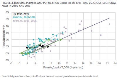
Basically, over the course of a housing cycle, from a year like 2016 to a year like 2006, construction activity increases similarly in most cities, regardless of their normal rate of growth. Basically, if homes per capita increases cyclically by 1% in Cleveland, it generally also increases by 1% in Los Angeles and Houston.
That means that in 2005, if you think cyclical construction is disruptive (You shouldn’t.) you might have been more correct to say there were too many homes in the Midwest than to say there were too many in Las Vegas. Adding 1% to 1% is a lot more than adding 1% to 3%.
How do we square that with Figure 3 where housing production the Midwest and Closed Access cities were flat to moderately rising while the Contagion states spiked up? Well, there are two notable mysteries to solve here.
First, population growth from the 1990s to the 2000s was declining in the Midwest. So, slightly rising permits per capita reflected a more cyclically inflated market than it seems. The nearly 6 units per capita in the Midwest in 2005 were being built even though population growth was lower than it had been when only 5 units per capita had been built in the 1990s. (Using Figure 4, you could say that as cyclical building increased in the 2000s, the plots that represent Midwestern cities were staying near the regression line as it moved to the right by moving down as much as they were moving to the right.)
But, housing supply doesn’t operate on a knife’s edge, and it is stunning to me that that has been the standard way that economists have talked about it cyclically. Homes per capita is not a remotely stable measure over time. And, using standard elasticities, it would take years of extra supply to cause rents to be lower by a few percentage points. There are many margins around which housing demand turns - when children move out, whether elderly parents move in, taking on roommates, using homes for seasonal use, tearing down old homes. A few hundred thousand extra homes is never a dire problem.
As noted above, rent inflation was moderate in the Midwest - below general inflation but not negative - around 1%-2%. At this point, we need a few decades of that kind of market, but even in the 2000s, 1%-2% rent inflation was great. Certainly nothing that needed to be rectified.
Second, the Contagion states spiked up because, … well, they are Contagion states. As I noted in “Home Price Trends Point to a Worsening Lack of Supply”, the Closed Access cities have such pitifully low housing production that when families increase their homes per capita demand by 1%, the Closed Access cities only increase their supply by some small fraction of 1%. Their housing stock is basically fixed, so when families demand more housing, the carrying capacity of the cities must decline.
So, in Figure 5, in the Midwest (blue), population growth is only weakly associated with housing permits. There are years where the population grew 200,000 and the Midwest permitted 100,000 homes and there are years where the population grew 200,000 and the Midwest permitted 350,000 homes. Housing demand doesn’t live on a knife’s edge!
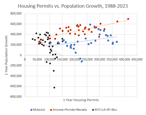
The Closed Access cities grow more slowly when housing demand is strong. This is a mathematical inevitability in their current state of governance. Every cyclically triggered new home that is built in Los Angeles is associated with several families that have to move away from Los Angeles because of a lack of more homes. They move to the Contagion states.
So, the reason that there is a pretty strong relationship in the Contagion states between cyclical housing production and population growth is that when housing demand is strong, their population growth increases because they are the population overflow destination for families displaced from the Closed Access cities.
The Midwest is a slow growth region, so it always builds more homes than the Contagion cities do, relative to population growth. In Figure 5, when the Midwest permitted 350,000 homes, it was associated with population growth of only about 300,000 residents. When the Contagion cities permit 350,000 homes, it’s associated with population growth twice that.
But, in the public imagination, it’s the Contagion states where the supposedly unwanted excess homes were built. I recently gave economist Joseph Stiglitz the what-for because he described a massive quantity of shoddy and unwanted homes in Nevada, which he associated with the crisis. That hallucination is canonical. Most audiences would nod their heads along with that claim.
As I pointed out, there was literally no building boom in Las Vegas. Figure 6 compares housing permits in the 3 Contagion states I tracked in Figures 2, 3, and 5. It’s ironic that the popularity of regions as “oversupply” examples is roughly in the opposite order of their actual building rates.
Nevada didn’t have a building boom. Arizona had a moderate one. And Florida did have one. Florida, by the way, is not as clear-cut as Arizona and Nevada in my counter-narrative about the crisis. There was more of a building spike there, and debt started accumulating there earlier than it did in Nevada and Arizona. Debt outstanding in Nevada and Arizona didn’t really increase faster than it did in the rest of the country until after the housing market was contracting.

But, as I explained above, all these Contagion areas were reacting to population growth. In 2004 and 2005, Florida was growing by more than 400,000 residents annually.
So, the Midwest really would qualify as the “overbuilding” region, even if Figure 1 looks like nothing, normal, nothing, normal, nothing, normal, crash. But, as I noted, there never is a reason for a crash. 1% rent inflation is not a problem to fix.
Finally, one reply might be about vacancies. Vacancy counts are shown in Figure 7 for the Midwest (blue, left scale) and the rest of the country (red, right scale). Rentals are solid lines, for sale are dashed lines. There were 3 different phases of increased vacancy.

The first increase was mostly limited to rentals in the Midwest from 2000 to 2006. Vacant homes for sale started to rise a little bit in the Midwest by 2005. Those are the only vacancies associated with the boom period. And, you can see back in Figure 2 that builders in the Midwest were reacting to that. Permits actually peaked in 2003 in the Midwest.
The next set of vacancies was in homes for sale in the rest of the country, which increased in 2006 and stayed high through the recession. Those vacancies were related to the Fed’s contractionary policy choices. They slowed down construction and purchaser demand for homes, and that was associated with cancelled orders at the builders, shifts in migration patterns, and frictions in the for-sale market that increased as new home sales collapsed.
The next rise in vacancies was in rentals in the rest of the country. That was a lagging indicator, largely in the Contagion cities after migration flows collapsed, foreclosures spiked, incomes had declined, etc. Those vacancies peaked several years after construction had started to decline, when cumulative construction was well below sustainable supply trends.
So, the only significant vacancies associated with the boom period were rentals in the Midwest.
Rental vacancies were rising and population growth was slowing because the Midwest was going through an economic rough patch, especially the auto sector. The unemployment rate in Michigan hit 7% in 2003 and was still there when the crisis hit in 2008.
Was there generally a residential and lending marketplace that was favoring construction activity relative to other periods? Sure. Was 350,000 annual permits a bit hotter than we might expect the Midwest to be pushing under those economic conditions? Sure.
So what should you do, come 2005 or 2006, about that region? Should you slow down their economic growth and create construction unemployment because there are a few hundred thousand vacant homes? Shouldn’t you aim to stimulate or stabilize the broader regional economy? Wouldn’t that be the way to reduce the vacancies over time?
Keep in mind, when you see apologists for the 2008 policy panic, this is the argument they are making whether they know it or not. When the first steps to slow the construction market down were implemented, there were no elevated vacancies outside the Midwest.
By the time we were to point B in Figure 1, there was no place in the country where vacancies would have been the result of active construction. Even by then, in August 2007, vacancies were due to market frictions related to an already deep contraction.
That brings us back to Figure 1. The fundamental fact about 2008 that is still greatly underappreciated is that most of the country didn’t have a bubble and bust. They just had a bust. And policymakers were still hallucinating a bubble when the bust was well underway. A bubble didn’t cause a bust. A hallucination did. There is no sane world where the consensus opinion of mark B in Figure 1 is to slow the economy to strangle construction, but that’s the world we made together.
The common lesson thought to be learned about the crisis is that the Fed should have hit the brakes in 2002 or 2003 instead of 2006. The real lesson is that when you’re at mark B in Figure 1, you let off the brakes. I hope that Figure 1 makes it clear what an easy lesson that should be to see in real time.
PS: Charts as supplements to some comments:


How can you write that many words about 2008 without mentioning the global financial meltdown—caused by subprime mortgage failures.
Is it time to retire or modify the designation "Contagion City" given that the data don't seem to support that? There was a contagion of bad interpretation by the Fed, economists, and media pundits in the lead up to 2008 as you have pointed out in your writing, but cities like Las Vegas, Atlanta, Miami---heck, most of the Sun-Belt---were simply operating according to market forces.
Price increases did exceed fundamentals in some places for a period of time in response to the migration impulse caused by the Close Access Cities, which probably spurred over-reaction by the Fed, and consequently lenders. Some of those writedowns in "Contagion Cities" could have been weathered with more measured policy.