I have written a few times about the comparison between the 2020s housing market and the Great Recession. In this post, I’m going to take another stab at it, with a focus on time series comparisons.
The jumping off point here is the oft-repeated claim that what happened in the 2000s was that a housing mania led investors and families to start to believe that home prices never go down. The story goes that this irrational bias led people to just keep throwing capital at housing, thinking it was all gain and no risk.
My responses are:
There are anecdotes, but the importance of bullish herd mentality is greatly exaggerated. Also, the reason that story is so popular is that the herd actually moved in the opposite direction. The 2008 crisis was confirmation bias for the real irrational herd. And, the real herd was already feeling bearish by 2005. There is some research about segmentation of the marketplace - basically smart money vs. dumb money theories. Sentiment was becoming bifurcated. The story goes that smart money was getting bearish while dumb money was still irrationally bullish. Certainly sentiment changes and is important always on some level. But, the quantity of that research is mostly just a product of the actual irrational herd, who have been very interested in finding herding stories to explain the 2000s housing market. Long story short, by 2006 or 2007, most home buyers and potential buyers were worried about falling prices. You might point at something like the anecdote of the stripper in “The Big Short”, but that is an incomplete observation. Housing sales were way down by the time that those anecdotes were ascendant (naive investors with multiple homes). If one stripper owned 6 investment properties, then that means that more than 6 other people who would have normally been buyers were sitting the market out. It’s really quite amazing how the truly irrational herd has managed to believe that the housing market in 2006 and 2007 was still in a mania while annualized new home sales were declining by tens of thousands every month. As I pointed out in “Building from the Ground Up”, the entire plot of “The Big Short” is set during that period of collapse. When Steve Carrell picks up the phone and nervously says, “It’s a bubble”, it’s sometime in early 2007. New home sales were already down by about 1/3. Yeah. Thanks for the heads up, there, chief.
Nationally, home prices should never decline by more than a few percentage points, and when they do, it isn’t some lesson that investors should use to chasten themselves. When they do, it’s because the federal government screwed up massively. Low and steady inflation is good. We should aim for that. But no reasonable economist calls for deep deflation to reverse earlier inflation. Nobody expected the hero of the perma-hawks, Paul Volcker, to create deflation. His policy was associated with a major recession, but nobody demanded 10% deflation to counter the price increases of the 1970s. Assets are a bit different than consumer products. Equities and bond prices can move up and down. And, home prices can too. But, the aggregate national basket of housing - especially with a low but positive inflation target - will rarely decline more than a few percentage points, nationally, if the market is in a functional equilibrium. Here, of course, the actual irrational herd has a herding story. They say that prices are sticky because sellers refuse to lower their reservation price. That is clearly true anecdotally, but it is clearly not important systematically. Prices, nationally, don’t normally trend deeply negative because the fundaments of housing never call for that.
All that being said, local home prices can be quite volatile - and just about everyone appreciates that fact. At any given time, there is likely somewhere where home prices are declining - either within a neighborhood or a city. And, it’s no big deal. Austin right now is a great example. The average home price is down nearly 20%. Prices probably needed to decline nearly 20%. And yet, sellers are lowering their reservation prices, builders are planning new developments, the city keeps growing. I’m sure most buyers in Austin in 2021 were worried about prices declining. Prices did decline. Everything’s fine.
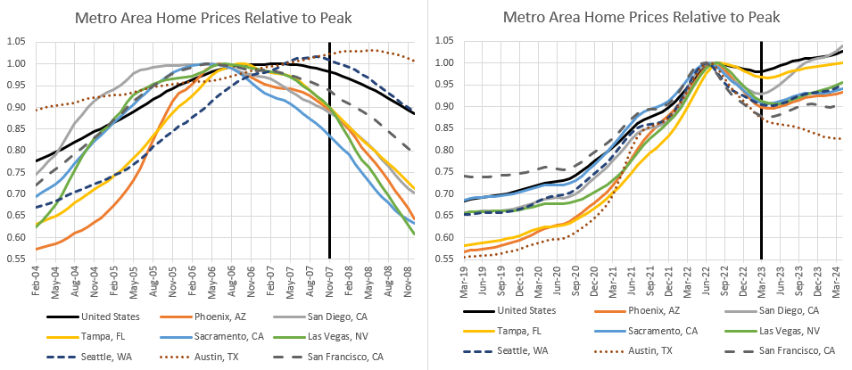
With all that on the table, let’s look at the last two housing cycles. Figure 1 compares the 2004-November 2007 period to the 2019-March 2023 period. March 2023 was the bottom of the current housing market. Nationally, the nominal decline in the Zillow estimate of the typical home price was about 2%. It was also about 2% by November 2007.
The metropolitan areas I have included in these figures were among the worst performing cities in at least one of the cycles. Some were among the worst performers in both cycles. In both cases, the worst performing cities tended to be down about 10%. In that way, they are similar.
The main difference is that there is a lot more variation in the 2007 period. Metro areas hit their price peaks at different times before 2007 and the price trends, both up and down, were more different.
In Figure 2, I have updated the recent period to April 2024 - 13 months after the national price bottom - and I updated the previous cycle to December 2008, also 13 months after the national price bottom.
The down-cycles were similar for the first 7 months, shown in Figure 1. The differences developed after those first 7 months. Of course, long-time readers will know that I don’t think there was any reason for them to be different. The national home price trend should have bottomed in November 2007.
Notice, that didn’t help Austin much in 2024. Prices there continued to correct. And, while prices in the other poor-performing cities have stopped dropping, they are still down 5% to 10% from their peaks, nearly 2 years later. In a normal housing downturn, where national prices only briefly pause or take a small dip, there is still a lot of price correction happening from place to place.
If you think that Florida or Arizona or Nevada were in the midst of a bubble in 2007, then, I would agree wholeheartedly with you that in any scenario, they might have seen city-wide price corrections even larger than the recent trends in Austin.
Figure 3 extends the earlier chart to the eventual bottom. The national average loss was about 25%. The worst cities averaged losses of 50% or more. All of those shared losses after November 2007 were due to catastrophic and popular policy choices. The trends to the right of that vertical line should have basically looked like recent outcomes. And, the reason they didn’t is largely related to the permanent tightening of mortgage lending standards.
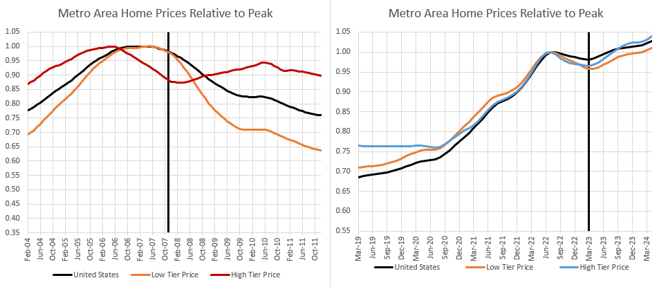
Figure 4 takes the analysis an extra step. Here, using Erdmann Housing Tracker data for the 30 largest metropolitan areas, I show home price trends for the average home, for a high-tier home (in a ZIP code with typical average adjusted gross income of about $250,000 today) and for a low-tier home (in a ZIP code with typical adjusted gross income of about $65,000 today).
There is little difference in today’s cycle. Both high-tier and low-tier have moved roughly together. The regressive rent inflation caused by the housing shortage was pushing up low-tier home values before Covid, but since then, macro-level trends have dominated.
The last cycle was much different, in several ways. First, by November 2007, high-tier home values were already down by more than 10%. Even though the national average numbers were just down 2%, high tier housing was already into much deeper territory than where we have been in the Covid correction. I would argue that this is evidence of the initial macro-economic errors. By the end of 2007, the Fed had already tightened too much.
The depth of the decline was hidden by the strength of low-tier housing. There is an interesting conversation to be had about that period, which is beyond the scope of this post. That was the period of CDOs, cash-out refinancing, and the last gasp of the subprime boom.
Definitely that was helping to keep the economy afloat. But the way it is universally treated is that non-traditional lending had created a bubble. It was delaying the inevitable crisis, or making the crisis worse, or making the crisis at all. But one doesn’t follow from the other.
This isn’t the point of this post, but also keep in mind that home sales and construction were collapsing hard during that period. It actually doesn’t fit the facts well at all to associate that period with lending-fueled demand. Rent inflation had been moderating until 2005, and then jumped back up in 2006 and 2007 when construction collapsed. An argument can be made that the stability of low-tier prices in 2006 and 2007 was from the same regressive rent inflation that has been responsible for low-tier price appreciation for much of the past 30 years.
During that odd time, there was likely a combination of those factors at work.
That late lending didn’t create a bubble. In 2006-2007, low-tier homes were already at their peak. That lending might have helped keep them there. But they were already at the market top when the mortgages that blew up were originated. That borrowing may have delayed a crisis that didn’t need to happen. That borrowing was saving the Fed from itself until the radical tightening of credit access shut down low-tier markets. That orange line should have mostly moved horizontally after 2007.
Bernanke was right when he said that the subprime boom wasn’t important enough to cause a crisis. He started the ball rolling on that crisis, and the Fed didn’t come in with the massive stimulus that would have been needed to prevent a crisis. But, the crisis was created by the massive regulated collapse in prime mortgage lending.
We didn’t need a crisis. By the time low-tier housing started to crash, we were long past-due for a correction. And, then, after that point, underwriters at Fannie and Freddie pulled the rug out from the market.
Notice that high-tier home prices stabilized in 2008. The decline in prices in 2006 and 2007 was steeper than the 2022 decline, but after 2007, high-tier home prices basically followed the same path that all homes followed after 2023.
All homes should have followed that path in 2008! From that point on, all the damage was due to shutting down 1/3 of the conventional lending market.
By the end of 2011, the average home had lost 25% of its value, but high-tier homes were still about 10% below the peak while low-tier homes were 35% below their peak. That difference is all from the destruction of buyer demand by federal agencies and regulators.
Finally, in Figure 5, I compare the high tier and low tier price trends of the worst performing cities from 2004 to 2011. The high tier ZIP codes are, to a first approximation, what housing markets might have looked like without the mortgage crackdown. There is a wide range of outcomes there. Even though the average high-tier home lost about 10% from the peak, these metropolitan areas range from more than a 40% loss to a 5% gain.
There are a lot of interactions going on there. A 10% nominal decline from 2006 to 2011 probably reflected more of a collapse than would have happened in a better managed cycle. The near total collapse of decades-long migration trends into places like Florida and Arizona surely created knock-on effects that added to their housing downturns, even in neighborhoods that were unaffected by the mortgage crackdown.
But, even accounting for those issues, it is easy to imagine that Phoenix and Las Vegas would have still seen declines of 20% or more.
In the low-tier ZIP codes, prices were down 35% on average across the US, from their peak. Just a massive regressive wealth collapse that so many people have been patting themselves on the back about for a decade. Or benchmarking to. As I have mentioned before, it is galling to see “advocates” for those neighborhoods who don’t question anything about the run-up to 2012, and whose only complaint is to decry that we didn’t use those markets in 2012 as an opportunity to engage in some massive social engineering project since we could buy the houses of those devastated families so cheaply.
In short, the right panel of Figure 5 is the picture of an economic tsunami and it should instead look like the right panel of Figure 2. And, for all intents and purposes, there is one reason and one reason only that it doesn’t, which is the blue line in Figure 6.
Long after the housing market had been more than subdued, we put our collective political knee on its neck until it would never get back up again.


Nice work. Thanks!
Judging from de facto policies, what we do not want in America is more housing, infrastructure or well-paid labor.
I don't think this is working out.
The other side of the coin is there are worse-governed nations, such as Haiti or Russia.