"Reassessing the role of supply and demand on housing bubble prices" (Part 6)
Post 2007 tightened lending was new.
To sum up the first 5 posts about my recent paper:
Constrained supply of housing was the primary driver of higher prices from 2002 to 2006, first by driving up prices in constrained cities and then by driving up prices in other cities as households moved away from expensive cities in large enough numbers to be disruptive. There was a credit boom at the same time, which was associated with some price appreciation, though it was much smaller than the effects of inadequate supply, and it mostly operated in opposition to the supply-driven boom. In other words, credit access helped push up prices mostly where the prices had remained moderate.
The bust was largely engineered through a crack down on lending, which did reverse the price gains that had been associated with credit access, but it did nothing to address the larger problem of inadequate supply. The country in 2010 was more bifurcated and less equitable than in 2002. The main differences were that supply-constrained cities had become even more expensive while home values of the poorest parts of the cities which had been growing generally fell below the levels common before the bubble.
There is one last aspect about the bust which I will address in this post. My regression, using the credit, speculation, and supply variables, has a bias in the 2006-2010 period.
As I discussed in part 3, in the 2002 to 2006 period, prices rose more, on average, in ZIP codes with lower incomes. But, this was generally due to supply constraints. Supply constraints make home prices rise more in ZIP codes with lower incomes, and so the relationship between income and price appreciation from 2002 to 2006 wasn’t uniform across the country. It happened in proportion to local supply constraints.
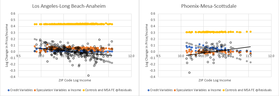
Figure 1, reposted from post 3, shows the estimates of the 4 factors plus residuals (residuals are the price/income changes the regression doesn’t capture) for LA and Phoenix. With a uniform income adjustment (the gray dots), the unexplained price/income changes are negatively correlated with income in LA and positively correlated with income in Phoenix.
In Figure 2, I have added my variable that estimates the effect of supply constraints on prices. This estimates the change in price/income in each metro area that is in proportion to the estimate of supply constraints in 2002. With the added supply variable, the unexplained changes in price/income aren’t strongly correlated with incomes.
Also, fixed effects estimates in Figure 1 are arbitrarily tied to the anchored point of the income control variable. In Figure 1, I have anchored it to the average ZIP code. In the model used in Figure 2, which I introduced in my previous paper, the neutral point of the supply variable isn’t arbitrary. It is the point, located generally at very high income levels where nominal spending on housing would be insensitive to supply conditions, where changing prices are statistically uncorrelated with changing supply conditions. This produces variables which distinctly convey aggregate changes in demand in a metro area (fixed effects), price changes that result from the systematic intra-metro housing migration and spending compromises which arise when supply is inadequate (supply variable), and idiosyncratic sources of local demand (credit, speculation, etc.).
Figure 3 shows the change in price/income ratios from 2006 to 2010 for Atlanta, Detroit, Los Angeles, and Detroit. You can see several trends here. The reversal in credit access was associated with declining prices in each city, especially for ZIP codes with low incomes. There was an especially deep decline in home prices across Detroit and Phoenix, shown by the “controls and metropolitan area fixed effects” estimates (yellow dots).
But, notice also that the residuals are upward sloping in all four metro areas. From 2002 to 2006, prices had risen in proportion to pre-existing supply conditions. But, when they declined from 2006 to 2010, they didn’t fully decline in proportion to supply conditions. There was an additional decline in prices in low-income ZIP codes at least as important as the decline attributed to the retraction of credit associated with my credit variables. (I have included the regression line of the residuals in Figure 3.)
So, there was an additional, relatively universal factor driving down home prices from 2006 to 2010, which affected low-income ZIP codes the most.
Some cities were more affected than others. Figure 4 shows the estimated effect of the credit variables and the unexplained residual price/income changes from 2006-2010 for the 3 major Texas metro areas, which generally avoided much of the boom and bust. The residuals are somewhat positively correlated with income in Dallas. They are flat with this regression over this time period in Austin and Houston. Most major metro areas had positively sloped residuals. Austin and Houston are somewhat unusual for having unbiased residuals.
This is one of the motivations for the scale of my credit shock variable in the Erdmann Housing Tracker. These results suggest, by some tests, that this additional loss of value amounted to almost 20% for the average home. That is correlated with income, so it was negligible in the richest ZIP codes and amounted to something like a typical 30% loss in the poorest. It takes a patch that large to erase the correlation of residuals with income in the 2006-2010 period.
So, the question is, what caused this extra drop in home prices? The credit variable already accounts for a full reversal of the previous increases that had been attributed to credit access.
A prime candidate would be additional tightening in credit access after 2007 which reached well into prime borrowers, and so wasn’t correlated with the credit access measures that I used in the regression.
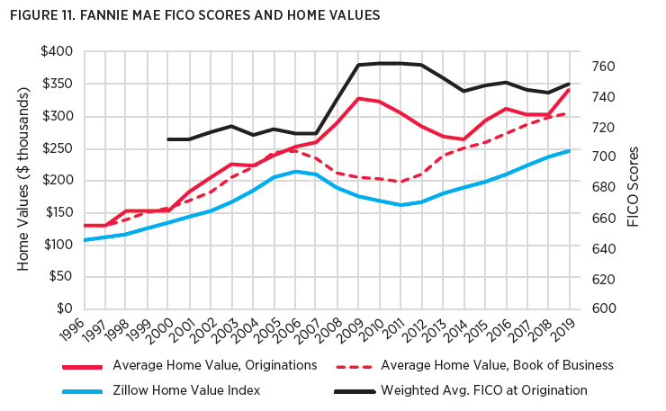
In the paper, I referenced data from Fannie Mae. Figure 5 conveys that data. At Fannie Mae (and, in fact, even in broader aggregate national data tracked by the New York Fed), the credit score on the average approved mortgage was relatively stable from 2000 to 2007. Then it shot up 40 points from 2007 to 2009, and basically stayed there.
From the mid-1990s to 2006, the average value of all homes - homes with existing Fannie Mae mortgages, homes getting new Fannie Mae mortgages, and other homes across the country, all had increased in value at similar rates. In other words, the same borrowers were getting the same mortgages for the same homes as they had in the past. Those homes happened to be more expensive over time, but they were the same homes.
Then, there was a sharp divergence from 2007 to 2009. Homes across the country and homes with existing Fannie Mae mortgages lost value. But the average price of homes getting new Fannie Mae mortgages shot up, so that by 2009, prices of homes getting new Fannie Mae mortgages were, on average, around 60% higher than existing homes that had received Fannie Mae mortgages in the past.
The scale of that shift is insane. And it’s even more insane that this happened without much notice or objection! This was not a reversal of any lending changes that happened from 2002 to 2006. And it led to price patterns that also weren’t reversals of patterns from 2002 to 2006, which is why my regression has those odd residuals from 2006 to 2010.
I’m not sure what the best way is to estimate the effect of this novel tightening in credit. I admit that when I ascribe these price changes to post-2007 credit tightening, I have a potential omitted variable problem. I’m not completely sure how to fix that, though I have tried to support it with various bits of background analysis (some of which will be in the next paper). However, the entirety of the existing literature has a much more fundamental omitted variable problem in that they completely ignore this massive, novel change in underwriting. It is a quite obvious alternative explanation for many of the trends in housing since 2007 to the explanations given in the existing literature.
It is common for research papers on the period to interpret the extra drop in prices from 2006-2010 as a confirmation of their preferred explanation for rising prices in 2002-2006, based on process-of-elimination logic. This massive change in the types of homes and borrowers served by our dominant mortgage institutions is never one of the eliminated alternative explanations. Please let me know in the comments if you have read any papers that account for the novel change in lending norms after 2007 when analyzing the various factors of the boom and bust.
You may balk at my explanation or feel that I am overconfident about the importance of this factor. I’m willing to entertain some doubt on that. But, I don’t think there is a case for wielding that doubt in defense of the existing literature. Assigning 100% of those price trends to the new lending standards is likely much closer to the truth than assigning 0%.
In neighborhoods across this country, working class homeowners suffered great losses in the value of their homes. This wasn’t because they had been speculating and over-borrowing. It was because we, collectively, were capable of being disastrously wrong and to act upon our wrongness through the regulatory powers of the state.
The conventional mortgage market practically stopped serving the lower half of the market. Prices declined because of novel new regulatory constraints on mortgages that reached much farther into the mortgage market than subprime. The effects of this change are highly correlated with incomes.
In addition to the patterns I have highlighted in prices, there was also a steep decline in housing construction in metropolitan areas with lower average incomes compared to metropolitan areas with higher incomes. In the final paper of this series, I will look at some of the other patterns in prices and housing construction over this period to further highlight the toxic effects of tight lending, supply constraints, and low housing production over the past few decades.


I just realized that there's a powerful analogy in your research to the old practice of redlining neighborhoods, and it makes me worried. Where that federal policy had explicit discriminatory aims, it was generally limited to discrete geographic areas within older cities. The current regime of lending constraints is like a redline around swathes of lower credit scores and lower income levels. Federal policy has effectively made a discriminatory practice of homeownership denial portable, although your data analysis tends to manifest in historically lower income zip codes. As a practical matter it would be easier to correct the problems you've identified, but it could be a tough fight with the generation that still has a skewed memory of the "housing bubble."
An old post that "awakened your call"!
https://thefaintofheart.wordpress.com/2012/10/27/the-housing-boom-financial-crisis-the-great-recession-3/