
2022 IRS Income Update and Affordability

The IRS published the ZIP code income estimates for 2022. This was an important update, because reported incomes were tossed around a bit during the Covid pandemic. 2022 gets back to relatively clean numbers, so that estimating current incomes from naive trends should be less noisy.
One reason these detailed income numbers are important is that the housing shortage creates very regressive rent inflation. Figure 1 shows the average change in real rents since January 2015 in the poorest quintile of ZIP codes that Zillow tracks rents on and the richest quintile of ZIP codes.
These should be flat. Rent should rise at the general rate of inflation. The real Case-Shiller index is based on the assumption that these lines are flat. This is a very odd situation, and it makes it hard to fully appreciate the damage from the housing shortage. Inflation normally doesn’t work this way.
Poor households and rich households have different baskets of goods and services, so sometimes economists try to come up with the inflation that poor families have experienced on their consumption basket versus the inflation that rich families have experienced. That is usually done by changing the weights of goods and services. More yachts for rich households, more porridge for poor households, etc.
But in the case of housing, under our current context of a nationwide shortage, rent inflation is higher for poor families than it is for rich families. A typical poor family living in an unchanged home since 2015 is spending 45% more than they were then, even after adjusting for inflation. The typical rich family is only paying 20% more.
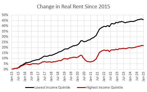
This is one way to tell that there is a shortage. This isn’t normal, or sustainable. This is a market in disequilibrium. Some households are spending more on rent than they would want to over the long-term, but the inflationary pressures are moving faster than families are willing and able to move to ameliorate them.
We will have moved from a shortage crisis to just an undersupplied market when a combination of more homebuilding and household decisions about migration and displacement move these lines back together. We will have moved from an undersupplied market to an amply supplied market when they have reverted back to 0%.
Rent inflation has flattened out a bit in the last couple of years, and as homebuilding activity continues to rise, I expect it to flatten out more.
Figure 2 compares rent affordability (% of income going to rent) in January 2016 and January 2025. I estimate current incomes by inflating 2022 incomes by 9%. The high rent inflation at the low end is raising rent as a percentage of incomes at the low end.

Figure 3 shows the price/rent ratio by ZIP code income. Price/rent ratios are mainly driven by rents. When rents rise by 1%, prices rise by more than 1%. So, higher rents lead to higher price/rent ratios, and economists don’t seem to account for this. This blind spot has led to so much bad policy. ZIP codes might have higher rents because they have better locations, better neighborhood amenities, households with higher incomes, limited housing supply because of zoning rules, etc. For any of those reasons, when rents are higher, price/rent ratios are higher. In Figure 3, price/income ratios are several times higher in rich ZIP codes than in poor neighborhoods. That is because higher rents are associated with higher incomes.

Because of that association, mortgage affordability isn’t nearly as systematically associated with incomes as rent affordability is. Rent takes a smaller portion of the typical income in a ZIP code with an average income of $100,000 than it does in a ZIP code with an average income of $50,000. But, to buy the house in a ZIP code with average income of $100,000, you have to pay a larger price/rent multiple.
Every city has a housing shortage now. But, back when most cities didn’t have a shortage, those factors would average out so that price/income levels were pretty similar throughout any given city. You could have a rule of thumb that a family should spend less than 3x or 4x their income to buy a house, and it probably applied to all buyers.
But EHT readers are familiar with the price/income pattern that develops within each city, depending on supply conditions. When housing supply is lacking, price/income levels stay pretty stable in the richest ZIP codes, and they rise pretty linearly as you move down the (log) income distribution in a city.
Mortgage affordability is proportional to price/income levels, so Figure 4 is a bit messy for the whole country, but it is really a collection of vectors all hinged at around 20% or less at the high end, and extending to the left. In cities that don’t have a shortage, they extend relatively straight to the left. In cities that have deep shortages, they are sloped so that they extend up and to the left. Add all those individual vectors up, and they look like Figure 4.

One thing to keep in mind about Figure 4 is that at incomes that are around the margin where mortgage access is important, mortgage affordability doesn’t have a strong association with either incomes or mortgage access. The typical debt payment to income ratio in ZIP codes with $100,000 incomes is similar to what it is in ZIP codes with $50,000 incomes. Maybe even a bit higher, on average.
Mortgage access hawks will usually cite high debt payment to income ratios as evidence of loose lending. They cite that because other indicators of mortgage access tend to scream that the market is especially tight. Debt payment to income (DTI) ratios aren’t a great indicator of lending conditions.
If you have a source that favors DTI as their indicator of lending conditions, check their history. Have they ever called for more generous lending? If they haven’t, then it’s a personality disorder posing as analysis.
Figure 5 compares mortgage affordability and rent affordability in ZIP codes with different incomes, in 2015 and today. Since mortgage rates have increased, the ratio has increased across the country.

It’s been a pretty sizable move. 2015 was unusually affordable for buyers that could qualify for mortgages.
Keep these asymmetries in mind when looking at national averages. When the average mortgage payment is equal to the average rent payment, that means that in the poorest ZIP codes, the mortgage/rent ratio is less than 0.5 and in the richest ZIP codes it is more than 2. Where households aren’t credit constrained, revealed preference says that ownership is always worth far more than renting.
We can get really complicated here discussing various discount rates on land and structures, inflation premiums, credit spreads, etc. At a very simple level, if taxes, insurance, and maintenance run about 2% of property value annually and if inflation runs at about 2% annually, then the present value of cash flows for renting versus owning should be about the same for a given home. (The rent will rise 2% each year while the owner has a mortgage payment that stays the same, but has additional costs that amount to about 2% of the property value each year. Those two cash outflow streams have similar present values.)
So, at a very basic level, we might consider a ratio of 1 to be a good rule of thumb. On the one hand, cheaper homes might have more maintenance costs or higher property taxes. On the other hand, families with choices clearly bid the prices of homes up to ratios well above 1.
There are many ZIP codes still well under a ratio of 1, and those ZIP codes are systematically the ZIP codes where families are allowed to rent but are generally denied mortgage access. Mortgage rationing through credit quality assessments is necessary, and important, but it systematically denies ownership to the households for whom ownership is most economical. I think that’s an important irony to consider.
On average, the mortgage/rent ratio has risen by nearly 0.5 points since 2015, but that means that a household with about $60,000 income today would face the same ratio that a family with $120,000 income faced in 2015. And, really, if you look at the lowest incomes, the ratio hasn’t changed much at all.
Broadly speaking, it isn’t affordability that prevents ownership in ZIP codes with lower incomes. It’s access to capital.
Inadequate housing construction has led to rent inflation. That has led to even more price inflation. Yet, still, ownership is strongly and systematically more affordable than renting in the ZIP codes where rents and prices have inflated the most. The negative supply effects of the mortgage crackdown on rising rents have been much stronger than the negative demand effects on declining prices. The mortgage crackdown hurt households in the most fundamental measure of housing affordability - rent. But, in the end, it made ownership more expensive too.
It seems counterintuitive to say that more mortgage access will lower home prices. It is because these supply issues and mortgage access issues have become the dominant factors affecting home prices. Back when they weren’t particularly binding issues, marginal changes in demand were relatively more important. And, so, analysts and economists got in the habit of treating mortgaged homebuyers only as consumers - demanders.
Homebuyers are suppliers. You don’t bring down the price of bread by making it harder to buy farmland. Homeowners are like farmers and the home (farmland) produces shelter (bread) which they consume. Reducing the number of farmers doesn’t reduce the demand for bread, even if most farmers are subsistence farmers that only eat bread from their own grain harvest.
The de facto policies of US governments are to criminalize housing production, and legalize all immigration (well, until Trump on immigration).
Keep these twinned policies in place for 30-40 years...and we are reaping the results. And yes, poor people are hit hardest.
BTW, this problem of enforced housing scarcity is by far the biggest economic problem the US has.
Instead, the macroeconomics profession has been obsessed with inflation for decades. Sure, no one is for inflation, and inflation much above 3%-4% is problem. Yes, hyperinflations are bad.
Entire careers and economics departments are devoted to expounding on these truths over and over again.
Meanwhile, the elephant in the room---housing shortages---is a cause of much lower living standards and inflation (as measured) but is nearly an orphan child.
Some of this is explicable, after all, most of the housing shortages are caused by the cumulative effects of local housing restrictions (although as Erdmann points out, shutting off financing will also cramp supply). Tough to figure a solution. There are some, and macroeconomist should be talking tirelessly about possible solution. Not, "2.8% inflation, such a disaster."
Well, kudos to Erdmann for staying the course.
Erdmann may wish to post on living standards in Sapporo Japan and Los Angeles---after the typical consumer pays the rent.
Are US living standards as high as depicted?
At bottom, I believe in free markets and private enterprise. Whether people in the bottom half of the US income/wealth picture will believe in free enterprise/free markets anymore...well, wait and see.
Thankful for the FHA loan I took out at age 24 to purchase my first house. I’d never have been able to save 20 percent.