Why more housing appears to make things worse
A recent survey paper found:
only about 30–40% of respondents believe that additional supply would reduce prices and rents. Using a conjoint design, we find that this “Supply Skepticism” is robust to question wording, stipulated counterfactual assumptions, and the cause of the supply shock. It also appears to be specific to housing: respondents generally gave correct answers to questions about supply shocks in other markets. Finally, we find that while nearly all renters and even a majority of homeowners say they would prefer home prices and rents in their city to be lower in the future, support for state preemption of local land-use restrictions depends on beliefs about housing markets. “Supply skepticism” among renters undermines their support for home construction.
Anyone in the housing space runs into forms of supply skepticism. Here’s a “macroeconomist/investment professional” who recently attracted some Twitter attention by taking the supply skeptic position. At last check, he was still poasting through it, God bless him.
He was basically posting the world’s most niche meme. Supply conditions tend to be stable, whether they are elastic or inelastic. With any stable supply curve, cyclical changes in demand will cause rising prices to be correlated with building booms. But, if supply is inelastic, rents and prices will rise slowly over time, and if supply is elastic, rents and prices will remain moderate over time.
So, if your problem is inelastic supply, then the casual observer will think there is a problem with too much demand and a housing market that is too cyclical and getting worse. A supply problem looks like a cyclical problem, even though it is quite the opposite. And, since housing is highly capital intensive, this gets all mixed up in financial markets. I think this is why the Austrian style business cycle point of view has become very popular over the past few decades, and it is causing a lot of lay investors, professionals, and analysts a lot of unnecessary stress and dissonance.
As I have touched on before, in the Closed Access cities (NYC, LA, San Francisco, Boston, San Diego) housing supply is so pitiful that population has become negatively correlated with housing production, as crazy as that sounds. I discussed that in one of my Mercatus papers.
The short version is that if the economy is going well, people can consume more, etc., one of the things they will consume more of is housing. Think of this in terms of “homes per capita”. Young folks move out of their parents’ home. Couples have kids. Roommates look for their own place, etc. If the stock of housing is perfectly fixed, then higher demand for housing would actually reduce the population capacity of a city.
In all cities there is some supply reaction to higher demand and higher prices. But, if the amount of supply that gets built is pitifully low to start with, then the increase in construction will not be enough to cover the new demand.
If your city is in that pitiful zone, where supply responds to higher demand, but not enough to meet demand, then it will seem like building booms don’t help.
Think of it this way. Your city allows 500 new homes a year (and typically has 500 new households). Things are going well in your city, so this year, 500 (additional) young adults decide to move out of mom and dad’s house. Local builders respond, and the city allows 750 new homes to be built this year. So, the local builder’s market expands by 50%, but 250 households still have to move away because there isn’t enough housing. Population declines.
You can see how this would cause locals to think that building booms just cause displacement. You would ask them to ignore what they saw with their own eyes?! You would ask them to forget the 250 friends who were driven from their homes by those greedy gentrifying developers?!
So, the cities with the worst housing supply actually have population growth rates that are countercyclical. They shrink during booms and grow (moderately) during busts. This is, in fact, what has been happening. The Closed Access cities were shrinking before 2008. It took a while for housing construction to tepidly recover after 2008, but as housing construction has increased in the US, they have all started shrinking again.
Since I have a bad habit of making things too complicated, this was the only chart about that which I included in the paper. Metro areas with a negative number on the x-axis are metro areas that routinely shrink when they build more homes.
The y-axis is metro area income. The reason there is a correlation there is that poor residents have to move away from cities that don’t build enough housing. The incomes of the remaining families are now higher, on average. Those poor residents have to move somewhere, and the places they move to have the opposite pattern to the Closed Access cities. Their population growth is highly positively correlated with housing construction, because whenever there is a building boom, they receive all the refugees from the Closed Access cities, which pushes their average incomes down. (See Riverside, Las Vegas, Phoenix, Tampa, Orlando, and Sacramento at that end.)
The reason the pattern exists in this chart is because a shortage of housing is driving domestic migration patterns and the difference in incomes.
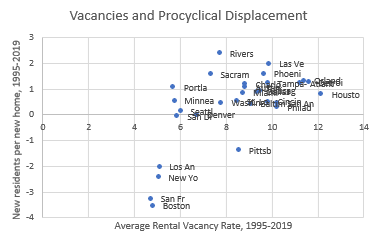
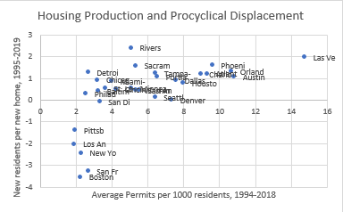
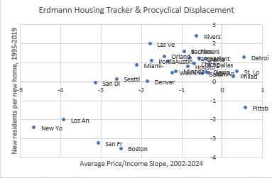
But, there are some more basic relationships I neglected to draw out in that paper. I will rectify that below. I have set these charts up differently than the chart above. On these charts, the y-axis is the correlation of new residents for each additional home. That correlation is negative for cities that shrink during building booms. Cities where poor residents are forced to move away when the economy is good are at the bottom. On the x-axis are factors that we might consider causal.
In Figure 3, the x-axis is the average rental vacancy rate from 1995 to 2019. Most cities have vacancy rates between 6% and 12% of rental units. Those vacancy rates reflect a number of local idiosyncratic market conditions.
A 6% vacancy rate appears to be the functional floor. The Closed Access cities are outliers in vacancies. Their vacancy rates are always very low and they don’t rise during economic downturns. That is because the use of their housing is moderated through the rise and fall of regional displacement. If vacancies started to rise above 5%, fewer locals would move away. If the economy improves, it is hard for the vacancy rate to fall much lower, so the only possible outcome is mass regional displacement. Vacancies don’t vary from about 5% in either boom or bust.
Figure 4 looks at housing production. For most cities, there is a wide difference in housing production - from 3 units per thousand residents in Detroit to 15 units in Las Vegas. Those are all cities where population growth drives housing production. You can tell how much demand there is to live in those cities by how many houses they build. They all tend to have a moderately positive correlation between population growth and housing production. (They are above the y-axis.)
When cities refuse to build, they have procyclical displacement. The Closed Access cities all average about 2 to 3 new homes per thousand residents each year. It’s hard to know how much demand there is to live there. Maybe 4 or 5 units would be enough. Who knows? But, since they build fewer homes than any growing city, they are differentiated by where they fall vertically on Figure 4 rather than where they fall horizontally.
You could say that cities at the top right are successful cities. Cities at the top left are cities with economic struggles. Cities at the bottom left produce economic refugees. And cities at the bottom right are the onanistic “superstar city” fairy tales that don’t exist, which we’ve been letting the Closed Access cities believe for far too long.
Finally, Figure 5 looks at the Erdmann Housing Tracker Supply indicator. In other words, how much more expensive (in terms of a price/income ratio) are homes in poor ZIP codes compared to homes in rich neighborhoods. Cities that don’t build enough housing are especially hard on the poor.
Again, you can see that most cities are in an ill-defined blob near the origin. The Closed Access cities are outliers at the bottom left. They are very expensive for their poor residents, and when the economy is good for everyone else, it is especially bad for the poor residents of the underhoused cities.
You can see how this works in Los Angeles, in Figure 6. Here, I show the price/income ratio in ZIP codes across Los Angeles (arranged by income), in 2002, 2006, and 2024. I also include Phoenix in 2002, which is an example of an amply supplied city where housing is universally affordable.
By 2006, the regressive effects of inadequate housing were maxed out in Los Angeles. Price/income ratios were as high as 16x in the poorest ZIP codes. LA population was declining, and it was largely those poor residents who were moving away.
Many of those residents were moving to Phoenix. They weren’t moving to Phoenix because Phoenix had a killer inclusionary zoning ordinance, or a massive public housing program, or a vacancy tax (Phoenix is full of empty homes in the summer.), or an affordable housing mandate, or rent control. Phoenix was building a lot of homes, mostly for residents with above-average incomes, who tend to buy new homes. So older homes and apartments were affordable. This policy was so successful, the price/income ratio was no higher in the poorest ZIP codes than it was in the richest ZIP codes.
Los Angeles has basically been pegged back at its 2006 slope after a temporary post-recession decline. I think this is basically where LA will sit for the foreseeable future. If they increase building or become economically stagnant, that line could level out. But, until then, on the margin, every new household will have to be matched with a displaced household, and the displaced residents will tend to come from those poor ZIP codes where costs are in the stratosphere. Changes in demand will play out through displacement.
Curiously, San Francisco has moved off that line. Maybe San Francisco is in decline. As recently as 2021, they were a steep slope similar to LA. (There basically aren’t any poor residents left in San Francisco - or at least there aren’t any that live in homes. They were already displaced, for the most part. So, you have to extend the trendline down to where poor neighborhoods would be, if there were any, to get to a 16x price/income level. This is probably what will happen in LA over time. Rents and prices will continue to rise, but Price/income won’t rise. The ZIP codes will just slowly migrate down and to the right as poor residents move away.)
Maybe a decline in demand for living in San Francisco will be associated with less procyclical displacement from San Francisco. In the upside down world of housing deprivation, bad is good and good is bad.
PS. In case this helps, here is the basis for the “new residents per new home” number. The US in this chart is normal. There is a slightly positive correlation between home building and population growth, but most changes in the rate of building are just cyclical changes in housing consumption per capita. In the closed access cities, more building is associated with less population growth. The number of “new residents per new home” in the charts above is the slope of the line in Figure 8.


Very nice analysis as usual!
I'm glad that I can treat the whole affair purely as an intellectual exercise, as I don't live in the US.
Though I wonder what the results would be if someone applied even a small portion of your acumen to eg my adopted home of Singapore.
Singapore is a very peculiar city. We do a lot of construction; NIMBYs don't seem to have any power; but there's also lot of pent up demand: people typically live with their parents until their 30s, but would be more than willing to move out, if cheaper housing was available.
Kevin, let me try to summarize your observation succinctly:
1. During booms, demand for housing goes up;
2. higher demand leads to higher construction, higher displacement, and higher prices; and,
3. some people will misinterpret this correlation as causation: "higher construction causes higher prices".
Did I get this right?
This seems like a sensible thing to worry about. But the reality may be even worse. Imagine a city X that allowed much more construction than most do today, while most cities maintain today's policies. When other cities boom, X will be a magnet for the displaced. In-migration will keep X's housing prices from falling. Yes, construction kept X's prices from rising as much as they would have without the construction, but NIMBYs won't see that. They'll see construction and higher prices together, and will reject the "more construction means lower prices" Econ 101 theory. They will be unable/unwilling to imagine what X's price-path would have been without the in-migration (lower) or without the construction (even higher), and so will be unable/unwilling to see how helpful the extra construction was.
In other words, I think the spatial correlation between more construction and rising prices will be even worse to deal with than the temporal correlation you highlight.
My conclusion from all of this is that (1) as a matter of extant reality, no one locality can solve the housing supply problem (the problem is too big); and, (2) any locality that tries only winds up "disproving" the idea that more construction lowers prices, at least in the eyes of NIMBYs.
The only way I see out of this is much stronger leadership from state governments in preventing localities from regulating construction to death. I do think that if California really led here, it could "single-handedly" (as one state) change the trajectory of housing prices by simultaneously satisfying demand within the state, and also providing refuge for out-of-state people fleeing the forced deprivation of their own foolish localities.
-Ken