What's driving home values (Part 1)
It's the rent! No, really!
Recently, the first of a series of 4 papers came out at Mercatus. In this paper, I showed how important rent inflation has been as a component of price inflation. I had a post that summarized that paper. There are many implications for housing analysis that come out of these papers, so I’m going to start a series of posts where I back up a bit, and just work through some of the background a small step at a time. The papers all build off of the same core ideas, so in this series of posts I expect to cover bits of all of them eventually, with some added background, discussion, and probably a few rants.
First, regarding rents and home prices, let’s look at a long-term picture. This chart was in the first paper:
The paper also included these charts:
To review: Figure 1 shows how price/rent ratios have become volatile in the US. Over the course of the paper, I argued that it is rising rents that are driving that volatility, and Figure 2 shows that metro areas with lower rents have stable price/rent ratios while the extremely high price/rent ratios have developed in the metro areas with high rents. The high price/rent ratios are due to high rents!
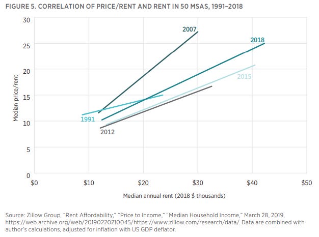
Here’s a graph going back farther in time, and including the plots for the 50 largest metros. Here, I haven’t adjusted for inflation. And, also I have included the black line, which marks the median US home each quarter from 1979 to 2018. So, each plot is a snapshot in time, and they drift right over time as nominal rents increase. The US measure drifts right along with them. (The US value is a median of the country, so it tends to run slightly below the regression lines from the snapshots, which are roughly the mean of the 50 largest metros.) The black line isn’t exactly the same measure as in Figure 1, but it’s basically telling the same story, and you can see the big hump in national Price/Rent ratios from the 2000s, and the drift back up after the crisis.
There really are two regimes here, and it’s easy to see. There was a long period where price/rent ratios were never very sensitive to rents. And, then, there was a period where the average price/rent ratio jumped higher, and when it did, the variance of rents between metros greatly increased and price/rent ratios were highly sensitive to those newly variable rents.
I have written that price/rent ratios are always higher where rents are higher - whether over time, between metros, or within metros. It is true over time and within metros (or, at least, you don’t see significantly negatively sloped price/rent ratio lines within metros). The graph above suggests that before the year 2000, you can’t really say that price/rent ratios between metros were dependably positively related. So, maybe I need to cop to having overstated the relationship a bit.
The reasons why I suspect price/rent ratio does tend to be positively related to rents include tax benefits for leveraged high priced properties and lower costs for rents that are high due to location and exclusionary regulations (no extra depreciation expense, etc.) There are also expectations - where values are expected to revert to a stable mean, temporarily higher rents would be associated with lower price/rent ratios, and where rents are expected to keep rising, they would be associated with higher price/rent ratios.
So, to the extent that I may have overstated the universality of the relationship, it may be that the relationship is largely due to the excess rents of exclusion, and the regulatory environment that has created that is expected to continue to create more variance between metro areas in incomes, rents, and home prices. Pre-2000 is a reversion to the mean (free) market. Post-2000 is an exclusive, regulated market. Price/rent is dependably positively correlated with higher rents, and before the year 2000, rents had not been different enough for the right reasons to create much correlation.
You can see the 2 regimes in Figure 4. The right panel is the slope of the regression line from Figure 3, each quarter, from 1979 to 2018. (One might see the right panel as less of a regime shift and more of a general rise in sensitivity over time, with cyclical fluctuations above and below a rising trend. That would actually fit better with evidence from measures like total rent/GDP.)
The left panel is the correlation between rent and price/rent. In other words, how much of the price/rent ratio is explained by the difference in rent. Keep in mind, this is one step deeper than the relationship between price and rent. We might expect as a basic first approximation that at any point in time, prices should roughly scale with rents. Where rents are 1% higher, so should be prices. By comparing price/rent with rent, I am looking at deviations from that basic proportional relationship.
Before the year 2000, there is basically no correlation between median rents and price/rent ratios across metro areas. Then, suddenly, it jumped to more than 60% by 2005, where it has basically stayed. The left panel of Figure 4 suggests that the market figured out around the year 2000 that we weren’t in a reversion-to-norms economy any more. We were in an economy with exclusive metros that would continue to be more expensive.
This is why we can learn something here that most policymakers, economists, and trading counterparties haven’t. It’s a new thing. Markets can figure things out even when market watchers and even market participants haven’t.
Most of the literature on the price spike from 2000 to 2005 pays little or no attention to rents. And, much of the literature, as a preface to the analysis, eliminates the relative differences between metro areas from the data! Before 2000, that would have been entirely appropriate! After 2000, that’s like trying to understand what makes a banana split taste good by doing chemical analysis on a maraschino cherry. But, you have to see the regime shift in order to realize that!
The Financial Crisis Inquiry Commission spent a single paragraph on rents, in order to dismiss them as an important factor in the housing boom of the 2000s. I have pointed this out in other places. They wrote:
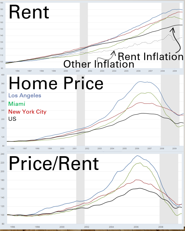
American economists and policy makers struggled to explain the house price increases… home prices had risen from 20 times the annual cost of renting to 25 times. In some cities, the change was particularly dramatic. From 1997 to 2006, the ratio of house prices to rents rose in Los Angeles, Miami, and New York City by 147%, 121%, and 98%, respectively.
They ended the paragraph, noting, “Perhaps such measures were no longer relevant, when Americans could make lower down payments and obtain loans such as payment-option adjustable-rate mortgages and interest-only mortgages, with reduced initial mortgage payments. Or perhaps buying a home continued to make financial sense, given homeowners’ expectations of further price gains.”
It never seems to occur to the experts that it was homeowners’ expectations of further rent gains that led them to pay more. But, never mind, the commission went on to spend hundreds of pages digging into the details of those dastardly mortgages to answer the question, “How could prices rise so much if rents didn’t matter?” Unfortunately, was a question that bore no relevance to us.
Figure 5 is a chart comparing the price/rent ratios and rents of 50 metro areas in 1997 and 2006, with Los Angeles, Miami, and New York City labeled. (Here, I have adjusted for nominal differences so the years can be compared apples-to-apples. I have adjusted the 2006 numbers to 1997 using the difference in nominal GDP.)
The FCIC thought they were cherry picking the worst examples of high price appreciation, and I suppose they did. But, what they had inadvertently done is pick the cities with the highest rent and the highest rent inflation. They didn’t know about the regime shift, so it didn’t occur to anyone associated with their report that in an analysis meant to dismiss the importance of rents in the housing market, it was really odd that the cherries they picked to make that point were cherries that were famously high-rent.
Here is a chart, using different data sources, showing changes over time in rents, home prices, and price/rent ratios in these three cities and the US. Their price/rent ratios had risen unusually because their rents had risen unusually.
I’ll stop here. At its heart, this is very simple. It doesn’t seem like I should need a series of posts to get at this. Rents are the fundamental driver of home prices. That should be the obvious initial expectation of any amateur financial analyst. And yet, it must not be simple. Rent suddenly became such a primary driver of relative home values that it not only explained the portion of prices it should explain, but it also explained 60% of the portion of prices that it shouldn’t explain. And at that moment - really, I suppose, because rents started explaining so much that they explained the parts that it seemed that they shouldn’t - the world gave up on the explanatory power of rents! And we’ve spent nearly 20 years cutting off our nose to spite our face, trying to figure out why rents stopped mattering in this economy that is being suffocated by rents.
Most price and rent data is from Zillow.com, which generously makes it publicly available so we can all be better informed.


Kevin, does your comparison of rents to prices assume that the media home is the same, whether rented or purchased? In my market, the median rent is for a "inferior" home than is used to calculate median price.