"Rising Home Prices Are Mostly from Rising Rents"
The First of a Series of Papers at Mercatus
I am very excited about these 4 papers. They will be posted over the next several weeks. The first one was posted last week. The topics are:
Rising home prices are mostly from rising rents.
At the metro area level, inelastic housing supply primarily raises costs for families with low incomes.
Recent price trends point to inelastic housing supply as the main cause of rising prices.
Adding a variable that captures the effects of inelastic housing supply, the causes of the 2002-2010 housing boom and bust can be more comprehensively estimated, and the scale of supply vs. demand factors can be compared.
Today, I will give you a summary of the first paper (you can read the whole thing at the Mercatus website). a chart at a time.
First, we start with the MVP of bubble charts - the long term real Case-Shiller housing index. As Professor Shiller points out, home price inflation shouldn’t rise faster than general inflation over the long run (and it didn’t until recent decades). According to Shiller, investing in housing became a fad that disregarded that expectation.
The problem with that theory is that rent inflation has definitely risen faster than general inflation for the past 40 years or so. So, instead of adjusting for inflation based on a reasonable theory that has stopped reflecting reality, why not adjust home prices with rent inflation instead of general inflation? When you do, it turns out that prices have become more volatile, but the deceptively compelling long-term flat pattern that suddenly jumps to a higher range isn’t so clear any more. Persistently high rent inflation is driving the rise in the “real” Case-Shiller index.
And, the case for rents driving prices gets even stronger when you look at individual metro areas. Here are plots with each metro’s median rent on the x-axis and the median price/rent ratio on the y-axis. What is clear here is that where rents are stable, so are price/rent ratios. Where rents haven’t risen, the Case-Shiller real price index is pretty close to a flat line, right up to today! Where prices have risen, it is because rents have risen. And when rents rise by 1%, prices always rise by much more than 1%.
This is a key point that I have made in previous work, so regular followers have probably seen some version of these charts before. But, it’s a point that can’t be overstated. The entire literature about the housing boom and bust has been built on the axiom that high prices were unsustainable because they rose more than rents had risen. It is an axiom that is superficially true, and yet, utterly wrong. Practically everything that has been written and said about the 2000s housing bust has rested on it. Yet, rising home prices have been, directly or indirectly, entirely driven by rising rents.
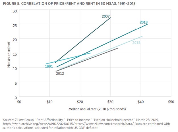
You can describe American home prices using 3 elements of the patterns in Figure 4.
The price/rent level of homes in cities with moderate rents - basically the left end of the regression line. If elements of housing subsidies, regulations, low mortgage rates, or taxes uniformly change home prices, they should affect this level. But, this level doesn’t usually change much.
The scale of the rise in rents - basically the length of the regression line on the x-axis. This is purely a product of obstructed supply.
The sensitivity of prices to high rents - basically, the slope of the regression line. This is a mutual result of supply and demand factors. Fundamentally, this source of rising prices is due to high rents, but it is influenced by demand factors that change the ability of buyers to pay for homes with high rents.
If we take out the noise, and just compare this pattern across metro areas over time, three periods stand out.
1991 to 2007: Rents increased in some cities, and where they did, by 2007, higher rents were fetching higher prices. Low rates? Easy money? Speculators? Maybe. But, the rise in the “real” Case-Shiller index was driven entirely by a handful of cities that were outliers pulling that line to the right (rising rents) and up (paying for rising rents).
2007-2012: Prices everywhere declined, but rents didn’t. THIS was the unsustainable and out-of-ordinary time. The main oddity during this period was that the left end of the line, which wants to be stable, declined significantly. Prices were unsustainably low. Rents had increased since 1991, defying Professor Shiller. But for any given rent level, compared to 1991, prices were lower. The right end of the line was also unsustainably low, but it was also now odd because rents continued to be much higher than in 1991.
2012-2018: At the low end, there was a slow return toward normalcy, while the high end, more than ever, was driven by rising rents, pulling the outlier cities more to the right.
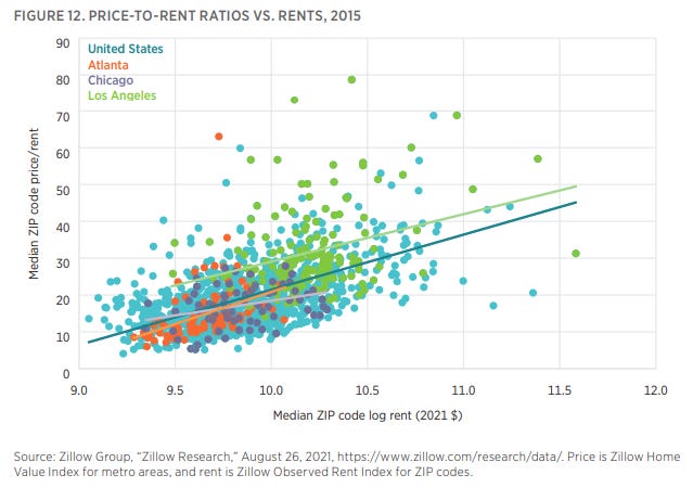
Now, let’s look even deeper - within metro areas. In the earlier period (here, I’m using 2002-2006), it was expensive cities getting more expensive while cheaper cities tended to stay cheap. But that pattern is reversed inside cities. This is a pattern that I will return to again and again throughout this series of papers. This is the peculiar signature of a housing deprived economy. The people it hurts are people with low incomes who live in cities with inadequate housing. Before 2008, that was limited to a handful of cities that were becoming housing cost outliers, and you can see that in Figure 7. Los Angeles looks different than Chicago and Atlanta because of what was imposed on its poorest residents.
Since most of the lay and academic literature has been based on the axiom that rents were unimportant, and nobody bothered to look close enough to correct that error, that pattern in Los Angeles has been generally blamed on loose lending or speculation. For a while, you could try to salvage that conclusion by claiming that loose lending increases demand across the board, and so it increases construction where supply is elastic and increases prices where supply is inelastic. There are lots of reasons that is wrong (construction rates and migration patterns don’t back it up, for instance), but, we created a natural experiment by removing the loose mortgage lending element, and now we can see what happens when loose lending isn’t a factor.
In Figure 8, we can see that prices are now rising in every city like they were in Los Angeles before. Low rates of building, with constrained lending, means that residents with low incomes are suffering from our policy choices now everywhere.
Now with better rent data, we can see that rising rents are behind that pattern. Figure 9 compares real changes in rent and real changes in prices for ZIP codes in the major metro areas from 2015 to 2021.
Remember: prices are rising especially for residents with lower incomes. That is because rents are rising especially for residents with lower incomes who were living in more affordable neighborhoods. Figure 10 shows real changes in rents with starting rents on the x-axis. In other words, where rents started lower, they have gone up more. THIS CAN’T CONTINUE. About a quarter of the variance in rents across ZIP codes vanished in 6 years.
So, there are 2 ends of the spectrum here. Rents are rising at the low end (because of systematic, persistent lack of housing production). That is driving prices up. And, remember, when rents are higher, price/rents rise. For each 1% increase in rents, you always see more than a 1% increase in prices. So, as low end rent affordability gets worse, low end price affordability is even worser, as it were, sir.
At the high end, rent inflation has been moderate, so price/rent ratios have expanded a bit.
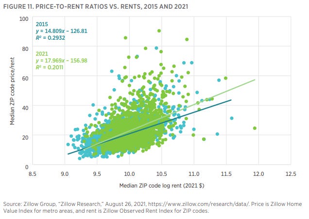
Cyclical overreach? Low interest rates? Maybe. But, if we look again at the price/rent ratios and the patterns within different metro areas, what you see is a fairly uniform pattern across metros in 2015. Price/rent ratios tended to be higher in the high rent parts of the cities. And, price/rent ratios tended to be higher in general in Los Angeles.
But, by 2021, what happened is that the compression of rents raised price/rent ratios in the lower-end ZIP codes, flattening the pattern of price/rent ratios within most metros. That mostly happened because high end price/rent ratios weren’t rising. The exception is Los Angeles. It’s price/rent pattern flattened too, but in general, its price/rent ratios rose compared to the price/rent ratios in the other metros. So, rising rents are pushing up prices in all metros, but LA is unusual in that price/rent ratios are going up across LA. One reason for this could be that rents in the expensive cities temporarily declined during the Covid migration, and that might have temporarily increased price/rent ratios there. So, it could be that rising rents will be the factor that pulls those price/rent ratios back down, as supply constraints go back to binding those markets after the Covid migration slows. (In other words, if price/rent ratios reverse their recent gains in the most expensive ZIP codes, in Figure 11, it may be mostly due to rents starting to go back up again in the expensive cities like L.A.)
One thing to keep in mind here, especially thinking about the Erdmann Housing Tracker, is that, when the post-Covid price boom arrived, homes at the high end of a lot of metro areas were likely selling at discounts by some measures, in 2021 - even when mortgage rates were extremely low. If you are worried that high mortgage rates will create another crisis by reversing recent price appreciation, this analysis should assuage you. It seems like that might be the case if you’re looking at national numbers or even at metro area medians. But, in many metro areas, if there are homes that have seen unusual price appreciation of 50%, they have likely also seen unusual rent inflation of 30%, and that can explain all of the price appreciation. The homes in those metro areas that have appreciated much more slowly - say 20% - may have experienced some price/rent expansion, but their price/rent ratios may have been a bit on the low side in 2020 or 2021. That’s not the case in every metro area. Some seem to have accumulated more cyclical upside than that. But, it describes many.
There will be much more to follow in the 3 remaining papers. I will leave you here with Figure 14, which shows an estimate of rent/income, by ZIP code. Rent has been taking a larger share of the incomes of residents where incomes are lower. This is a predictable result of inadequate construction. A lot of building has to happen everywhere to get housing affordability back to normal. And trying to continue to achieve price affordability by raising the cost of borrowing or by lowering incomes with a cyclical downturn would be the proverbial definition of insanity.
I have some requests. If you found anything useful here, please share this where you can. I have made some inroads with some policymakers and academics, but if you look up the definition of “grassroots” in the dictionary, you’ll see my picture. I depend on you to help share these insights with people who can use them - for policy decisions, for research, and for personal and professional asset allocation decisions.
Second, please come back and check out the other papers. They build upon each other to provide a broad framework for thinking about housing markets and influences on home prices. I think I have developed a way to quantify the effect of supply constraints on home prices in a way that allows it to be analyzed alongside other factors like lending norms, speculation, etc.
Third, please consider subscribing to this newsletter. Paid subscribers get monthly updates on housing data using the unique framework I have developed. There is a lot of questionable analysis out there on this very important topic, and my framework can help you maintain a confidence about what concerns are important and what aren’t, whether you’re just trying to be an informed citizen or whether you are allocating millions of dollars of capital that is sensitive to the business cycle or home prices.


My observation is it became very fashionable in the past decade for the upper class to own multiple homes. My closest neighbor owns a beach cottage, a house in Florida and now two houses in Maryland. They are trying to sell one of the Maryland houses but put it for sale post the current cycle peak and now it languishes.
I have many friends and family in Utah and they speak of it being quite normal for people to own a second home, typically in the warmer climate of Southern Utah.
The QE / ZIRP policies of the past decade made owning real estate a very attractive investment. One got to own an asset that not only was appreciating in value but also provided cash flow as a VRBO / AirBNB rental and a promise of a large return if the house was ever sold.
What happens as home are purchased for personal use, personal investment and short term rental? The supply of homes available to live in decreases. But demand for housing grows as people (a) need a place to live and (b) there is always the desire to join the investment trend.
If we see a crash in housing prices over the next several years, will the "experts" recognize that bubbles exists? Will they acknowledge the damage caused by QE and ZIRP?
I'm having trouble following figure 5 and the explanation. Is it information that there are labels on the left side of the line for some and the right side for others? Where can I see in the chart that "Prices everywhere declined, but rents didn’t" in 2007-2012?