
Sources of Rising Prices

Figure 1 is from yesterday’s post. Here, I want to discuss in more detail the phases of price and rent trends.
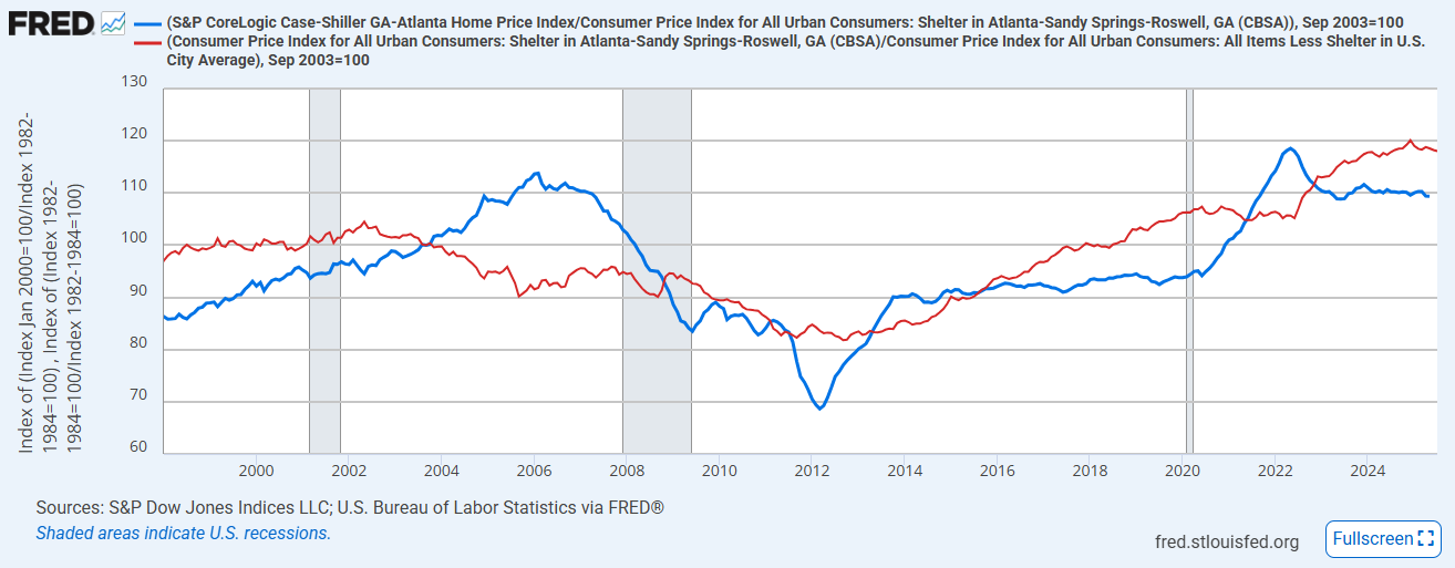
There are several distinct phases here. I mentioned the first two in the previous post:
During the lending boom from 2003 to 2006, rents declined, and Atlanta price/rent ratios increased mostly because of declining rents. That is a good thing. That is a progressively improving cost of living, driven by private investment.
From 2007 to 2011, prices dropped sharply because of the mortgage crackdown. And, the mortgage crackdown had such a deep effect on Americans’ ability to consume housing, it also led to declining rents. But, prices declined much more steeply than rents, leading to very low price/rent ratios.
From 2012 to 2014, price/rent ratios recovered from the bottom of the panicked, undercapitalized market bottom. This is the period where much of the market share of large-scale investors in existing single-family homes was established. The percentage of single-family homes that are rented peaked at the end of this period. Since then, family homeowners have been buying up single-family homes, and the market share of single-family rentals has been declining.
Unfortunately, there will always be a majority of voters who want to blame large investors for problems that large investors can’t plausibly be responsible for. We have to hope that a plurality of voters don’t have a religious conviction toward that prejudice and that somehow we can avoid making the worst policy decisions here. The jury is out on that question.From 2015 to 2020, homes were too cheap in Atlanta, because of the mortgage crackdown. Few new homes were constructed, so rents were rising and prices were rising in proportion to rents (so the price/rent ratio was flat).
[edit: During those years, homes in Atlanta selling for less than the median price typically would require mortgage payments well less than half the rental payments that were required to live in the same house. Affordability was definitely not the factor keeping renters from being owners. The mortgage crackdown had cratered prices, but not rents.]
Fixed mortgage rates were around 8% at the end of 1999 and declined to about 6% by the end of 2002. They ranged around 5% in 2009 and bottomed out at less than 3% in early 2021. Then they increased from about 3% in 2020 to 7% in 2025. The change in price/rent ratios between 1999 and 2002, 2009 and early 2021, and 2020 and 2025 are helpful indicators for how important mortgage rates are in home prices. Not necessarily zero, but not definitive.
Regarding the 2015 to 2020 period, lower interest rates should lower rents and raise relative prices in a city with elastic supply, like Atlanta before 2007. So, what was creating the trends in rents and prices from 2015 to 2020?After 2020, supply chains have been interrupted, and so housing construction has been unsustainably low, even though rents have inflated enough to push home prices high enough to justify new construction in many places. So, rents have continued to rise, price/rent ratios have risen on top of that, builder margins have been high, and construction input prices have been high.
I get a little bit into the weeds on this below.
Keep reading with a 7-day free trial
Subscribe to Erdmann Housing Tracker to keep reading this post and get 7 days of free access to the full post archives.