October 2022 Erdmann Housing Tracker Update
The California YIMBY Miracle Continues
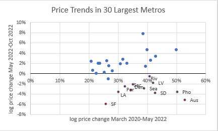
The trends I noticed last month continue. It’s hard to see movement from just one month in the charts, but the coastal California cities have now extended their run of apparent supply-side improvements to 5 months.
These scatterplots compare price changes from March 2020 to May 2022 (on the x-axis) to price changes from May 2022 to October 2022 (y-axis). Figure 1 is total price changes. The West continues to be a regional outlier, with no sign of a housing contraction in the East.
Figure 2 shows the relative changes in price with the supply component removed, so this is changes in price attributed to local income growth and cyclical factors. Austin continues to be an outlier here, increasing its cyclical reversal from last month.
Figure 3 shows relative changes in price with the cyclical component removed, so this is changes in price attributed to local income growth and supply constraints. The California cities continue to show improvement here (price contractions for the right reasons).
Updated national numbers below the fold for paid subscribers. “Founding member” subscribers have received an e-mailed file with prices for total price changes (attributed to cyclical, supply constraint, and credit constraint factors) for 30 major metropolitan areas.
(Here is a post describing the tracker.)
Keep reading with a 7-day free trial
Subscribe to Erdmann Housing Tracker to keep reading this post and get 7 days of free access to the full post archives.


