Housing Supply & Demand within Cities, Part 1
Previously, I posted that supply changes are slow moving and demand changes can be fast moving. And, I warned against claiming YIMBY victories because of large short-term shifts in rents or prices.
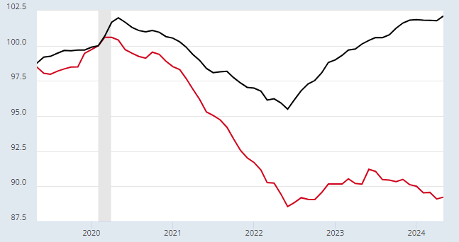
Figure 1 is a chart of real rents for the US (black) and for one metro area (red) which I will name later.* Should we use deflating rents here to claim a YIMBY win?
Then, I looked at the subject from a macro-level point of view. Along the same lines of my first point above, changes in demand can be cyclical and quick-changing while changes in supply are more slow and long-term. At the macro-level it is also important to differentiate between short-term trends and long-term trends.
Less supply raises rents and prices, and more demand raises rents and prices. In 2007, it was possible that we could have turned around 30 years of declining residential investment. That would have lowered rents and prices. But, in the short-run, it would have looked like an overheated cycle.
So, critics of an overheated cycle were inadvertently, but really quite directly, blocking a long-overdue regime shift to building more. The trends are so pronounced, I think you can easily see it in Figure 2, from that post. Long-term real estate values are negatively correlated with residential investment. Short-term real estate values are positively correlated with residential investment.
Imagine if the blue line had continued to rise above 2% after 2007. That would not have been associated with such a deep cyclical decline in real estate valuations, but it would have been associated with a more important gradual decline.
In order to get real estate values back down below 100% of GDP, we need to get residential investment back up, permanently above 2% of GDP. The longer residential investment stays this low, the higher home valuations will get, and the more there will be large cyclical ups and downs in home prices. (Notice how small the valuation cyclical ups and downs were back when residential investment was higher.)
There was mass approval of and insistence on collapsing residential investment in 2007. It went all the way up to important policymakers. Those who ascribe high housing costs to cyclical overheating will never allow Americans to be adequately housed. This is still a very popular position today as home prices appreciate again, even though residential investment has been permanently pushed so low that there really isn’t any room to collapse it again.
Both locally, and nationally, understanding the importance of supply is key. But, it is also important to understand what is due to changing demand. The collapse in residential investment was due to a purposeful collapse in demand at a moment where supply could have returned to normal. The collapse in rents in Figure 1 (the red line is San Francisco, by the way) is due to an idiosyncratic local collapse in demand. Rents are declining in Austin too. San Francisco is a supply failure and Austin is a supply success story. So how do we tell the difference?
In this post and the next, I will use some basic inferences about supply and demand within each metropolitan area to answer that question. One tricky issue with housing supply and demand is that both are non-linear.
Housing is a combination of necessities and luxuries.
So, demand is elastic at the high end. Wealthy families can easily give up extra amenities when costs are high.
Demand becomes more inelastic as housing becomes more scarce. The components of housing that are necessities increase as families substitute away from the luxury components. So, families are willing to spend more when housing becomes the primary gatekeeper for access to jobs, family, social services, etc.
But, eventually, housing takes so much of family budgets that demand turns elastic again when it is very expensive. Each little marginal rise in rents in a city like LA forces another families to move away from the region or to be unhoused. Total demand becomes the net of one family arriving and another family leaving.
Supply is also non-linear. Existing homes put a floor on housing at any moment in time. And, in any given year, cities are willing and able to permit a given number of homes. Within that range, supply tends to be highly elastic. If demand actually declines, then prices can fall dramatically as demand falls below the stock of existing homes. And if demand rises above the municipal willingness to issue permits, prices can rise dramatically when more homes aren’t built to meet demand.
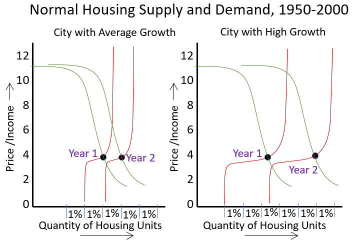
For most of the 20th century, these non-linearities didn’t matter, because when local permitting is high enough, home prices and construction are largely kept moderate by elastic supply conditions. Basically every city fit somewhere between the right panel and the left panel of Figure 3 during the 20th century. Demand determined how far quantity moved to the right each year, and supply moved right along with it.
So, for instance, from 1996 to 2006, the population of Dallas grew by about 27% while Cincinnati grew by about 7%, yet the price of the average home in both cities was similar in both years. Cincinnati was in the left panel of Figure 3, Dallas the right panel. That’s how housing has traditionally worked, and I think this is why economists have been left flat-footed by recent developments in housing. There is little historical experience where housing markets operated outside the comfortable range with stable elasticities.
By the turn of the century, the Closed Access cities (NYC, LA, San Francisco/San Jose, Boston, and San Diego) had supply curves stuck in the left-hand panel of Figure 3 regardless of demand. So, intersection of supply and demand has crept higher until now, in those cities, demand is at the top of the curve where the demand curve flattens out.
After 2008, mortgage suppression made every city’s supply curve look more like the left panel of Figure 3, and so prices have been creeping up the right side of the supply line everywhere.
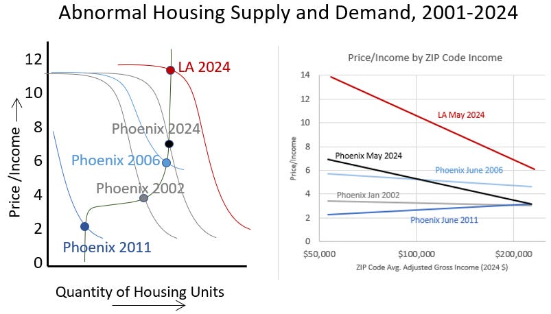
Figure 4 shows how markets have acted in the 21st century as they have been jostled around outside the elastic middle. Phoenix has been pushed and pulled all sorts of ways. LA just has the perennial problem of ruthlessly inelastic supply. In the left panel, I have compared the demand conditions of Phoenix and LA at various points. LA is now just locked in at the top of the range of housing demand. Home prices in LA are now determined, on the margin, by the rents households are willing to pay before they either move away or become homeless.
Phoenix in 2002 was still comfortably in the right panel of Figure 3 - building a lot of homes and remaining moderately affordable across the city. Then, the outpouring of families out of LA (the individuals acting out their elastic demand for housing in LA) pushed demand up in Phoenix beyond its supply capabilities. That pushed the demand curve in Phoenix to where it was in 2006.
Then, the massive demand shock that was imposed on the housing market through mortgage suppression pushed demand in Phoenix down below the existing stock of homes. Then, in the ensuing years, mortgage suppression turned Phoenix (and most cities) into a city from the left panel of Figure 3. Supply could only grow slowly. The relative position of supply and demand has slowly been rising up to the perennially supply-constrained condition of LA, complete with more homelessness, more outmigration, lower population growth, etc.
In my recent work, I have found that the price/income ratio of homes across a city, by ZIP code income, is an important clue about local supply and demand conditions. The slope of those lines can tell us what the shape of the supply and demand curves are. Most importantly, you can see that perennially inelastic supply conditions mostly raise prices where incomes are lowest. The poorest residents are the residents that must make tough decisions about affordability, and it is the specifications of their inelastic demand which eventually gives way to regional dislocation or homelessness that determines the top of the range of home prices.
It appears that a price/income ratio in the mid-teens for the poorest ZIP codes, which is associated with a price/income ratio in the average ZIP code of around 11, is the asymptote where the marginal increase in home prices becomes fully a function of the denominator of local price/incomes as families with different incomes sort into and out of the city based on their ability to pay for housing.
In Phoenix, a continuation of constrained supply will continue to push rents higher and increase price/income ratios higher. In Phoenix, many families are still able to pay more to remain. Increasingly, as it rises up the supply line, demand for housing will lead to more outmigration rather than rent inflation.
Comparing Phoenix in 2006 and 2024 in Figure 4 shows how the Price/Income line I use often at EHT can help differentiate between cyclical (demand) and secular (supply) effects on home prices. In 2006, prices had risen sharply even among homes with a large luxury element. That is usually not sustainable. Those changes can be expected to reverse relatively quickly, as they did in Phoenix. Austin recently is in a similar pattern, and prices corrected relatively quickly.
The normalization of demand is what will cause prices to correct in those contexts. To the extent that supply elasticity is involved in those changing prices, it is in the classic sense of supply in the short-term being less elastic than supply over longer periods.
In 2024, buyers of homes with more luxury components in Phoenix are spending the normal amount for them. Poorer families in homes with a larger necessity component are spending more. That is a product of perennially inelastic supply over the long-term. So, I tried to draw the demand curves in the left panel to reflect those differences.
Changes in willingness to spend money that compress and stretch the demand curve up and down can change quickly. Changes that move the demand curve right and left require regional migration, births, and deaths, and those tend to move slowly.
This is enough for now. I’ll look at individual metro areas over time in the next post.
*The red line in Figure 1 is real rents in San Francisco.


The chart on residential investment in the US as percent of GDP...should be plastered on every billboard in the US (OK, in the internet era, digitized all over the web).
I have an idea: Let's stop building housing, stop building infrastructure and Detroit-ify industrial America.
What could go wrong?
Well, to ice the cake we could teach college kids to hate liberal democracies, and they might believe it as they can't buy a house, and have huge debts to pay...