
Home and Land Prices, Part 3, and March 2025 Erdmann Housing Tracker Update

Following up on the previous post, here is a different way of looking at Phoenix home prices over time. I usually normalize things by using price/income ratios. Here, I graph Phoenix home prices at various points using prices. (In order to have comparable values over time, I have adjusted all values so that the average Phoenix income at any time is equal to current income levels. This doesn’t change the basic shapes that the data takes, but it makes it visually easier to compare two different points in time.)
It is very easy to see the different effects on home prices over time. ZIP codes are arranged by income on the x-axis and home price (Zillow ZHVI) on the y-axis.
Figure 1 shows January 2000, December 2005, and December 2011. In 2000, Phoenix was a neutral market. In richer neighborhoods, homes tended toward a price/income ratio of 2.5 (see the regression equations). ZIP code averages ranged from about $200,000 to $500,000.
Then, in 2005, there was a boom - a cyclical event - a bubble, as it were. Prices generally rose proportionately across the valley. It was as if the regression line was tethered near the origin and rotated up or down.

Then, by 2011, it had rotated back to neutral, but also the low end was pushed oddly down. So, by 2011, if the regression line was extended all the way to the y-axis, it would be in negative territory.
Figure 2 shows the same measures, but on a log scale, so that all proportional changes are shown as the same distance. You can see that the red line looks like it was just moved up uniformly from the blue line - all homes increased in value in similar proportions from 2000 to 2005. The log scale helps to see changes at the low end better. You can see that in 2011, low end prices had been sharply lowered.
This wasn’t one thing. This wasn’t a bubble that was reversed. It was a bubble that was reversed plus a significant mortgage crackdown that swung low tier home prices as far down below neutral as the bubble had pushed them above it.

It’s pretty amazing that one of those things populated whole aisles in the library economics section while the other went unnoticed.
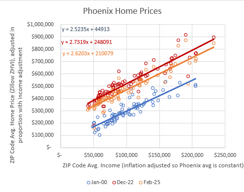
In Figure 3, January 2000 remains on the chart as the neutral reference point. December 2022 is shown in red and February 2025 is shown in orange. This is not on a log scale. This is like Figure 1.
Since 2011, it’s like every lot in Phoenix developed a $200,000 premium. Not proportional. Uniform across the city. This is what happens in every city with a housing shortage, which today is practically every city.
If you know what to look for, it is very easy to tell the difference.
Well, I say that, but the change from 2022 to 2025 looks like a reversal of some of the housing shortage, but it’s not really. It’s actually the combination of the reversal of a small cyclical boom after Covid. That reversal lowered the top end a bit. And, there has been additional tightening of lending standards, which lowered the bottom even more, in the same way that it had declined in 2011.
You can see that if your analysis is based on average home prices in the US or in Phoenix, you’re missing a ton of very significant detail. You miss so much that you can be convinced that this situation calls for tighter lending standards, apparently.
So, when thinking about forecasts of housing construction and home prices, think about these various changes. Why are home prices in low tier Phoenix $400,000 instead of $250,000 as they had been during the 2005 boom? What moved them there? What would move them back down? Could that happen quickly? The change from 2008 to 2010 could happen quickly (though even that reversal took significant public policy force).
What is going to happen in the US economy and housing market to move that orange line in Figure 3 back down to the blue line? Anything else besides a lot of construction would be a historical anomaly. Reversing a boom like the reversal after 2005 would swivel the regression line as if it was tethered near the y-axis, except now it would be tethered at $210,000 instead of $40,000. If you think home values in Phoenix are going to significantly decline, is that what you had in mind? Low tier homes will be $300,000 and high tier homes will be $500,000?
That’d be pretty weird. What is going to happen in Phoenix to make it less weird? The only way to lower prices at the low end is to build hundreds of thousands of new homes. Is that a part of your recession forecast?
Or maybe “this time is different” and home prices will move in a way that is different than they have ever changed before. Has anyone explained how a new model of housing would work? As far as I can tell, nobody realizes that they would need a new model because they haven’t noticed or grappled with these trends.
This month’s data update is below.
Keep reading with a 7-day free trial
Subscribe to Erdmann Housing Tracker to keep reading this post and get 7 days of free access to the full post archives.