A Brief History Using the Tracker
In this post, I am going to highlight the history of housing costs in a number of American metropolitan areas, using Erdmann Housing Tracker data.
To review the model, in a series of 4 papers, I established a model for thinking about home price factors. Cyclical factors tend to raise and lower prices across the board in a city. Supply constraints raise prices in a way that is negatively correlated with local incomes in a city. Mortgage constraints lower prices in a way that is positively correlated with local incomes across all cities.
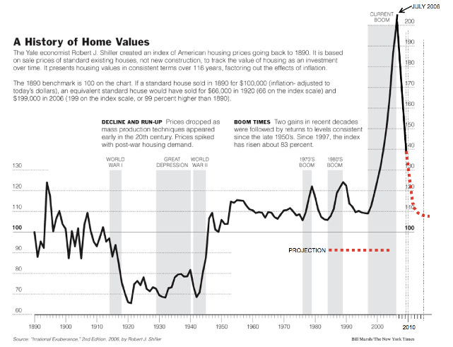
This is all relatively new in the history of American housing markets. As the famous Case-Shiller home price index makes clear, home prices were regularly affordable for, basically, all of history. Basically, before the turn of the century, housing across and within metropolitan areas tracked reasonably well with incomes. Families with lower incomes spent a little larger portion of their budgets on housing, but in general, price/incomes across the country and across cities were pretty similar, and moderate.
The tracker data starts in 2002, and even then in most cities, you can see that traditional pattern.
Austin - Superstar
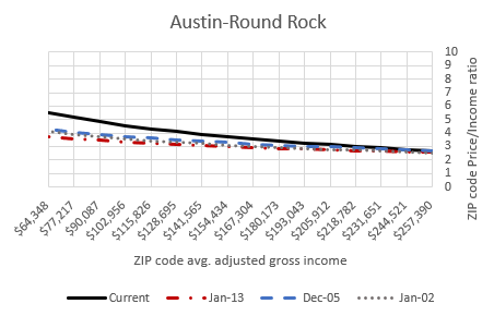
A version of Figure 1, for 30 major metropolitan areas, is in the monthly updated Excel file that “Founder” level subscribers get. Here it is for Austin. This chart shows the typical price/income levels of homes across Austin, based on current ZIP code income. You can see that (1) prices across Austin were relatively stable throughout the 2000s, and (2) they were in the range of that historical norm. Prices of homes in the richer neighborhoods sold for about 3x local incomes and prices of homes in the poorer neighborhoods sold for about 4x local incomes.
The reason it fell to some nobody bozo like me to develop the insights you see at this substack is that, in all of history, none of my research was relevant. The things that have been happening in the American housing market for the past 30 years are new. They never happened before. The world has had substandard housing, dangerous housing, and all matter of other kinds of housing. But it requires state capacity to enforce unaffordable housing. The special institutions capable of doing that are relatively young.
So, there is no history of literature on the causes of volatile and perpetually rising housing costs among poor residents, because there is no history of volatile housing costs among poor residents.
There is a literature on the history of “housing bubbles”. Those, more or less, have happened before, and in the 2000s, more or less, you could say there were aspects of one. But, it happened within the context of this new thing. And, if you are trying to understand American housing through the bubble lens, or through any other lens that doesn’t account for this new thing, then you’re studying contagious disease without a microscope. You’re just going to have a hard time getting it.
My model isn’t rocket science. It’s a simple regression based on a simple model that hasn’t been used by others because it was never relevant. It is understandable that others have been drawn to the models they already had. But, unfortunately, this is a new thing. A new problem we have made.
You can see how the old models were working in that Case-Shiller chart. The dotted red line is the old models at work. When major cities have price/income variation that ranges from 3x at high incomes to more than 10x at low incomes, what exactly is the mechanism that is supposed to push aggregate home values back to that centuries-old norm? Thinking with the old models, the question itself is incoherent. The old models couldn’t even observe reality. Robert Shiller won the Nobel Prize for the work that drew that dotted red line. (Oops. I might have been too hard on Dr. Shiller. I think the source of the projection on that chart might have been Barry Ritholz.) The most important question might have well been typed in the wing-dings font as far as that dotted red line is concerned.
By 2015, Shiller was worrying that prices were moving too far above his dotted red line. Some people, still using the old models, joined him in that. They claim to have spotted a bubble by 2002, and again by 2015, and they will perpetually see a bubble from here on out, because home prices aren’t even going to fall below the 2005 bubble levels until enough people see this new thing. (See Australia and Canada, which share our problem but which didn’t impose the mortgage collapse. The old-school bubble spotters have been in permanent bubble-watch since 2002.)
Anyway, back to Austin. As late as the mid-2010s, it was just a normal city in terms of housing costs, and it was a superstar city in terms of population and income growth. The failing cities that tricked the economists with old models into thinking they were superstars because they made themselves too expensive for their neediest residents can eat Austin’s dust.
The lack of supply, nationwide, since 2005, has stressed all cities. It is impossible for any single city to completely avoid that. So, Austin doesn’t look exactly the same as it did in 2002. Prices in poor parts of Austin have risen to north of 5x local incomes. That’s the lowest of all the cities I will show you below. Because that’s what a real superstar city looks like. Decades ago, when the pretenders were actually superstars, too, that’s what they looked like.
Also, one final note on Austin and the EHT model: At the peak of the Covid boom in 2022, there was a bit of a temporary demand spike in Austin. Call it a bubble if you want. The way cyclical demand works is it pushes prices up across the board. And, 2 years ago, price/income ratios across Austin were about 1 point higher than they are today.
The “bubble” or the cycle, or whatever you want to call it, has corrected in Austin. They have a lot of work to do to try to flatten that line. Austin is in better shape than most. (Even the other Texas cities have steeper lines than Austin.) And, I suspect Austin - the superstar - will flatten the line as good as any city will.
This is all EHT data, so the rest will be below the paywall for subscribers.
Keep reading with a 7-day free trial
Subscribe to Erdmann Housing Tracker to keep reading this post and get 7 days of free access to the full post archives.


