What's Driving Home Values (Part 3)
Building a properly supply-focused housing sector POV
Adding up the price, rent, and income relationships of the previous posts, I propose an aggregate real estate valuation model, which I described in my recent Mercatus paper.
I will use this figure, from the paper, which displays the correlation between rents and price/rent ratios among the 50 largest metro areas, at several points in time from 1991 to 2018. In the paper, I propose that the aggregate value of American residential real estate can be broken out into 3 factors.
The basic, generally stable price level of the median home in affordable metro areas where supply isn’t overly constrained and rents are low. (Basically, the price/rent ratio at the left end of the regression lines shown.)
The increase in the price of the median home in each metro area, proportional to the basic variance in rents. In other words, before accounting for the increase in price/rent ratios that routinely is associated with higher rents, a home with 50% higher rents will obviously be associated with a 50% higher price. (Basically, the length of the regression lines horizontally along the x-axis.)
The interaction between higher rents and higher price/rent ratios. The median price/rent ratio in LA or San Francisco will tend to be above 20, whereas the median price/rent ratio in Kansas City or Indianapolis will tend to be closer to 10, and this is largely associated with the rent level. So, this is also a result of higher rents, and some other set of factors which influence the ratio at which higher rents translate into high price/rent ratios.
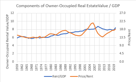
That’s it. You can think of those three factors using Figures 2 and 3, from the earlier posts.
Factor 1
Basically, a large portion of American cities are always, more or less, still in the pre-1980 regime - 80% real estate value/GDP, 6% owner-occupied renter value/GDP, low teens price/rent ratios, give or take a few points up or down. That’s the left end of the regression line.
Figure 4 shows the price/rent relationship at the end of 2017. (More recent periods will require some commentary because we broke the housing market in 2008, so old trends are breaking down.) Most metro areas are clustered down around the left end of the regression line. There are some differences in price/rents for various reasons like local property tax rates. But, basically, as of late 2017, at least, there were a bunch of cities with median rents just over $1,000 and price/rent ratios in the low teens - the pre-1980 norm.
In the graphs in Figures 2 & 3, most of the country would be basically a straight line.
Factor 2
Then, there are a handful of cities where rents aren’t just 50% elevated. In some, rents are 2 or 3 times the levels of the most affordable cities. So, the average increase in rents over the past 50 years isn’t really a national trend. A few outliers have seen rents rise much higher, and they are pulling the average up. That’s Factor 2, which basically equates to the blue line from Figure 3. They have moved far to the right, pulling the average with them.
Factor 3
Finally, the cities with high rents also have higher price/rent ratios, so, again, most cities aren’t really a part of that. It’s a few outliers, where, again, the price/rent ratio can be double or more what the price/rent ratios in the most affordable cities are, pulling up the average.
There are a couple points to ponder here:
The changes in aggregate values come mostly from outliers.
Rents are responsible for all the increases in aggregate home values, either directly through Factor 2, or as an interaction with some other variables that influence the slope of the price/rent relationship in Factor 3. Rents are involved in all 3 elements.
I’ll leave it at that for today’s post. Ponder what factors could influence the slope of the price/rent line. That’s really the only mystery to solve in American macro-level housing valuations. I will discuss that in future posts, and I will argue that while there are surely several variables that influence it, you can get 90% of the way to solving the mystery with a relatively binary analysis. There are a couple of elephants in the American housing market room and everything else is a rounding error.
As always, please consider supporting the work with a subscription and sharing it with anyone who might benefit from thinking about it.


