
What the Case-Shiller Home Price Chart Really Tells Us

There is a subtle yet important point that I should reiterate. The Case-Shiller home price index actually helps make this point, though most citations of Case-Shiller are confused about it.
The point is this: The “shortage” I am tracking and that I measure by using trends in home prices and rents isn’t just a gap in a supply and demand graph. It’s not just a matter of a standard reduction in quantity and increase in prices, though, of course, measuring quantities and prices is part of the process of identifying the problem.
If low construction productivity was the binding problem, or if it was just a matter of homes being a bit more expensive, the Case-Shiller chart would still be moving in a flat line like it famously had been for a century.
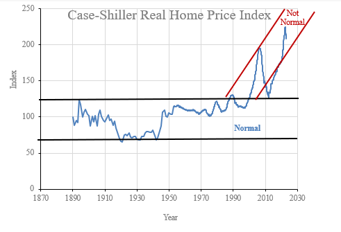
Marginal shifts in construction costs or local supply elasticity would be associated with changes in real residential investment but total spending on housing would remain within the normal range. The reason the Case-Shiller chart was flat for a century is that families have a very strong preference for spending a stable portion of their incomes on housing. When housing becomes less expensive, we tend to build more of it. When it becomes more expensive, we build less of it. Much of that adjustment is associated with how well we maintain and upgrade older homes. Nominal housing expenses as a portion of incomes (and, thus the inflation adjusted value of existing homes) tended to remain in a horizontal band over time for a reason.
What has happened in the last 30 years or so - first in a handful of cities, and then nationwide after 2008 - is that the supply of new homes has become so constrained that homes are regularly filtering up.
In normal housing markets, family incomes tend to rise a percentage point or two each year, on average, and homes depreciate by a percentage point or two each year, so that even with some maintenance and upgrades, homes tend to filter down over time so that future tenants of any given home will typically have lower incomes than the current tenants have.
Today, in most places, homes are filtering up. The future tenant of the typical home will have a higher income than the current tenant. The rental value of many homes is rising faster than the incomes of the families living in them. Now, families frequently either have to pay uncomfortably higher rents or downgrade their housing under duress.
Many homeowners are in that situation, but they are insulated from it because they own the home and don’t have to pay the rising rents. If you doubt that this is the case, note that there is currently a backlash about property taxes. Property taxes do scale with rental value. So, even homeowners feel their homes filtering up. Property tax rates haven’t generally been getting hiked up. But, the market value of homes has been inflating, and so property taxes have been inflating too.
Wherever you see homeowners complaining about unaffordable property taxes, you’re looking at evidence of upward filtering.
And, here’s the thing, that is really, really weird. That’s not just, “Oh, I wish I could afford nicer homes in better neighborhoods.” That’s, “I literally can’t afford to just consume a stable amount of housing over time even as my income grows.” And, families really hate trading down. Obviously we hate being forced to leave places with jobs, family, friends, etc. that we have a history with. We also generally don’t like trading down to neighborhoods with fewer amenities, worse schools, higher crime, etc.
So, when the Erdmann Housing Tracker says there is a “shortage”, it isn’t really measuring some deviation from an ideal. It isn’t measuring a market where households aren’t upgrading over time as much as they would like to. It is measuring how deeply we have moved into a different regime. It is measuring how far we have pushed past a tipping point into a housing market that is governed by families forced to choose between busting a centuries long spending tendency or giving up on a location or a socioeconomic status that they are comfortable with.
When the Case-Shiller chart became a popular thing to share, everyone understood that it represented a regime shift. That was why it was so galvanizing. That’s what caused the moral panic about mortgage lending. The chart didn’t just demonstrate some deviating trends. The chart reflected a market that had jumped the shark. We had busted out of anything that had been normal for a century into a completely different range.
It turns out, the regime shift had little to do with a mortgage boom or low interest rates. The regime shift was real. But, it was a regime shift to paying ransom for the right to stay in place rather than paying for walls, windows, and a roof.
The Case-Shiller chart is a good representation of the thing I measure at the Erdmann Housing Tracker. If we were in the old regime, it wouldn’t matter if we were at the top of the range or the bottom of the range. The Tracker’s Supply component wouldn’t show anything. It’s not measuring marginal shifts. It is measuring how far away we are from a traditional market where marginal upgrades over a lifetime are the norm. It’s measuring how far through the looking glass we are.
If only it was as popular to morally panic about other people having distressingly too little as it is to morally panic about other people having too much. There are still a large number of people who express skepticism about the supply crisis. In a lot of cases, I think it is related to the misinterpretation of the Case-Shiller trends to begin with. It’s a lot harder to change a conclusion about such extreme evidence than it is to be presented with fresh evidence. I’m not sure what it will take to lift the fog.
I think if nobody had ever seen the Case-Shiller chart, I could make a pretty easy case by showing it to them fresh and saying, “See. The supply problem is so bad home prices have jumped permanently outside any previous norms. That’s how much families are willing to pay when supply constraints price them out of their own homes and their long-standing communities.” It would be easy to understand.
But, instead, the Case-Shiller chart was hijacked - not least of which by its namesake. So, when I try to make the case that supply isn’t just suboptimal, but is in a crisis - a regime shift, a whole different world - the nearly universal initial reaction is “Well, maybe. But I remember those Case-Shiller charts about the out of control credit bubble. You’re trying to explain away too much that I already know.”
Still, In the Year of Our Lord, 2025
On this topic, I happened to catch some recent reactions on twitter that make for good examples of the subtle logical challenges here. One tweeter was skeptical that AI is in a bubble, because there is so much discussion of a bubble, and presumably we wouldn’t be so self-aware about being in a bubble if we were in one.
One commenter tweeted, “I’m begging people to go back and read the contemporaneous reporting of the housing market from spring of 2005 to mid 2006. It was meticulously documented by the mainstream press how insane consumer behavior was, and how prices subsequently began rapidly declining.”
They linked to a New York Times article from March 2005. At that time, construction and home prices were still rising. As Stefon would say, the article has everything. Examples of frothy behavior, comparisons to the 1990s tech boom, a warning from Robert Shiller, complacent statements from analysts who say that a bust can’t happen because housing is different or “this time it’s different”. It ends with “Such confidence about real estate has created a 1990’s-like stampede of new investors. The night before the Nexus party, Patrick Cullert, 31, and Jennifer Mathews, 29, who are engaged, camped out to ensure they would be near the head of the line for one of 16 condos to be sold at the party. It was today’s version of pestering a broker for shares in a hot public offering.”
Another commenter tweeted, “The Economist special report published in June ‘05 contains essentially all of the evidence you would need (or that people now refer to) to understand there was a bubble.”
The article, headlined, “After the Fall” notes that “Property markets have been frothing from America, Britain, and Australia to France, Spain, and China. Rising property prices helped to prop up the world economy after the stock market bubble burst in 2000. What if the housing boom now turns to bust?”
Within this discussion and these articles, you can see everything. You can see that the financial crisis happened because we decided it was fated, and ensured that it was fated. Once that happened, all the observations about 2008 were a Greek chorus of confirmation bias.
First, let’s look at the basic claims in these brief excerpts. All of the observations in the New York Times were accurate. There is little to debate, factually. And, some of that activity was unsustainable. Some of it drove up prices, temporarily, by a meaningful scale in some locations. The error that is snuck in there, by the tweeter, is that this froth is presumed to be responsible for all of the increase in property values, and, a priori, was presumed to be responsible for all subsequent declines in property values - whatever they might be. That is a huge jump in logic that practically everyone makes on this issue without realizing what they are doing.
“Speculators cause bubbles, therefore the heat death of the universe will be caused by speculators.” Bubbles are defined by their collapse. So, “The Economist special report published in June ‘05 contains essentially all of the evidence you would need (or that people now refer to) to understand there was a bubble.” only makes this jump in logic implicitly. All the evidence that there was a bubble was there, so when a bust would develop later to confirm that it had been a bubble, we had all the evidence we needed that we should be handmaidens to that bust. This is a very common point of view.
I have shared charts like this before. Figure 2 shows the Case-Shiller indexes for high tier (solid) and low tier (dashed) home prices in Los Angeles (red), Phoenix (blue), and Atlanta (black).
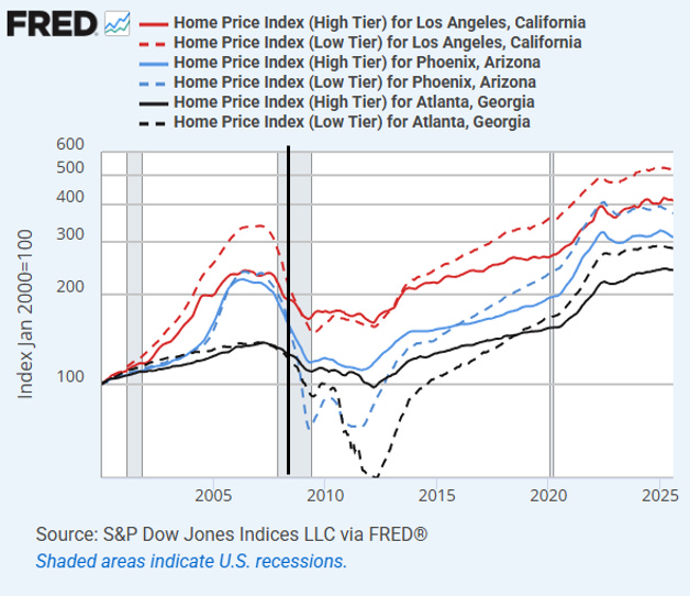
Well before the eve of the September 2008 crisis, all the froth that might have been related to the anecdotes in those stories had ended, and by September 2008 excess market prices had generally reversed. There was a bit of an extra tick down even in high tier neighborhoods after 2008, but by mid-2008, high tier and low tier prices had reconverged in Los Angeles, and high tier prices in all three markets were near the 2014 prices that settled into new trends after the crisis dislocations had worked out.
The only city in Figure 2 where low tier prices had substantially outgained high tier prices was Los Angeles because Los Angeles was the only city that had already fully transitioned into the shortage regime that forces rents to rise faster than incomes. Now, that is the case in every city, so low-tier prices are higher in every city. (That is the only way to get the Case-Shiller index so far out of normal range.)
Both high- and low-tier home prices had been elevated in Phoenix because the migration surge out of Los Angeles had created a demand boom in Phoenix. If we hadn’t already been in a new regime where the shortage in places like Los Angeles had permanently raised average home prices outside their normal range, the boom in places like Phoenix would have lifted the Case-Shiller index to the top of the century old range, not above it. The “bubble” part of the 2000s was the normal part!
You could say that in a few regions in 2005 homeowner wealth really was temporarily overstated. But that had corrected by 2008. It corrected because the migration from LA suddenly dried up in 2007 as families increasingly chose “the devil they know” as the economy started to weaken.
Years after cities like Phoenix had fully corrected, the national Case-Shiller chart was still elevated - because we were in a new shortage regime that extorted more rents from families wishing to stay put. But since the Case-Shiller chart was hijacked, the elevated level well after 2008 was still commonly cited as evidence of the need for more austerity.
After September 2008, the main outcome was the deep collapse of low-tier home prices in Phoenix and Atlanta caused by the novel crackdown on mortgage access at the federal agencies. This was not the reversal of anything, and across the country it was responsible for essentially the entire net $5 trillion loss of real estate wealth associated with the crisis.
Since any horrible thing that could happen after 2005 had been pre-blamed on activities in 2005, few were curious about possible alternative outcomes.
And, note that the first paragraph in the report lists 6 countries that “had all of the evidence you would need” that there was a bubble (which is defined in hindsight by its bust). Figure 3 shows real home prices in those 6 countries, indexed to the second quarter of 2005. Only 2 of the 6 saw significant real price deflation! And real prices in the US have moved back up, in line with most of the other countries, even after creating the unnecessary havoc shown in Figure 2.
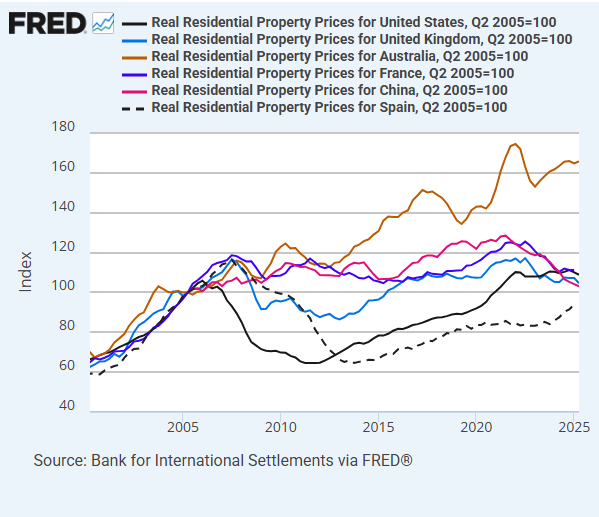
By its own standards, the report has a batting average of .333 at best! And, this is in the first paragraph that a (British!) housing expert made sure to screenshot to accompany his citation of the report that 20 years later is his go-to citation for identifying bubbles. That’s one of the baffling things about this. Most of the countries that had elevated home prices in the 2000s didn’t impose America’s mortgage crackdown, and so they didn’t have a housing bust, and yet analysts from those countries accept the inevitable bubble-bust story as canon!
Also, that first paragraph notes, “Rising property prices helped to prop up the world economy after the stock market bubble burst in 2000.” This goes to my contention that the overestimation of agglomeration value leads to a lot of confusion. This is another, worse version of that. Agglomeration value is at least sustainable. This notion that property prices were unsustainably elevated by a global financial bubble creates even more confusion. At least, agglomeration enthusiasts are correct that cities make us richer. The false Case-Shiller bubble story paints it all as a ruse. We only thought we were richer. It was a house of cards on a foundation of sand.
A lot of the discussion in my first book, Shut Out, addresses the costs of the housing shortage. But, that sentence succinctly gets at the crux of the confusion. As shown in Figure 3, every home price that was elevated before 2008 was elevated as a result of a mass migration of households out of leading economic centers. Please read this slowly, a couple of times if you need to. Refugee events do not, ever, prop up the world economy. This refugee event was associated with a significant transfer of economic rents to existing real estate owners - and the capitalization of those rents into real estate prices - in cities like Los Angeles. Transfers.
Real estate owners were spending their renters’ or their homes’ future buyers’ money because ownership in an economy that was blocking investment in real assets entitled them to it. In nominal terms, I suppose the use of those transfers as collateral is associated with some nominal spending. But, the Fed was already countering the effect of those transfers. Nominal growth and inflation in the years leading up to 2008 were moderate. Nominal spending from the payers of those transfers was already being lowered to counter the nominal spending from the receivers of those transfers. Many of the families flooding out of Los Angeles to Phoenix were trying to get out from under that. Under those conditions, nominal economic growth along a neutral trend will be associated with elevated real estate values. But, unfortunately, we had “all of the evidence you would need” to conclude that asset values needed to be lower. The bust had to confirm the bubble.
Once we benchmarked to that outcome, with powerful macroeconomic policy levers that required choices, what’s the difference between an accidental crisis and a purposeful one?
When the Fed started aiming at slowing down construction in an economy experiencing a regional housing refugee event, they were already increasing the economic rents that were being transferred to real estate owners, and, so, from that point on, the Fed’s unintentional and unattainable goal was to create economic rents while preventing the prices of the assets entitled to those rents from reflecting them. That required a crisis, and the mortgage crackdown in 2008 was finally the policy that made the impossible inevitable.
The crisis was inevitable because by 2005 we had “all of the evidence you would need” to make the impossible seem inevitable when we finally found the right combination of policy poisons to cause it.
All along, what was “propping up the world economy” was desperate families in Los Angeles spending 60% of their income on rent trying to hold on to a life where they had a history, friends, a career, and family, until they were finally the next family to be broken and move east to start new. That’s actually the only context that motivates families to have such hefty sums extracted, year after year. You think those families were “not as wealthy as they thought they were”? I can promise you that they understood exactly how unwealthy they were. And 20 years later, as a result of the hijacked Case-Shiller evidence and the policies it led to, families all over the country know how unwealthy they are, but they don’t know why. “Democracy is the theory that the common people know what they want, and deserve to get it good and hard.” Brace yourselves for how unwealthy families that rent will be when we ban landlords in the last act of our vicious cycles.
How do we stop this vicious cycle if conventional wisdom still grips the academy and the commentariat? But how will that conventional wisdom ever be toppled?
Great article as always, perhaps your best I have read. Embarrassingly only now finding out about your published books. Will have to check those out.
Nice post---I think this is the first time you have used the term "refugee" to describe the migration dynamics that dominated the national housing market prior to the Great Recession. It's a bit weird that the wealthiest state in the country maintained a regulatory policy that created a condition that is similar to having a civil war or a natural disaster. Now, there is a political narrative that California actually is a war-torn wasteland requiring military intervention. It would almost be funny except that you have people like Karen Bass grumbling about how SB 79 will wreck the urban paradise that is Los Angeles.