
Multiple Binding Constraints Make Housing Analysis Hard

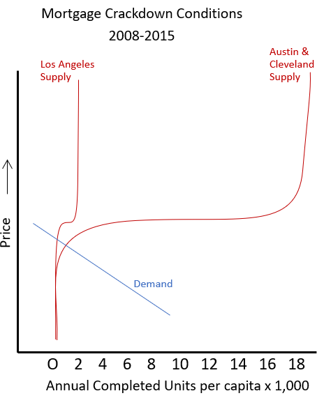
Figure 2 shows cyclically neutral housing conditions. (And yes, that is approximately the scale of the difference between local supply constraints in Los Angeles and the other Closed Access cities and other cities.)

Housing supply in each metropolitan area is vertical at the left end (existing homes) and vertical at the right end (permitting capacity) and relatively flat in the middle. That’s why in Figure 1, metro areas that permitted 25 new homes per thousand residents had similar rents to metro areas that permitted more than 100.
If we think about Figure 1 in terms of Figure 2, dots in Figure 1 move to the right, according to demand, and then hit some maximum, after which they move up. But, if that was purely the mechanism, you would think that there would be a gradient of cities with various permitting capacities, and the dots would form more of a triangle than an L-shape.
I think this aligns with my broader intuition that families are less willing to spend more on housing aspirationally than they are willing to spend to avoid displacement. Fast-growing cities have, at times, hit their permitting capacity - Phoenix and Las Vegas in 2005, Austin in 2021. But, the effects have been temporary. And, where population growth has caused local housing costs to rise, temporarily, in cities that permit housing at an above-average rate, it has generally been at times where they are at the back end of the displacement crisis and their population growth is from families leaving the high cost cities.

After 2008, the mortgage crackdown lowered prices across the country so that the prices of many existing homes were lower than the cost to build equivalent homes on free land, so the demand curve was pushed to the vertical left end of the supply curve.
The only new homes that made economic sense were high tier homes in neighborhoods with high amenity value or multi-family construction that leverages more units on a given plot of land.
One of the plausible sounding and wrong explanations for why the 2008 housing cycle was so deep is that long lead times in the construction process create a lag in the supply of homes that doesn’t respond quickly to cyclical fluctuations. Because of that, the story goes, developers overbuild into recessionary conditions, and in 2008 they overbuilt at a massive scale.
But, the types of construction that recovered the most quickly were multi-family construction, which has the longest development lead-time, and construction in the Closed Access cities, like Los Angeles, where development lead-times are especially long. Now, I’m sure that there are developmental lead-time frictions, and without those, the recovery in multi-family and Closed Access housing would have been even quicker.
But, still, that is not the order in which the recovery would have happened if the cycle was driven by a lagging-supply response. There was never a glut of housing anywhere before the collapse. It was completely a demand collapse. If policymakers hadn’t forced demand to collapse, single family home construction would have been recovering by 2008, and declining prices would have been limited to a few regions.
Over time, demand for household formation pushed rents higher until demand for purchasing homes moved back up to the flat part of the supply curve. But, as I discussed in a recent post, I think that the American housing construction market has been in an almost constant state of hysteresis for the past 30 years - production this year can only rise so far from production last year - briefly interrupted by the collapse after 2008.
The quantity of new home completions has been unsustainably low for that entire time, so that rent inflation has been elevated. But, the sector could only increase construction capacity by about 0.1 completions per 1,000 residents annually. So, nationally, the demand curve is at the vertical right end of the supply curve.
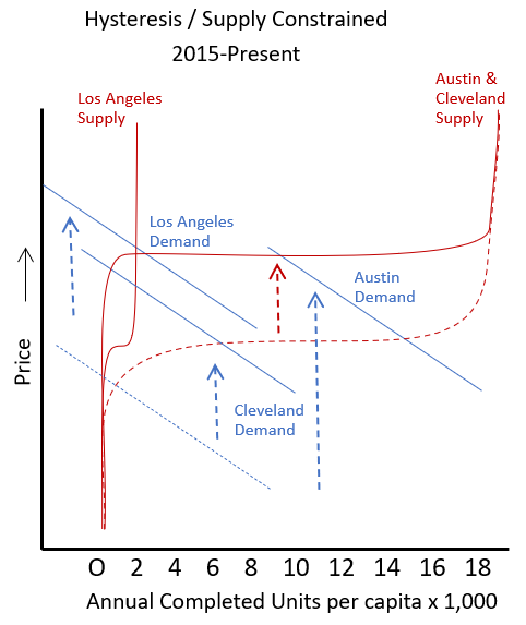
But, the way that plays out at the metropolitan area level is that rents inflate, and home prices inflate, motivating builders to pay more for land and materials. This pushes the flat part of the supply curve within every metropolitan area higher. Input inflation directs materials to the fastest growing cities, and the quantity constructed is correlated with local demand, much like it is during normal times.
The local change in the supply curve is similar to the effect of more expensive dense building in a city that is growing because of agglomeration value. It’s just that scarcity is capable of pushing the curve much higher than agglomeration value is, and also it takes really bad supply conditions to move the supply curve up like this - literally forcing families to trade down while they are aging in place because their housing costs are rising faster than their incomes. Under less catastrophic scarcity conditions or under conditions where agglomeration value is driving costs higher, families counter rising costs by reducing the amount of housing they consume over time to keep nominal spending nearly normal.
Figure 5 compares the average real price of new homes in the Northeast (red), which is a lot like Los Angeles in the figures above, and the Midwest (orange), which generally has conditions more like Cleveland.
Whenever completions have been rising, from the early 1990s to 2005 and from 2012 to the present, the market has been under hysteresis conditions. Capacity has to be slowly reattained. When it is under those conditions, builders bid up the price of inputs (blue line).

That pushes the flat part of the supply curve higher. Notice that the real price of new homes in the Midwest roughly tracks the price of inputs. Cleveland is back at the flat part of its supply curve, but the flat part of its supply curve is higher because builders are directing materials to inflated homes in Phoenix and Austin.
The average price of homes in the Northeast is high because demand is perennially pinned on the right vertical end of its pitiful supply curve. So, the average price of homes in the Northeast has risen much higher than the cost of inputs.
Upzoning would reduce prices in the Northeast by extending the right side of its supply curve out, so that its demand curve crossed the supply curve on the flat part of the curve.
Construction will recover in the Midwest when the national capacity to build increases enough that rent inflation moderates. A correction back to lower input costs will be associated with a building boom in the Midwest. The flat part of the supply curve will move lower, and intersect with the demand curve at a lower price and higher quantity. That isn’t because high input costs are directly causing homes in the Midwest to be more expensive. It’s because our condition of hysteresis directs inputs to faster growing markets.
All these non-linearities create false readings in the data if you don’t understand what is going on.
Upzoning doesn’t help if you’re on the flat part of the supply curve under hysteresis.
At a national scale, the demand curve is hitting the vertical part of the supply curve at the right end. Large scale investors will likely be an important factor in getting national housing supply high enough to reduce accumulated rent inflation. But, under current conditions, banning large investors might not create an immediate shift because the demand curve might still be hitting the supply curve at the vertical right end, even without them. And, it might well lower home prices by moving the demand curve down, but not down far enough to get to the flat part of the supply curve.
So, the anti-corporate folks will say, “See. Banning investors lowered prices and didn’t have any effect on construction.”
Supply-crisis skeptics might notice that after 2008 the supply curve seemed vertical, and scoff, “Oh, did every city suddenly downzone?” And some economists might even conclude that, “Yes! They did!”
This makes housing analysis difficult under today’s conditions. We want to think about linear supply and demand curves being moved around by various factors, but housing today is characterized by extreme differences in elasticity. Supply curves are flat or vertical, and they are being moved to flat or vertical conditions by an array of complications. Right now, you could say that the supply curve is simultaneously vertical (national hysteresis conditions) and flat (greenfield regions around most cities).
Unfortunately, since all these factors are routinely underappreciated, it is very easy to publish analysis on housing that is straight up garbage, with a veneer of quantitative certitude.
I enjoyed the article! You mentioned how these complications make it possible to publish papers flawed reasoning, were you thinking, for example, of the recent GCPI paper (McCrae et al.)?
Although I pretty much agree on everything here and think this is an abhorrently underrated insight, just want to point something out RE greenfield:
It’s completely possible for you to be correct about greenfield *supply* being on a flat part of the hysteresis curve, and for me to be correct about greenfield *demand* having hit a relatively vertical part of the hysteresis curve due to BOTH the mortgage crackdown AND underlying antipreferences for the suburban development style.
Basically, Millennials grew up in stroad-infested hellholes and don’t want to live in either the unaffordable ones they grew up in nor their exurban apotheoses; the mortgage crackdown simply ensured they didn’t have an attractively cheap escape hatch to just default to exurban greenfield *anyways*.