
Mismeasuring the Affordability Problem

I occasionally get my ire up about someone posting a chart of mortgage affordability, where they will usually use market mortgage rates, median household income and some estimate of the typical home price over time, and they will claim that there isn’t even an affordability problem. Most recently, I’ve written about it, here. And, maybe this post is mostly a repeat of the same points I’ve made before, but I think I have a slightly different way of showing it here. And, this uses data from the Erdmann Housing Tracker, so non-subscribers might get a glimpse of how the simple model I run can help highlight important issues.
The problem with those charts is that the decision to seek meaning from those charts reflects a lack of understanding about our housing crisis. It reflects the problem of not even knowing what question to ask.
There are at least 4 margins through which “Mortgage Affordability” changes:
Interest Rates
Obviously, mortgage rates are important in a practical sense for leveraged buyers and especially for leveraged buyers that can’t qualify for a mortgage large enough to purchase the home they would choose. This can sometimes be the case because American mortgage regulations and programs have long been influenced by a sort of conservatism where front-loading cash outflows (which the 30 year fixed rate mortgage does) to make mortgaged purchases more financially stressful in the early years is meant to keep buyers from overconsuming to protect them from themselves.
That is especially the case in high-inflation scenarios, so that “mortgage affordability” measures look really bad in the 1970s and early 1980s. There are a lot of problems with using the measure this way. A 30-year mortgage has 360 payments, so using a measure of only the first payment when that payment is going to decline sharply in real terms over those 30 years isn’t very informative.
And, it also happens to be the case that mortgage rates just don’t have much important effect on home prices in the long-term. If they did, “mortgage affordability” charts would be a relatively flat line instead of ranging from 20% to 50% depending on what mortgage rates are.
My figures here don’t really address that issue. I will take “mortgage affordability” at face value to make some other points.
Geography
My figures here will also not address this problem. There wasn’t much geographical difference in home prices until the late 20th century. There were some dense locations where, say, unit size might be traded off against location, or where families in regions with amenities like reliable mass transit might spend more for housing because the home included access to amenities that kept other expenses lower.
But, by 2008, the Closed Access cities included neighborhoods that commonly contained homes worth more than 10 times their residents’ incomes (versus a traditional 3x multiple). They are still in that range today, but they aren’t such outliers any more, because many other cities now have neighborhoods where home prices have risen to double the 20th century 3x norm.
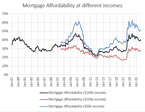
Under shortage conditions, high housing costs are highly regressive. In Figure 1, I compare the typical mortgage affordability over time for families with 3 different income levels (based on 2026 incomes). In the 20th century, this chart was basically just a chart of mortgage rates. By the 2000s, the national number was not really informative. There were many cities that basically looked like the red line for all households. The blue line (mortgage affordability for poorer households) was mostly being driven higher by the extremely high costs of homes in the Closed Access cities where few families with lower incomes could newly purchase homes any more.
Today, there is still some geographic variance, but now many places are expensive, so the elevated mortgage expenses are reflective of a national problem.
Incomes
In Figure 1, I compare typical mortgage affordability at 3 different income levels. In the 20th century, this margin didn’t matter much. Homes in all neighborhoods across all incomes sold for similar multiples to their residents’ incomes.
This is the housing crisis. The problem is that mortgage affordability for a family making $50,000 is nearly twice what it is for a family making $250,000. This is a new thing. The scale of it is massive. And it is increasingly the case everywhere. And there is only one conclusion that the average “mortgage affordability” measure represented by the black line points to: the person that made the chart doesn’t have a clue what the problem is.
For families with the highest incomes, housing for the past 20 years has been more affordable than ever before.
Rent
The final margin I will discuss here is rent versus owning. The main source of our affordability problem is that the extreme tightening of mortgage access after 2007 turned us into a nation of housing haves and have-nots. The lack of affordability is a side effect of that problem. It is why the income-correlated costs have risen so much. And the high costs are from inflated rents. The haves, who can get mortgage funding, have been able to buy homes at a discount because excluding the have-nots pushed prices down. That’s why rents increased: for years, homes were too cheap, so builders couldn’t profitably build more.
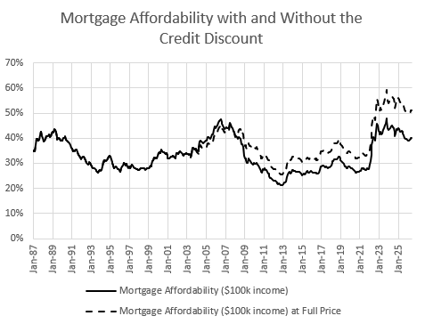
In Figure 2, the dashed line is what mortgage affordability would be for the average family with $100,000 income if homes didn’t have a discount from the mortgage crackdown.
Think of the dashed line this way: it’s the price that renters households would be willing to pay to own their homes, if they had access to mortgage capital, based on price multiples that were common in the 20th century.
In Figure 3, I compare mortgage affordability across incomes, and I include the undiscounted affordability measure for families with $50,000 incomes - what the typical renter with $50,000 income should be willing to pay in mortgage payments to own their home.
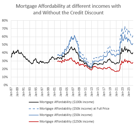
Families with $250,000 incomes can generally qualify for mortgages, so there is no discount in their neighborhoods. Mortgage affordability in those neighborhoods was extremely easy when mortgage rates were low. Now, mortgage affordability in those neighborhoods is right at the level it had been at for years before 2008. It’s easy to see how pundits who live in those neighborhoods might not have a clue what the problem is.
In those neighborhoods, the typical starting payment for a new home takes about 30% of the buyer’s income. In the 20th century, you could have said the same thing about the typical family with a $50,000 income.
But, today, the typical family with a $50,000 income has to rent because we won’t let them buy a home. And the mortgage payment that would equate to their rent expenses would take 60% of their income. Twice what it should take.
And the reason that number is so high is that the supply of new homes has been so lacking that housing costs have been rising on many families faster than their own incomes have been rising. And that puts them in the position of making hard decisions. Move out of the entire region? Move their kids into a worse school or a neighborhood with higher crime? And faced with those sorts of decisions, they choose financial distress.
The distribution of costs is the crisis. The average expense of families who are allowed to take out mortgages isn’t even feeling a part of the proverbial elephant.
@Kevin: So, one thing that Derek Thompson has been on about lately is this idea of a "unicontext". And while it doesn't strictly translate to the housing field, I do believe it has a strong analytical relationship to your work.
To wit, what I appreciate about your work, despite our various occasional minor quibbles, is that you are able to tie MULTIPLE sources of information together into a coherent narrative. Whereas, your detractors/opponents (such as Aziz Sunderji) absolutely LOVE to yank a bunch of disparate data points out of their own contexts and then pretend that they disprove your entire framework.
Obviously, I see the "unicontextual" approach as FAR more valid. Each market is going to do different things based on its local conditions, and each market movement over different timescales doesn't necessarily HAVE to be ENTIRELY explained by ONE cause. Rather, it's a multitude of causes - the mortgage crackdown since 2008, pandemic swings + postpandemic inflation, long term suburbanization against the context of the pre-suburban levels of urbanization, the unfortunate impact of Euclidean zoning and the patchwork mess of dozens of other regulatory systems (like fire codes banning single-stair), and the limits of local geography on sprawl and exurbanization - each interacting differently.
It's how we end up with the vastly diverse array of [1] a deeply housing-constrained NYC at the center of a megalopolis of suburbs larger than any other in the country, able to continue sprawling well past the magic 1-hour commute limit, [2] a Kalamazoo that (as you've described) has plenty of room for further sprawl, [3a] a St. Louis (in my experience) that hit its 1-hour commute limit with a city center devastated by white flight [3b] vs. a Chicago (also my experience) that replaced STL as the premiere midwestern urban center despite also suffering white flight, and [4] an LA that only exploded in the suburban era and thus is devastatingly sluggish to densify itself on a fully-suburbanized plain surrounded by mountains.
All of those things can be explained by the same context. But it takes a discerning mind to be able to parse it all out without just declaring, "See, there's cheap housing in the flyover cities, therefore it's all just a dEmAnD MiSmAtCh!1".
Well said