Another Follow-Up Against Agglomeration
Sorry to flood your in-boxes. Another comment required a new post so I could paste another chart in response.
(Original post. First Follow-up.)
The comment was a question about unit types.
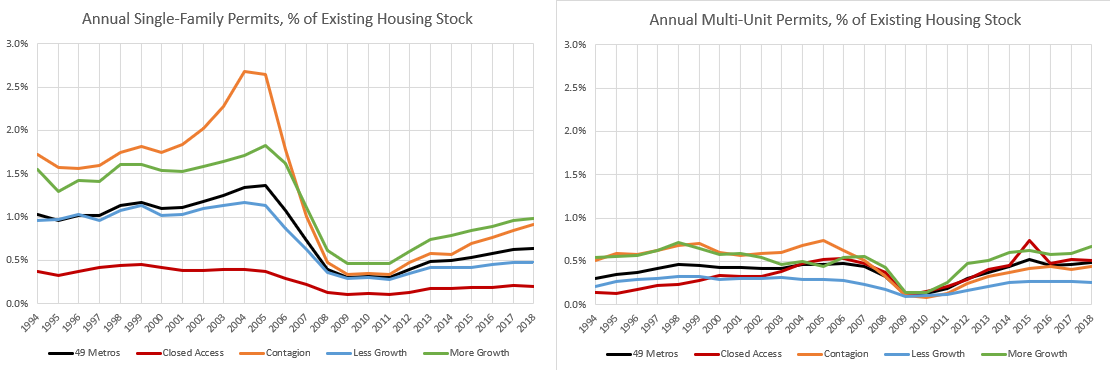
This is single-family units and multi-family units among various types of cities. (Closed Access is NYC, LA, Boston, San Francisco & San Jose, and San Diego. Contagion is cities in inland California, Arizona, Nevada, and Florida.)
I think this really helps to see the scale in which the mortgage crackdown led to our current housing shortage, because every city has a pre-existing multi-family disease.
Pre-2008, just about every city maxed out multi-unit permits at about 0.5% of the housing stock, annually. Differences in growth were mainly differences in single-family homes built in the exurbs. Then entry level homes in that market were killed with the mortgage crackdown.
(And, please note here how obvious it is that the crackdown wasn’t a reversal of temporary subprime-related spike. In most cities, there was no spike. This was a deep reversal of decades-long housing production. If you mention to that fella at the end of the bar that maybe we should loosen up lending a bit so that single-family housing construction can recover, you’ll need to wipe the spittle off your face after he blares, “Oh, you want to bring back liar loans?! We know how that turned out!!” And, so, our national mutual suffocation pact will remain popular.)
Single-family homes in the exurbs was the band-aid on our broken city-building governance. We ripped the band-aid off and the tent cities growing in our urban parks are just the exposed surface of that gaping wound that had been quietly festering for decades.
This actually has me second-guessing something. The drop in construction activity after 2008 was correlated with metro area incomes. The lower the income, the more construction dropped.
But, as you can see in Figure 14 (from this paper), total production now is more level. Previously, poorer cities had built more.
This is just what we would expect to see if my point from the last couple of posts is true and dominant. What if the causation is mostly in the direction of housing constraints leading to higher incomes? (Because rents rise regressively, and so household incomes determine migration patterns.)
Clearly, the drop in new single-family home building is related to mortgage standards, but maybe the trends in Figure 14 are due to the root cause of income differences. Where new single-family housing was lower already, there was less room for local construction activity to decline. Maybe the scale of the decline was correlated with local incomes because constraints on pre-2008 construction activity had created those income differences.
Here is the correlation between single-family construction trends before and after the Great Recession and MSA income. I think I have to conclude that my reasoning in the paper was a bit off. My updated explanation is that less building leads to higher incomes. The drop in single-family construction has been similar across metropolitan areas. This could be because, since higher housing costs are the determining variable in residency decisions, homes are more expensive in cities with higher incomes, and so tightened mortgage lending affected all cities, on the margin, in a similar way. A potential home buyer making $100,000 in San Francisco might have similar mortgage constraints as a buyer with $50,000 income in Atlanta.
I didn’t dig deep enough in the paper with Figure 14, which led me to a small error in reasoning.


OK. For the first time I think fully I get the supply side argument.
And post meltdlown the supply chain shrank which prevented multifamily construction to pick up the slack.